A return to the Maison's archive
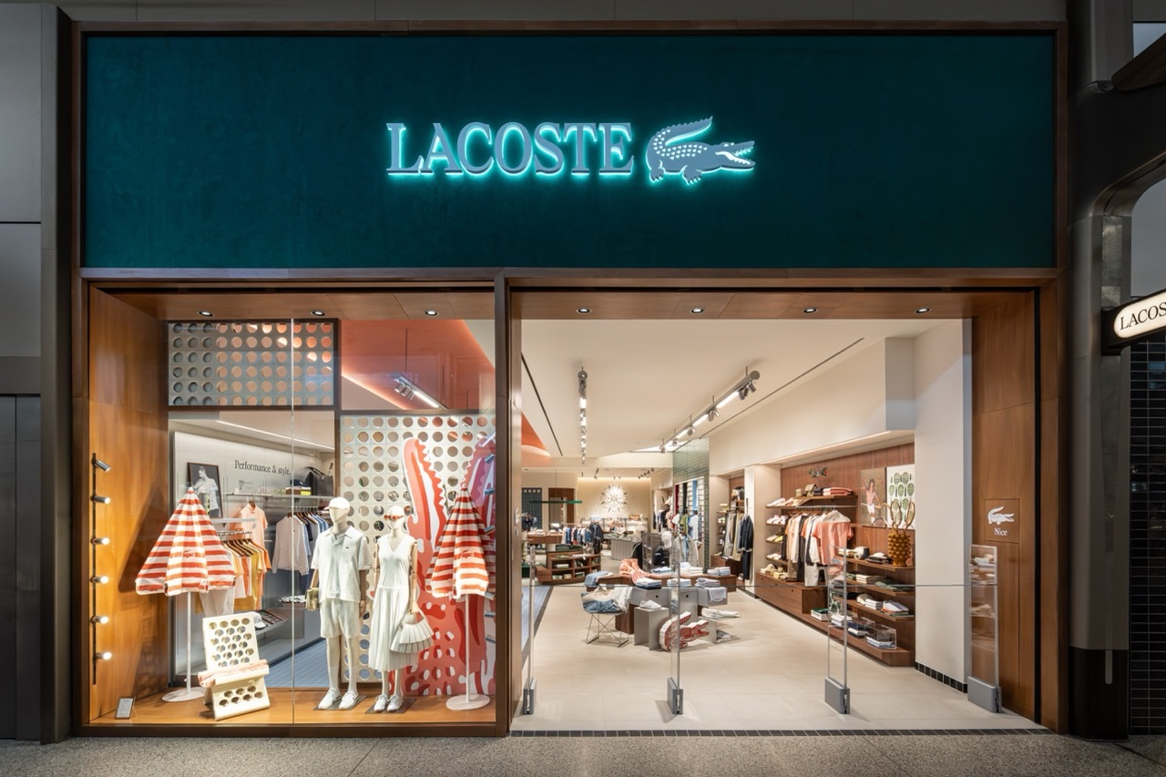
On 21 April 2026, Lacoste presents an evolved visual identity that re-anchors the Maison in its archival vocabulary. The work is developed in collaboration with London studio Commission Studio and is being rolled out progressively across all brand expressions in the months ahead.
Typography stands at the centre of the system. A bespoke serif typeface, drawn from the Maison's archives, reintroduces a pronounced presence of serif characters historically embedded in Lacoste's expressions. Its proportions, rhythms and spacing assert a signature that is both refined and distinctive.
The Crocodile, refined
The emblematic Crocodile, originally drawn by illustrator Robert George, is treated with a more considered approach so that the emblem can step forward more prominently when used on its own. The red tongue, present in the original drawing, becomes more visible across selected expressions, extending a historic detail while reflecting the playfulness that defines the brand.
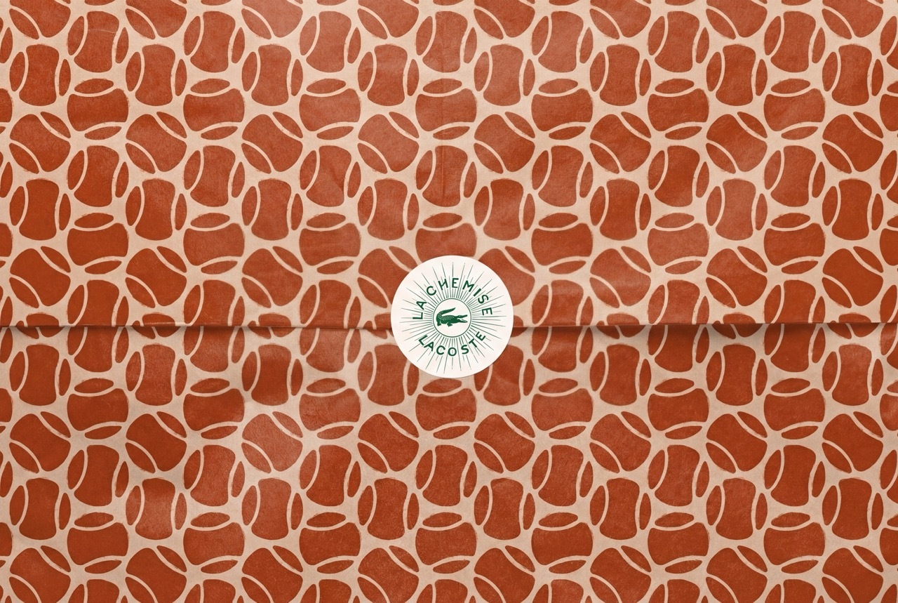
The colour palette returns the Lacoste green to a tone closer to its original shade, joined by clay, a reference to the surface of tennis courts, and farine, an off-white that recalls René Lacoste's first blazer. René Lacoste's handwritten script enters selected applications, including the Café Lacoste logotype, and motifs inspired by Robert George's graphic archive inform new packaging expressions.