Three changes, one announcement
On 14 September 2026, at 09:05 from Bagsværd in Denmark, Novo Nordisk publishes a press release making three changes at once. It shortens the name it uses day to day from Novo Nordisk to Novo. It puts a new line at the centre of its brand, "Lasting Health Starts Now". And it introduces four cultural principles under the name "The Novo Way".1
The release files all three under one heading, and the order of that heading is the argument: the company "enters next chapter to bring better health to more people, supported by 'Novo' rebrand and updated corporate culture". The chapter comes first; the brand and the culture support it.1 Tania Sabroe, executive vice president, People, Organisation and Corporate Affairs, states the relationship: "Brand and culture work together: culture shapes how we reach our strategy and how we work, while brand shapes the value that people attach to our products and services, and how our company is perceived around the world."1
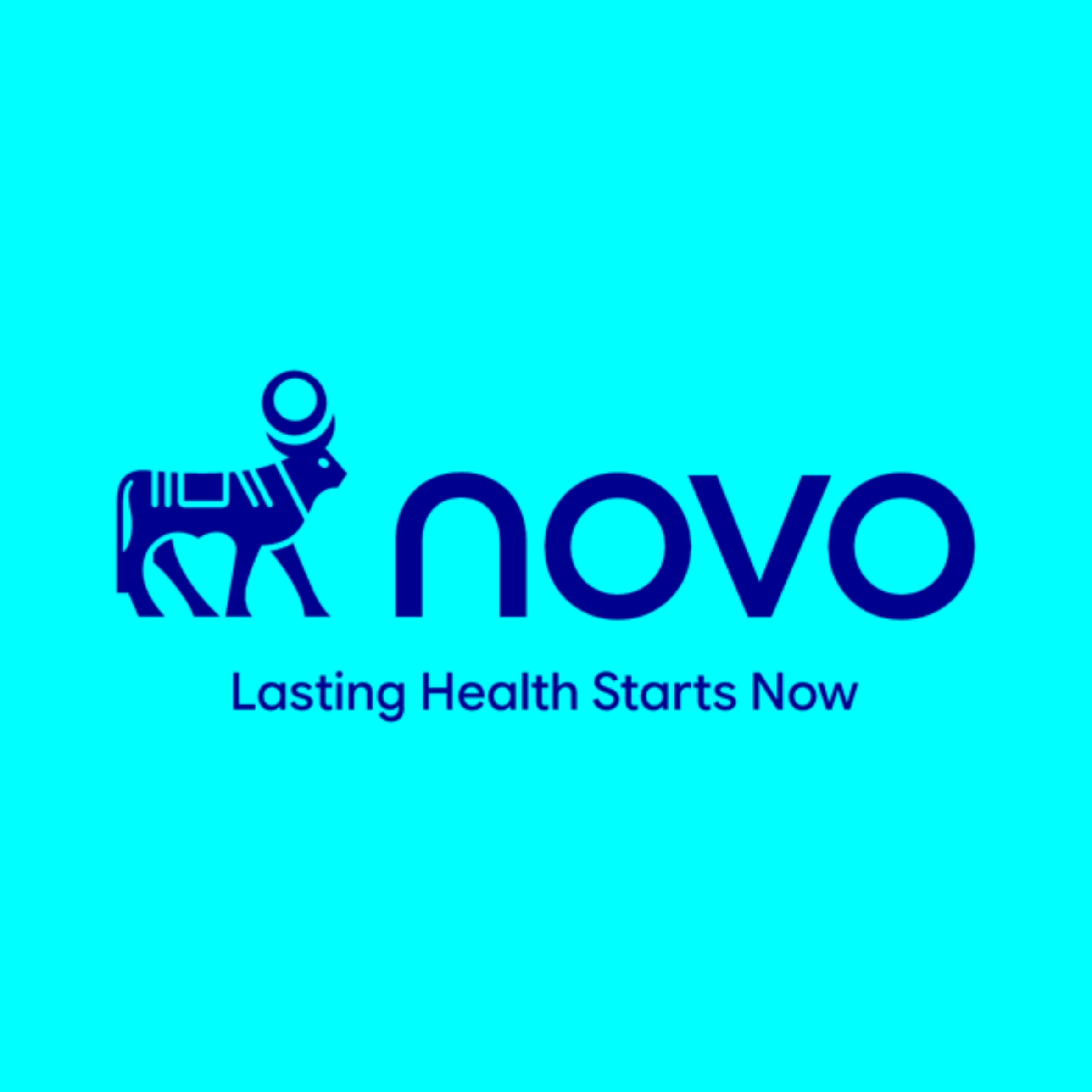
The half of the name that goes
Novo Nordisk A/S remains the legal global company name. Novo becomes the working name.1 What drops out is the half that records a merger. Nordisk Insulinlaboratorium was founded in 1923 by August Krogh and Hans Christian Hagedorn, after Krogh returned from Toronto with the insulin technique. Novo Terapeutisk Laboratorium followed in 1925, founded by the brothers Harald and Thorvald Pedersen, who had worked at Nordisk. The two combined in 1989.2
The surviving half is the younger one. Design Tagebuch, reporting the relaunch on 21 September, dates the company to 1923, the founding of the half being retired from daily use.3 Novo's own boilerplate avoids a year and says "For over a century", a formulation that holds for either predecessor.1 Its heritage timeline is less coy, marking 2023 as the year "Novo turns 100", counting from Nordisk.4 The company dates itself by one predecessor and names itself after the other.
The bull turns
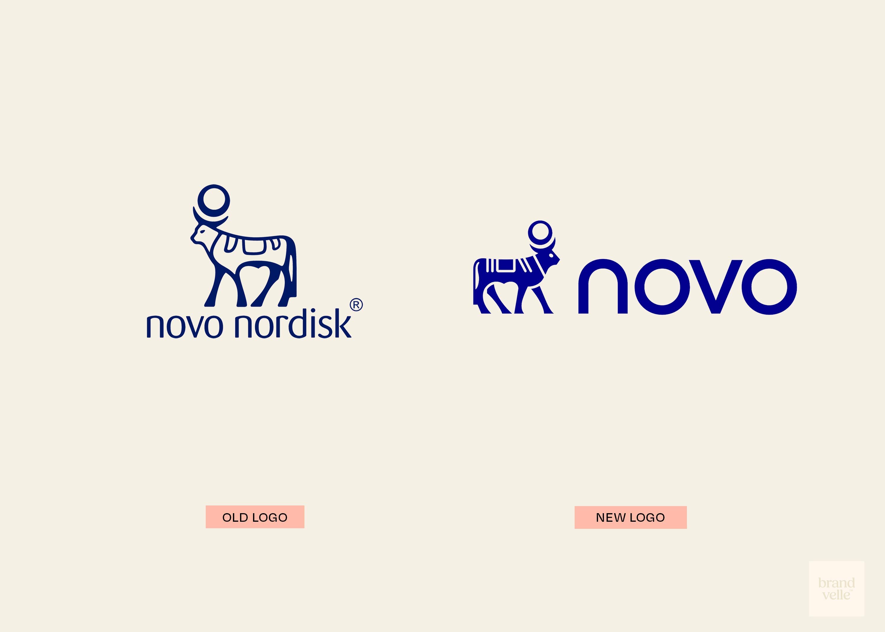
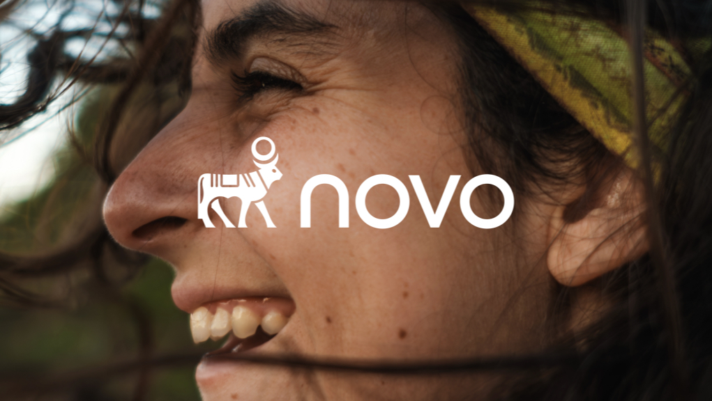
The mark that carries across is the Apis bull, and it comes from the same 1925 company. Novo publishes its own account of it, a chart headed "The evolution of the Novo Nordisk logo" running by decade from the 1920s, with the NOVO wordmark added in the 1930s.4 In every version on that chart the animal faces left. Novo describes the new identity in terms of continuity alone: it "includes the Apis bull logo rooted in Novo's heritage, while giving the brand a contemporary and future-fit expression". The release names no designer and does not describe what changed.1
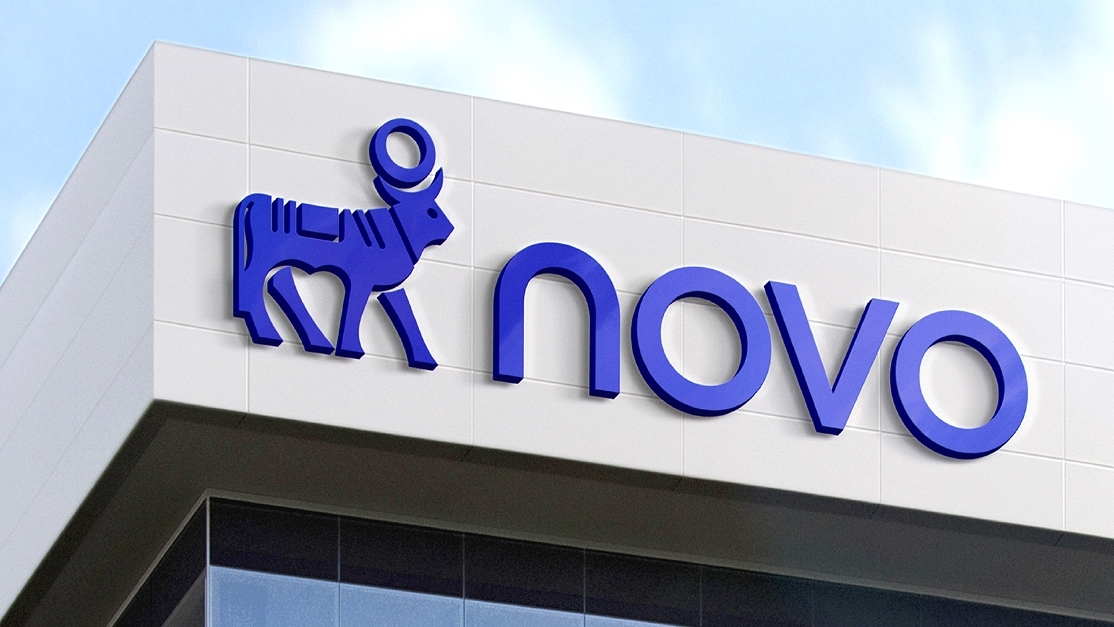
The changes are catalogued elsewhere. Design Tagebuch records that the bull now stands ahead of the wordmark, where the two were previously stacked and centred; that the animal faces right rather than left; that "novo" stays in lower case but is now set in a geometric sans; that the primary blue gives way to a saturated ultramarine; and that the corporate typeface changes from Noto Sans and ApisForOffice to a face called Novo.3 Measured against the company's own chart, the turn is the first reversal of the animal in a hundred years. The house typeface, meanwhile, now carries the same name as the company.
Apis was a sacred bull in ancient Egypt, held to be the embodiment of Ptah and later a manifestation of Osiris.3 A company whose case rests on science keeps a religious animal at the front of its signature and calls it heritage.
Four principles, named as behaviours
"The Novo Way" is built around four principles, each glossed as a sentence about conduct rather than left as a value word: Customer Obsession, Competitiveness, Clarity, and Care and Integrity. Clarity reads "We create focus and speed through clear priorities, simple ways of working and decisive action"; Care and Integrity reads "We care for our people, show respect, and never compromise on patient safety and ethics".1
Novo describes the set as building on century-old strengths "while setting out the behaviours and ways of working needed to innovate and lead in a faster, more competitive and increasingly consumer-driven market".1 Two of the names, Customer Obsession and Competitiveness, are the vocabulary of consumer business rather than of pharmaceuticals, and the release says why. Mike Doustdar, president and chief executive, puts it as a requirement: "Healthcare must become more responsive, relevant and easier to fit into everyday life."1
The identity arrives before the strategy
Doustdar draws a line around what is not changing: "Our brand and culture are strategically important and will enhance how we operate and compete, but the reason we exist will not change."1 The sequence is worth noting on its own. The release ends by pointing to a Capital Markets Day in London on 21 September, where Novo says it will set out the updated strategy in detail.1 The name, the line and the four principles arrive a week ahead of the strategy they are said to support, and the website is relaunched on the new identity in the same period.3
Novo gives its own headcount as over 67,000; Design Tagebuch gives around 69,000, in roughly 80 countries.1, 3 No colour specification for the new ultramarine appears in the company material read, and no design agency is named in either account.1, 3
Written with AI assistance, edited by a human. Find out more about our Use of AI.
1. Novo Nordisk, "Novo Nordisk enters next chapter to bring better health to more people, supported by 'Novo' rebrand and updated corporate culture", press release, Bagsværd, 14 September 2026, 09:05, read 21 September 2026, for the headline wording, the three changes announced together, the shortening of the everyday name to Novo while Novo Nordisk A/S remains the legal global company name, the line "Lasting Health Starts Now", the sentence describing the updated visual identity as including the Apis bull logo rooted in Novo's heritage while giving the brand a contemporary and future-fit expression, the four principles of The Novo Way with their full wording, the passage about building on strengths that have defined the company for more than a century, both quotations from Mike Doustdar, president and chief executive, the quotation from Tania Sabroe, executive vice president, People, Organisation and Corporate Affairs, the figure of over 67,000 employees, the boilerplate phrase "For over a century", the Capital Markets Day in London on 21 September, and the absence of any named designer or agency. https://www.novonordisk.com/news-and-media/news-and-ir-materials/news-details.html?id=916765
2. Wikipedia, "Novo Nordisk", read 21 September 2026, for the founding of Nordisk Insulinlaboratorium in 1923 by August Krogh and Hans Christian Hagedorn following Krogh's visit to Toronto, the founding of Novo Terapeutisk Laboratorium in 1925 by the brothers Harald and Thorvald Pedersen, and the 1989 merger of the two into Novo Nordisk A/S. https://en.wikipedia.org/wiki/Novo_Nordisk
3. Achim Schaffrinna, "Novo Nordisk: Evolution der Corporate Identity", Design Tagebuch, 21 September 2026, read the same day, for the dating of the company to 1923, the figure of around 69,000 employees, a presence in roughly 80 countries and products marketed in roughly 170, and for the account of what changed in the mark: the bull placed ahead of the wordmark where bull and wordmark were previously stacked and centred, the change of the animal's direction from left to right, "novo" remaining in lower case and set in a geometric sans, the primary blue replaced by a saturated ultramarine, and the corporate typeface changing from Noto Sans and ApisForOffice to a face called Novo. Also for the description of Apis as a sacred bull in ancient Egypt held to be the embodiment of Ptah and later a manifestation of Osiris, associated with fertility, strength, renewal and divine vitality, and for the relaunch of novonordisk.com on the new identity. The article names no design agency. Design Tagebuch publishes in German; the wording given in the body is a translation and the reading of the bull's direction is the publication's own. https://www.designtagebuch.de/novo-nordisk-evolution-der-corporate-identity/
4. Novo, "Our heritage", novonordisk.com, read 21 September 2026, for the timeline entry marking 2023 as the year Novo turns 100, for the account of Harald and Thorvald Pedersen, former employees of Nordisk, forming Novo Terapeutisk Laboratorium in 1925 and the two companies competing until the 1989 merger, and for the published chart captioned "The evolution of the Novo Nordisk logo", which shows the mark by decade from the 1920s to the 2010s, adds the NOVO wordmark from the 1930s, and shows the animal facing left in every version on it. The observation that the 2026 mark is the first reversal of the direction is drawn from that chart together with the change reported in note 3; Novo does not state it. https://www.novonordisk.com/about/our-heritage.html