From Dimension to Flatness
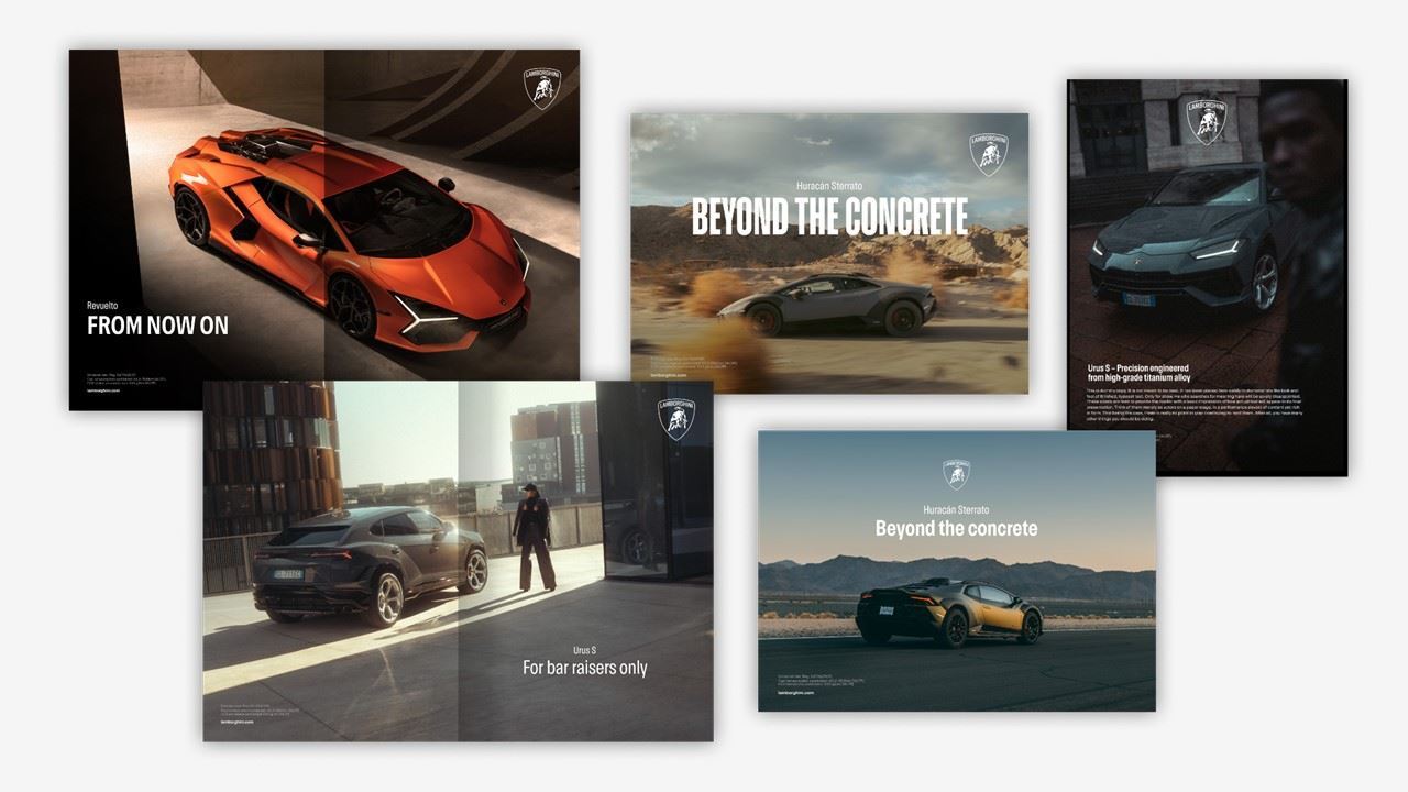
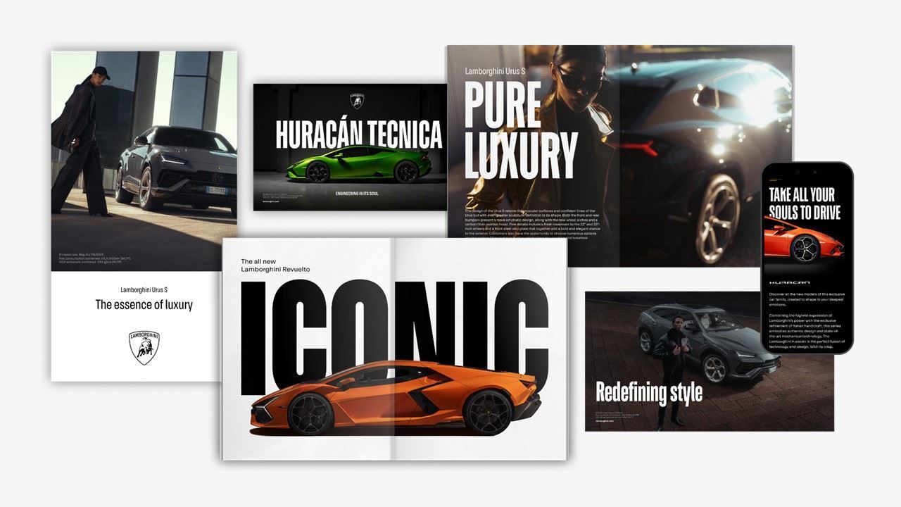
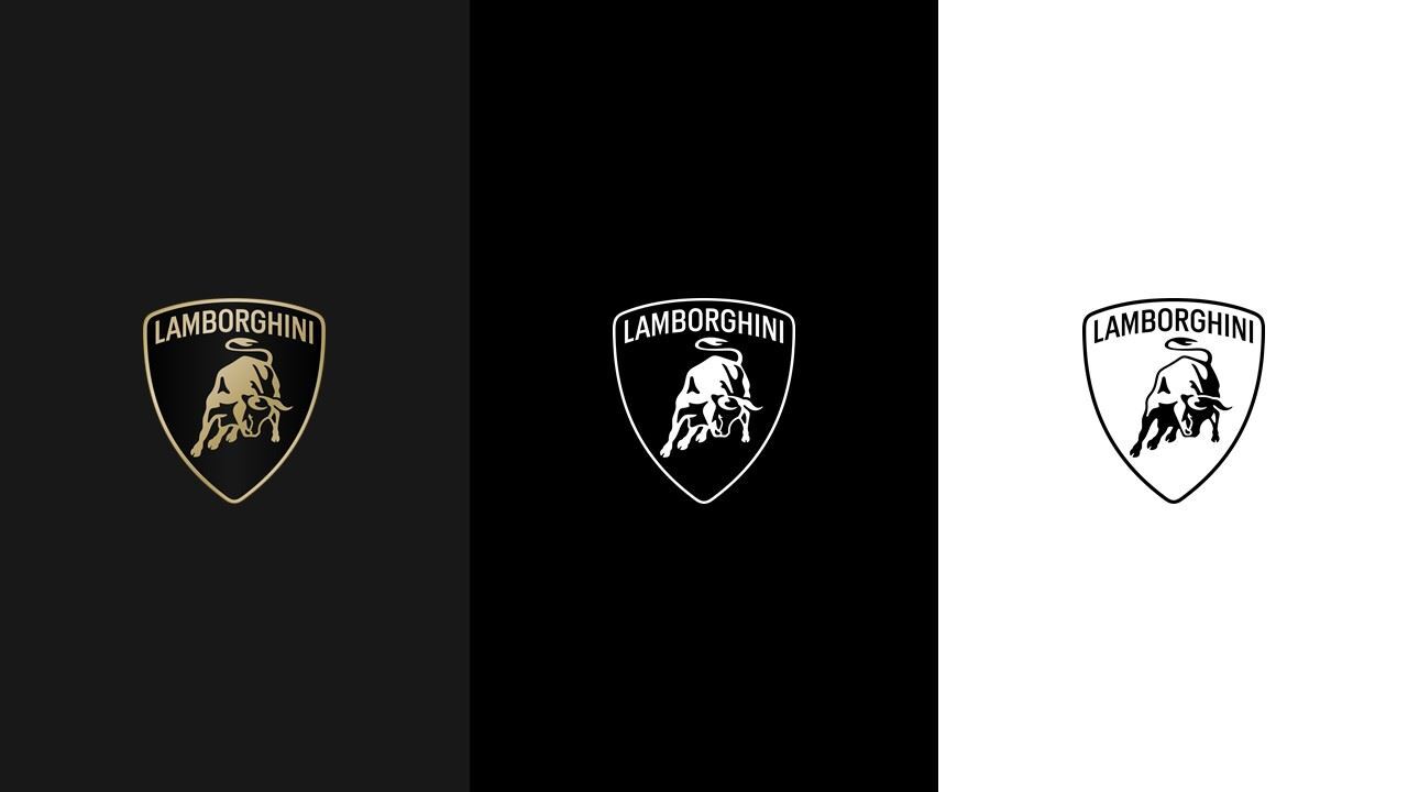
In March 2024, Lamborghini, owned by Volkswagen Group through Audi, redesigned its corporate mark for the first time in over 20 years. The new logo abandons the three-dimensional embossed appearance of the previous bull and shield, replacing it with a clean, flat two-dimensional version.
The raging bull—a motif central to Lamborghini's identity since 1963—endures in this iteration. The symbol references founder Ferruccio Lamborghini's Taurus zodiac sign, embedding a personal and astrological narrative into a corporate mark. The shield containing the bull remains, but stripped of dimensionality.
Digital-First, Vehicle-Agnostic
The redesign is deliberately calibrated for digital environments. The flat aesthetic functions across application interfaces, touchscreen vehicle displays, mobile apps, and digital marketing channels—contexts where three-dimensional effects render poorly or introduce visual noise.
The new mark debuted on the Revuelto hybrid supercar, signaling Lamborghini's commitment to the Direzione Cor Tauri electrification strategy. The logo redesign accompanies, rather than leads, this vehicular transition, serving as visual alignment with the company's technological and environmental pivot.

Heritage Preserved, Form Modernized
The redesign represents evolutionary modernization rather than fundamental transformation. By retaining the bull motif and shield structure while flattening the execution, Lamborghini signals continuity of brand essence alongside contemporary design thinking. The shift from embossed physicality to digital flatness mirrors the automotive industry's broader movement toward electrified, software-mediated experiences.