A colour chosen by shortage, not by design
Since the 1920s, Hermès had packaged its leather goods in boxes designed to resemble pigskin, finished in a pale cream shade. In the mid-1930s the house updated that packaging to a mustard or marigold yellow with dark brown edging and lettering, a combination that stayed in use for several years and had nothing to do with the colour the world now associates with the maison.
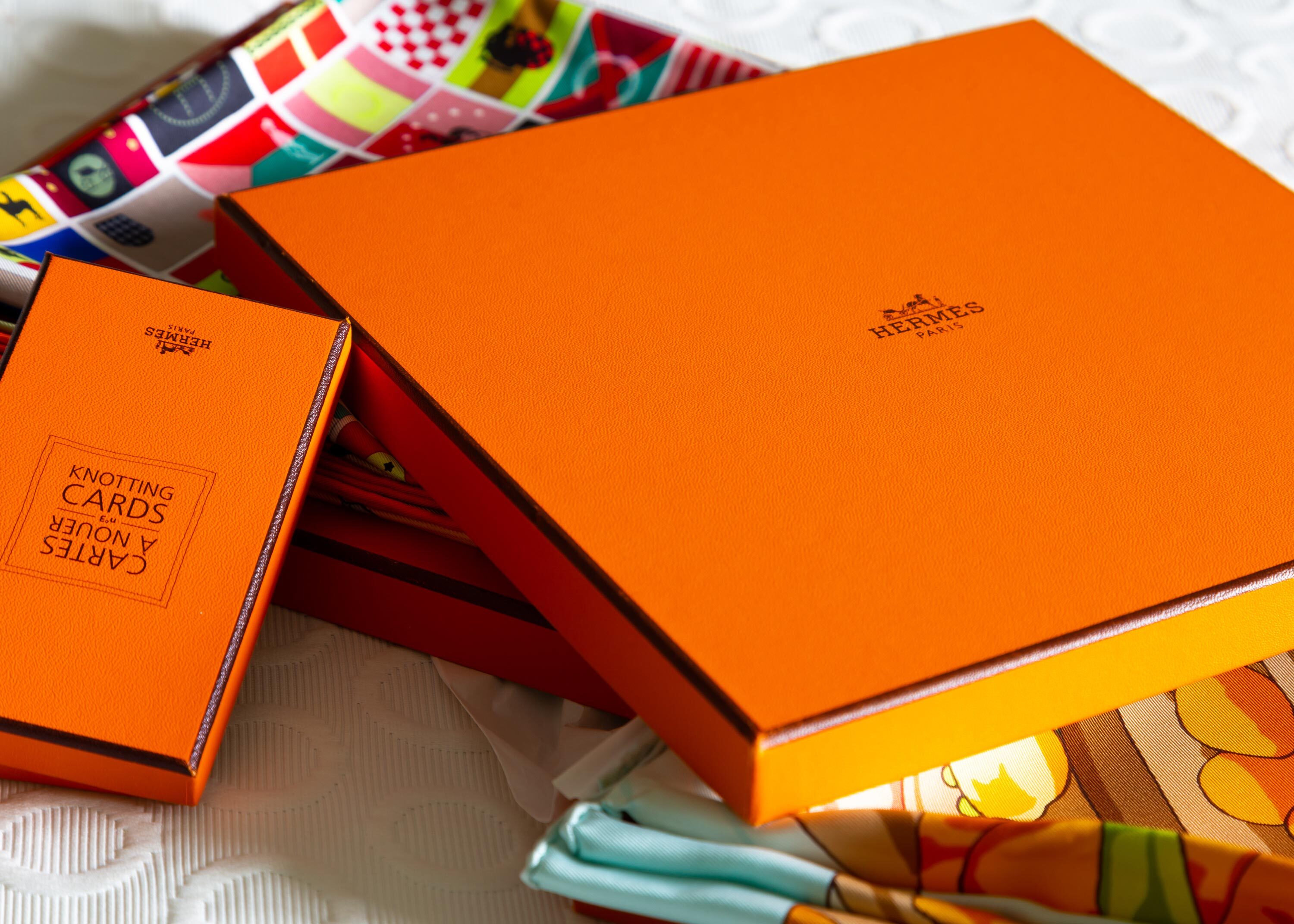
That changed in 1942, during the German occupation of Paris. Wartime shortages had disrupted the supply of the cardboard Hermès normally used, and the house's regular stock was unavailable. According to the account the house itself now tells, the only cardboard a supplier could still provide came in a colour nobody else wanted at the time: orange. Émile-Maurice Hermès, then running the maison, accepted the material rather than halt packaging altogether, added a chocolate-brown ribbon and the horse-and-carriage emblem, and put the orange boxes into use.
From wartime substitute to permanent signature
What began as a substitution born of necessity outlasted the shortage that caused it. The orange shade varied slightly over the following years as different card stock became available, but by the 1960s Hermès had standardized the colour it used across all packaging, and it has not changed since. In 1949, a dark chocolate Bolduc ribbon, tied by hand at the point of sale, was added as a fixed detail, completing the presentation that customers now expect when a purchase leaves an Hermès counter in one of the house's boxes.
The specific shade, known internally as colour 93, has no equivalent in the standard Pantone system, a detail the house treats as evidence of its distinctiveness rather than an inconvenience. Hermès has registered trademarks for the colour in numerous jurisdictions around the world, arguing that decades of consistent use have made the orange recognisable enough to identify the house without any accompanying text. The European Union Intellectual Property Office disagreed with that argument in 2005, ruling that plain orange was too common a colour for any single company to claim as a trademark across the bloc, though Hermès continues to rely on the colour as a widely recognized signature regardless.
A packaging system built on one wartime decision
The consistency has been commercially useful well beyond the original boxes. Today Hermès produces roughly 188 different box sizes and shapes, round, rectangular and square, covering everything the house sells, from handbags and scarves to ties, boots, tableware and jewelry. Each one uses the same orange stock and the same ribbon detail first added in 1949, so that the packaging communicates the brand before a customer has opened it or even seen what is inside.
In 1994, the box itself won a packaging design award, recognition for what had by then become one of the most widely recognized pieces of retail packaging in the world, unusual for a design that originated as an unplanned wartime substitution rather than a considered brief. The story is now told openly by the house and its historians as part of Hermès own account of its identity, a case in luxury branding where a signature colour has a documented, undramatic and slightly accidental origin rather than a carefully commissioned one.
The episode also illustrates a pattern that runs through much of Hermès visual history: once an element proves distinctive, whether a colour, an emblem or a ribbon tied by hand, the house tends to keep it fixed for decades rather than revisit it with each change in creative leadership, treating consistency itself as a form of luxury. The same horse-and-carriage emblem that Émile-Maurice Hermès added to the first orange boxes in 1942 remains printed on every box the house produces today.
Few luxury houses can point to a founding brand asset with as plain an origin story as Hermès can with its orange. The colour was never focus-tested or commissioned from a designer; it was simply the cardboard that was available, kept because it worked and never questioned once it did.
The box's recognisability has also given it a life independent of the products it carries. Empty Hermès boxes are resold, collected and occasionally counterfeited on their own, and the packaging is now used within the secondary luxury market as one visual cue, among several, that buyers check when authenticating a bag or accessory bought outside an Hermès boutique. A ribbon tied the wrong way, or a shade of orange that looks slightly off, can be enough to raise doubts about a piece's origin.
Hermès has occasionally varied the packaging for specific occasions, printing limited runs of boxes for anniversaries or particular boutique openings, but these variations have stayed close to the base orange and brown combination rather than replacing it. The house treats the packaging the way it treats its emblem: open to small, deliberate variation, but never to a wholesale change that would break the link back to 1942.
Written with AI assistance, edited by a human. Find out more about our Use of AI.