A 19th-century painting becomes a house emblem
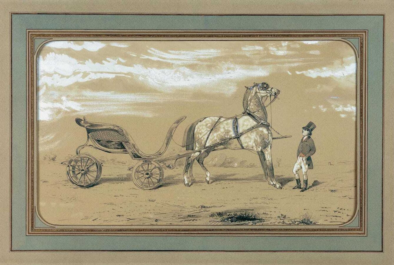
In the 1920s, Émile-Maurice Hermès, grandson of founder Thierry Hermès, acquired a small lead and white gouache drawing titled "Le Duc Attelé, Groom à L'Attente" by the French painter Alfred de Dreux. The image showed an elegant four-wheeled carriage, known in French as a duc, harnessed to a single horse and attended by a liveried groom in top hat and tailcoat, waiting rather than moving. The drawing entered the family's private collection and stayed there for years before it became the basis of the house's visual emblem.
Hermès had spent its first ninety years without a fixed graphic mark, relying instead on its name and its reputation as a maker of saddles and harnesses for European nobility. The choice to base an emblem on a painting of a carriage, rather than on a monogram built from the family name, kept the symbol tied to the trade the house was founded on in 1837: equipping horses and the people who rode and drove them, not designing a badge for its own sake.
From trademark to printed emblem
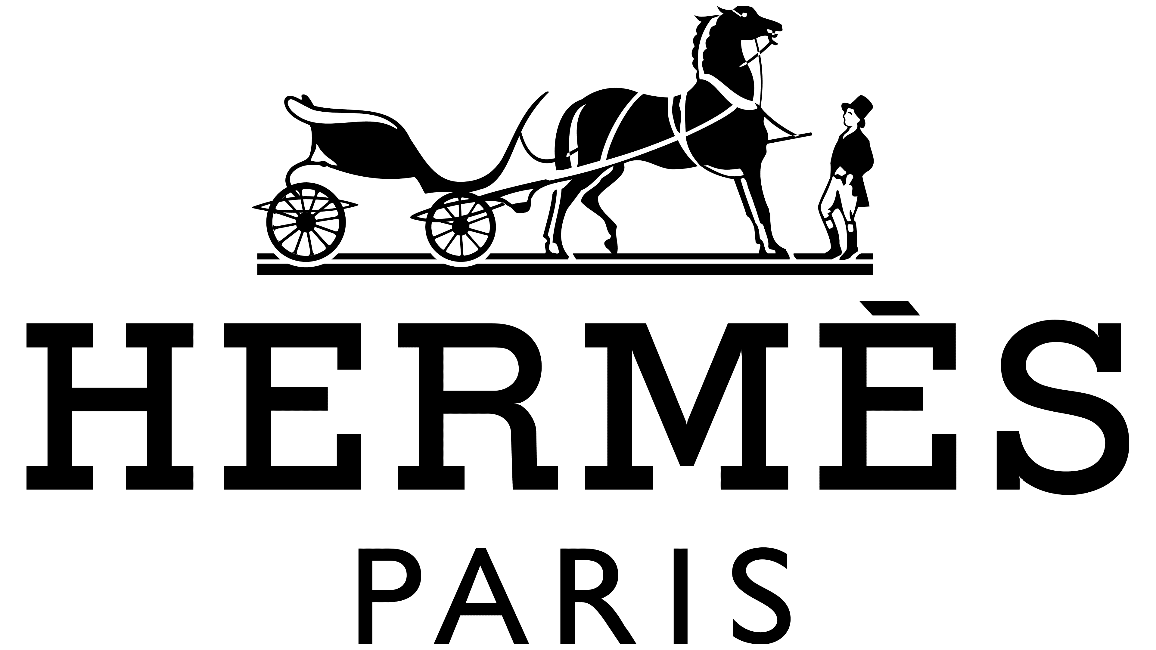
The horse-and-carriage device was officially registered as a trademark in 1945, in the difficult years following the Second World War, securing the house's legal claim to the image. Five years later, in 1950, Hermès formally adopted the design drawn directly from de Dreux's painting as its printed emblem, applying it to stationery and packaging before it spread, over the following decades, to scarves, leather goods and shopfronts. Unlike the interlocking initials that other houses had already established, the Hermès mark pictured a scene rather than a set of letters, asking the viewer to read a small story rather than recognize a monogram.
That story carries a detail that has become part of Hermès folklore: the carriage in the emblem has no visible driver. Jean-Louis Dumas, the founder's great-grandson who led the house for more than two decades from 1978, is widely credited with a line that is still quoted inside the company today.
"The first client is the horse, the second is the rider."
The remark reframes the emblem, and by extension the house, as one that places the working relationship with an animal and its equipment ahead of display for its own sake. The groom stands ready rather than performing a gesture for an audience, and the carriage waits rather than races past, an image of preparedness that has little in common with the more ornamental crests other luxury houses adopted in the same period.
A minimalist refinement, then no further change
The emblem was refined once more in the 1970s, when its lines were simplified. The horse, the carriage and the groom were rendered with fewer strokes and cleaner outlines, a change in keeping with a broader shift across luxury branding at the time toward marks that could hold up at small sizes, whether printed on a scarf label or engraved on a belt buckle. The essential composition drawn from de Dreux, a duc carriage with a single horse and an unseen driver, was left untouched.
That restraint has kept the emblem legible for more than seven decades without a further redesign. Where several luxury houses have alternated between figurative crests, wordmarks and flattened logotypes over the same period, often responding to changes in creative direction or ownership, Hermès has kept the same image since 1950 and adjusted only its execution. The mark now appears far beyond the stationery it was designed for, printed on the house's silk carrés, stamped into leather goods, cast in metal on accessories and used sparingly in advertising, each instance tracing back to the same carriage that Alfred de Dreux painted for a private client in the nineteenth century.
The longevity of the emblem also reflects a wider trait of how Hermès manages its own symbols: they are adopted rarely and changed even less often. As the house's product range expanded outward from saddlery into leather goods, silk, ready-to-wear, watches, jewelry and perfume across the twentieth century, the Duc carriage remained the one constant visual signature tying every category back to the equestrian trade the maison was founded on in 1837, long before it made a single handbag.
For a reader today, the emblem offers a rare case of near-total continuity in luxury branding: one act of trademark registration in 1945, one act of formal adoption in 1950, and one act of stylistic refinement in the 1970s, with no rebrand in between and none announced since.
The absence of any text in the emblem has also served the house well as it expanded into markets where a French wordmark carries no immediate meaning. A horse and carriage reads the same way in Tokyo, Dubai or New York, needing no translation and no adaptation for local alphabets, a practical advantage that goes some way toward explaining why Hermès felt no pressure to simplify further even as many of its peers flattened their own marks into plain wordmarks over the past decade.
Written with AI assistance, edited by a human. Find out more about our Use of AI.