ING
Logo of ING in Hanover, Germany. Source: nmann77 – stock.adobe.com

ING

ING presents itself as a direct, digital-first challenger bank, built on a purpose of helping people stay a step ahead and expressed through the Dutch orange and lion.

  • Finance
Founded
1991
Industry
Banking · Financial Services
Headquarters
Netherlands
Ownership
Public company

Key Facts

Current claim

“Do your thing”

Brand logo & color
#ff6200
Values

We're honest, We're prudent, We're responsible

ING, Purpose and values
Purpose

Empowering people to stay a step ahead in life and in business.

ING, Strategy
Vision

To become the best European bank: most loved, most valued and most impactful across our markets"

ING, ING at a glance

Brand Chronology

ING rebuilds its brand system across forty markets (2025)

ING rebuilds its brand system across forty markets

2025
ING rebuilds its brand system across forty markets
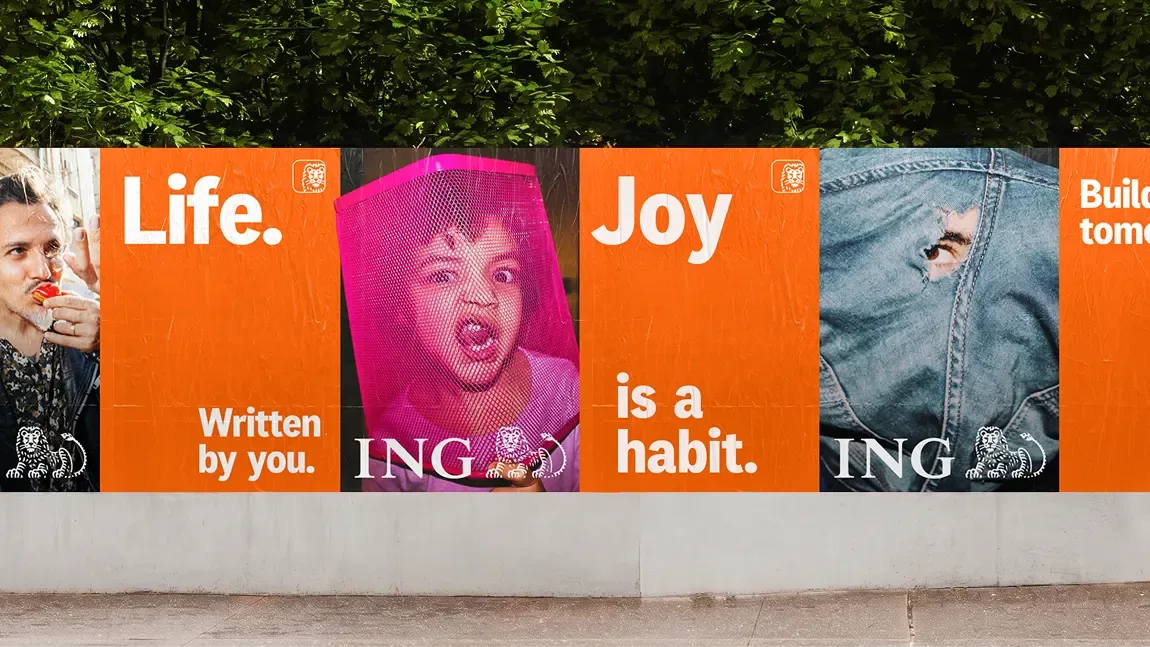
ING brand system developed with AKQA. Source: AKQA
ING rolls out a new global brand system across forty markets and four segments, with no launch announcement of any kind.
ing news branding rebranding
Read Article →
The DiBaDu sound logo, 1999 to 2021 (2021)

The DiBaDu sound logo, 1999 to 2021

2021
The DiBaDu sound logo, 1999 to 2021
Notation of the DiBaDu sound logo used in ING-DiBa advertising in Germany
The sound logo set the bank's own name to a Bert Kaempfert theme, outlived that name by three years, and was retired in 2021.
ing news foundation
Read Article →
ING writes one line for forty markets (2020)

ING writes one line for forty markets

2020
ING writes one line for forty markets
ING do your thing campaign artwork with the orange lion
After decades without one, the bank adopts a first global tagline of three words that name the customer's plan, not the bank.
ing campaign news rebranding
Read Article →
ING-DiBa drops the DiBa after fourteen years (2018)

ING-DiBa drops the DiBa after fourteen years

2018
ING-DiBa drops the DiBa after fourteen years
The ING wordmark with the lion, adopted in Germany in place of ING-DiBa. Source: horizont.net. AI remastered.
The German bank retires the older half of its compound name and trades under its Dutch parent's name from November.
ing news logo redesign
Read Article →
Twenty years of ING Deutschland and Dirk Nowitzki (2017)

Twenty years of ING Deutschland and Dirk Nowitzki

2017

Twenty years of ING Deutschland and Dirk Nowitzki
Dirk Nowitzki statue unveiled outside ING’s Frankfurt headquarters. Source: ING
Two decades after the first advertising contract, the bank marks the partnership with a bronze figure outside its Frankfurt head office.
ing campaign news brand ambassador
Read Article →
Logo Design (1991)

Logo Design

1991
Source: logos-world.net

In 1991, ING Group introduced the logo that continues to define its visual identity today. The design combines the ING wordmark with a reclining orange lion, a long-standing symbol of strength, stability, and reliability.

The lion, rendered in a distinctive orange hue, stands out against the white background and reinforces the brand’s Dutch heritage while conveying confidence and prestige. Positioned beside the symbol, the ING name appears in large blue capital letters set in a serif typeface, creating a balanced composition that reflects the company’s established presence in the financial sector.

ing logo redesign

Founded

1991
Internationale Nederlanden Groep formed in 1991 from insurer Nationale-Nederlanden and postal bank NMB Postbank, with a root ING traces to Barings in 1762.