
Three words, no product in them
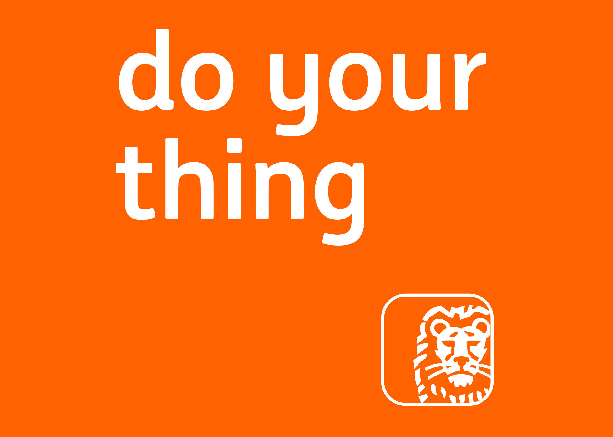
In January 2020 ING adopts "do your thing" as its first global tagline. The group has operated across dozens of markets since its formation in 1991 without one.
The line names no product, no rate and no service, and it does not describe the institution saying it. ING keeps it in lower case, which removes the emphasis a capital would place on any one of the three words.
The line points away from the advertiser
ING presents the tagline as the articulation of its purpose, which it states as empowering people to stay a step ahead in life and in business, and of a promise to make banking frictionless, to remove barriers to progress and to give people confidence in their ability to make decisions and move forward.
Both formulations describe the customer acting and the bank reducing friction. A line following that logic has no room to talk about the bank, because the argument is that the bank is not the subject.
Why a first global line arrives in 2020
ING Groep was formed in 1991 from NMB Postbank and the insurer Nationale-Nederlanden, and its market businesses carried local names for much of the period that followed. In Germany the group name replaced the compound ING-DiBa in November 2018.
A shared line becomes available once the market businesses carry the shared name. The tagline follows the renamings rather than preceding them.
The absence of a global line until 2020 is itself a fact about how the group grew. A tagline is a group-level asset, and a group whose market businesses trade under different names has nowhere to put one. A first tagline after 29 years is also a statement about what the group had decided it was. Between 1991 and 2020 ING was a holding structure with banks inside it. A single line addressed to end customers in every market treats it as one brand with markets inside it.
Built to travel
Three short words with no product noun in them can sit over different offers without adjustment. The same line runs over a mortgage in one market and a business loan in another, and it does so without being rewritten for either.
What identifies the sentence as ING's is not the sentence. It is what the group attaches to it: the orange, the lion and, in Germany, a sound logo the bank had confirmed it would keep two years earlier.
Source: adsoftheworld.com
What it looks like on screen
ING Australia launched the direction on 1 March 2021 with Ogilvy AU, building its television films around a computer-generated lion moving through everyday scenes. The bank's stated reading of the animal was that, like the lion in the films, its people are always there in the background helping customers get on with their lives without getting in the way.
The lion is an inherited Dutch national symbol. In these films it is used to stand in for the bank's own staff, which is a considerable distance from where the symbol started.
Lower case is a small decision with a consistent effect. It refuses the emphasis that would set the tagline apart from the copy around it, and it makes the three words read as something said rather than something declared.
The same line for business customers
In September 2020 ING applied the words to wholesale banking, addressing what it called changemakers across the United States, Europe, the Middle East and Africa, with print advertising in the Economist and the Financial Times and a companion list of a hundred business disruptors.
That application is the more demanding test. Business customers are addressed with arguments about capability, scale and terms, and a line about doing your own thing has no obvious purchase there. ING resolves it by naming the audience instead, which keeps the subject on the customer.
The consumer line and the corporate line are the same line. A tagline that names the customer's ambition rather than the product has no consumer or corporate register to choose between, because the sentence works wherever there is someone with a plan.
What was built on it afterwards
ING rebuilt the system governing its brand across 40 core markets and four customer segments in 2025, covering strategy, visual identity, motion, verbal identity and a scalable design system. That work sat on top of a claim that was already five years old and already shared across the group.
The order is worth noting. The names were unified in 2018, the line arrived in 2020, and the design system followed in 2025.
Written with AI assistance, edited by a human. Find out more about our Use of AI.