
A brand system that arrives without an announcement
ING Groep, the Dutch parent of the group's national banks, has rebuilt the system that governs its brand across forty core markets and four customer segments.1 The work is developed with AKQA and covers strategy, visual identity, motion, verbal identity and a scalable design system.1 What distinguishes the project is how it reached the public. No ING press release and no trade coverage could be located, and the only published account of the work is the agency's own case study, dated April 2025.1, 2
ING has not said why the work was released without an announcement. There is no launch film, no campaign explaining a new look, no before and after. The system is placed into circulation and left to be noticed.
The problem as the agency states it
AKQA sets out the brief in terms that will be familiar to any long-established challenger. "ING built its name as the ultimate challenger bank: orange, direct and built around customer freedom. But as the banking category became crowded, ING's hard-earned clarity eroded. How can a brand that once stood apart avoid becoming just another option?"1 The stated ambition is to build "a flexible, scalable brand experience that reconnects the business with its founding purpose".1
The strategic move is described as shifting the brand from reactive to convicted, and grounding it in chosen progress rather than urgency.1 That is a positioning correction rather than a visual one, and it is what the rest of the system is built to carry.
Three principles and an idea line
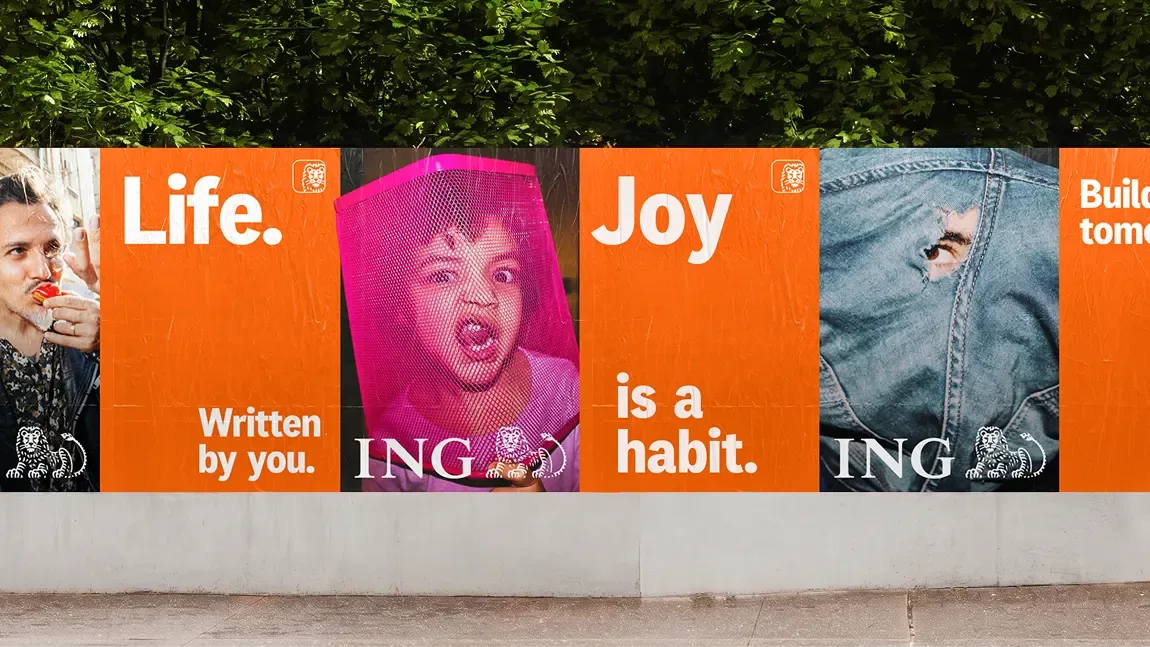
The concept rests on three active principles: Daring, Progressive and Joyous.1 The idea line beneath them is "Dare to move forward", and from it the team derives what it calls a visual language of forward momentum.1 The three words are doing governance work as much as creative work. In a system that has to hold across forty markets and four segments, principles are the mechanism by which local teams decide what belongs.


What actually changes
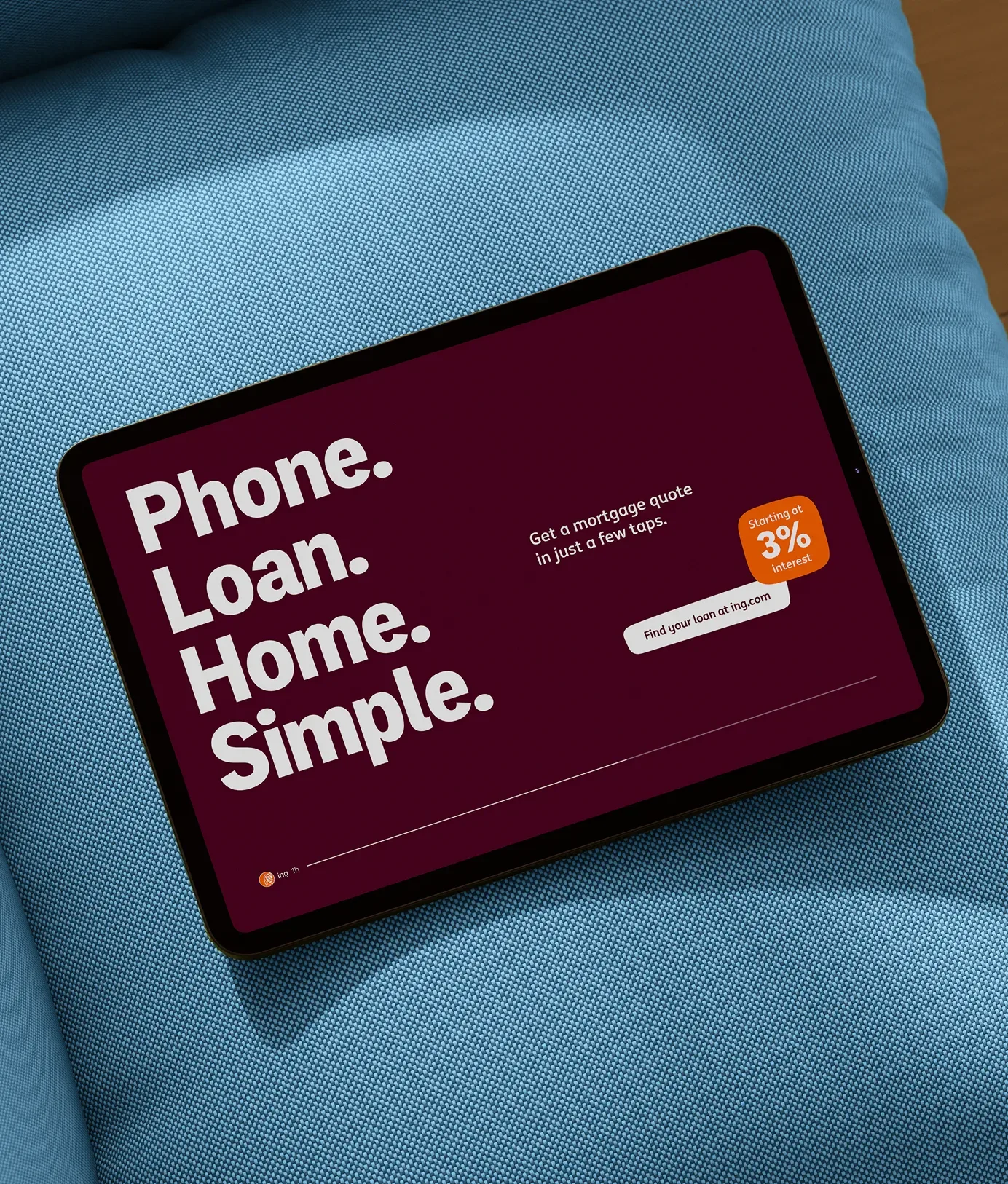
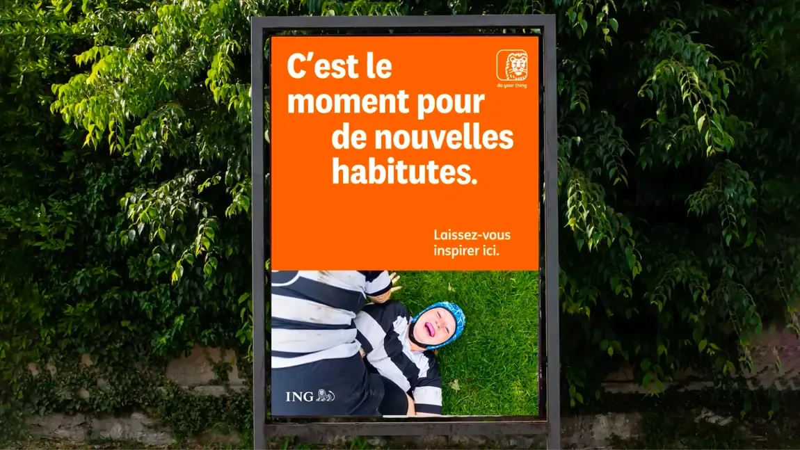
Four elements are named in the visual identity workstream.1 The lion is refreshed rather than replaced. A custom typeface is introduced. The colour palette is described as rejuvenated. The blob, the soft shape ING has used for years, becomes a dynamic framing device rather than a static container. The stated purpose of all four is to make the foundations digital first.1
The motion system is described in more detail than the other workstreams. It defines a language of forward momentum across three named behaviours: Instinctive Character, Radiant Path and Layer Progression.1 Verbal identity and tone of voice are handled as a separate workstream, described as a sharper and more consistent voice that works across segments and the full range of customer communications.1
The design system underneath is built to adapt across Retail, Private, Business and Wholesale without, in the agency's words, "diluting coherence or distinctiveness".1 A final workstream covers adoption, embedding the system with ING's internal teams so it functions as a starting point for campaigns, events and product work rather than as a document.1
A title borrowed from the bank's own language
The case is titled "One step ahead", and the phrase is not new.1 ING's purpose, published since the Think Forward strategy of 2014, is "Empowering people to stay a step ahead in life and in business".3, 4 One of the three behaviours in the bank's Orange Code is "You are always a step ahead".4 The agency's own ambition line plays on it directly. The title is a restatement of ING's existing vocabulary rather than a new line, and it is not a consumer-facing tagline. That role still belongs to "do your thing", introduced in 2020 as ING's first global tagline and still published as such.4, 5
The orange and the lion
Both assets the refresh protects are older than the brand that carries them. ING was formed in 1991 from the merger of NMB Postbank Groep with the insurer Nationale-Nederlanden, and its name is an abbreviation of Internationale Nederlanden Groep.6 The bank's own history explains the identity plainly: orange is the national colour of the Netherlands and the lion is the country's national symbol.6 Several predecessor institutions already used lions.6 No designer is credited anywhere for the 1991 mark.
What is not published
The omissions are as notable as the inclusions. The custom typeface is confirmed to exist but is never named, and no foundry or type designer is credited.1 The colour palette has no published specification. Beyond the client lead, Feyza Feridunoglu Tamer, global and Netherlands head of brand and marketing, no individual is credited on either side.1 No outcome is quantified. Beyond the counts of markets, segments and principles, the case publishes no figure of any kind.
Tamer's assessment is the only quote either party has published. "AKQA joined us as true strategic and design partners, bringing our strong foundations back to life. This project established a system that is ready for where we're going next."1 For a project of this scope, that is the entire published record.
Written with AI assistance, edited by a human. Find out more about our Use of AI.
1. AKQA, "ING: One step ahead", case study published April 2025, the only public account of the project and the source for its scope of forty core markets and four customer segments, for the workstreams covering strategy, visual identity, motion, verbal identity, a scalable design system and adoption, for the challenge text "ING built its name as the ultimate challenger bank: orange, direct and built around customer freedom. But as the banking category became crowded, ING's hard-earned clarity eroded. How can a brand that once stood apart avoid becoming just another option?", for the ambition of "a flexible, scalable brand experience that reconnects the business with its founding purpose", for the strategic move from reactive to convicted and the grounding in chosen progress rather than urgency, for the three principles Daring, Progressive and Joyous and the idea line "Dare to move forward", for the four visual identity elements of the refreshed lion, a custom typeface, a rejuvenated colour palette and the blob as a dynamic framing device, for the digital first purpose behind them, for the three motion behaviours Instinctive Character, Radiant Path and Layer Progression, for the verbal identity workstream, for the system adapting across Retail, Private, Business and Wholesale "without diluting coherence or distinctiveness", for the adoption workstream, for the case title "One step ahead", for the typeface being named nowhere and no foundry, type designer or individual creative being credited, and for the quotation and job title of Feyza Feridunoglu Tamer, Global and NL Head of Brand and Marketing at ING, "AKQA joined us as true strategic and design partners, bringing our strong foundations back to life. This project established a system that is ready for where we're going next." https://www.akqa.com/work/ing/one-step-ahead/
2. ING Groep, "Media kit", ING Newsroom, consulted on 18 September 2026, for the absence of any ING press release or published statement on the 2025 brand system; the page offers photography, publications, board information and media contacts, and routes its "brand fundamentals with logo and brand guidelines" to the gated portal at brand.ing.com, so no brand specification is public. https://www.ing.com/newsroom/media-kit
3. ING Groep, "ING launches ING Values", 22 January 2015, and GlobeNewswire, "ING strategy update: Accelerating Think Forward", 3 October 2016, for the Think Forward strategy having been launched in 2014 and for the purpose "empowering people to stay a step ahead in life and in business" being the wording carried under it. https://www.ing.com/Newsroom/News/Features/ING-launches-ING-Values.htm https://www.globenewswire.com/news-release/2016/10/03/876305/10165421/en/ING-strategy-update-Accelerating-Think-Forward.html
4. ING Groep, "Purpose and values" and "Strategy", ing.com, consulted on 18 September 2026, for the purpose as ING still publishes it, "Empowering people to stay a step ahead in life and in business", for the Orange Code behaviour "You are always a step ahead" being one of the three behaviours alongside "You take it on and make it happen" and "You help others to be successful", and for "do your thing" being described there as ING's first global tagline. https://www.ing.com/about-us/purpose-and-values https://www.ing.com/about-us/strategy
5. ING Nederland, "ING lanceert 'do your thing'", ING Newsroom Nederland, 6 January 2020, for the tagline having been introduced in 2020. The release is in Dutch and states it as: "ING is 2020 begonnen met een nieuwe merkrichting, inclusief de eerste wereldwijde tagline van het bedrijf: 'do your thing'." https://nieuws.ing.nl/nl-NL/188624-ing-lanceert-do-your-thing/
6. ING Groep, "History", ing.com, consulted on 18 September 2026, and Wikipedia, "ING Group", for the 1991 creation of the group through the merger of the postal bank NMB Postbank with the insurer Nationale-Nederlanden, for the name being an abbreviation of Internationale Nederlanden Groep, for the bank's own explanation that "Orange is the national colour of the Netherlands, and the lion is the country's national symbol", and for the predecessor institutions that already carried lions, the Rijkspostspaarbank with the Dutch coat of arms flanked by two lions, the Nederlandsche Middenstandsbank using the same mark in the 1950s and 1960s, and the insurers De Nederlanden van 1845 and the Nationale Levensverzekering-Bank before they merged into Nationale-Nederlanden. https://www.ing.com/about-us/history https://en.wikipedia.org/wiki/ING_Group