The first identity overhaul since 2017
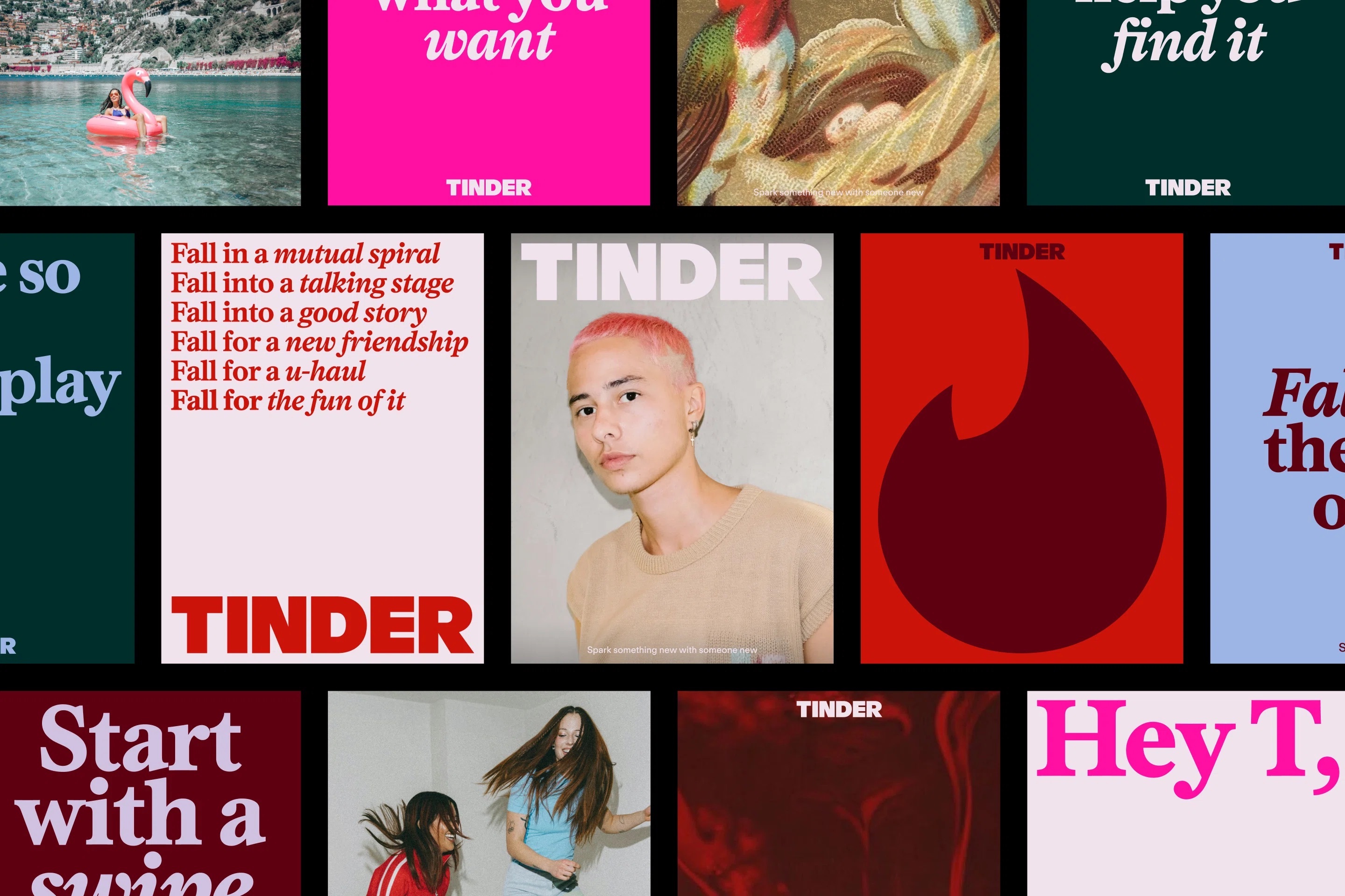
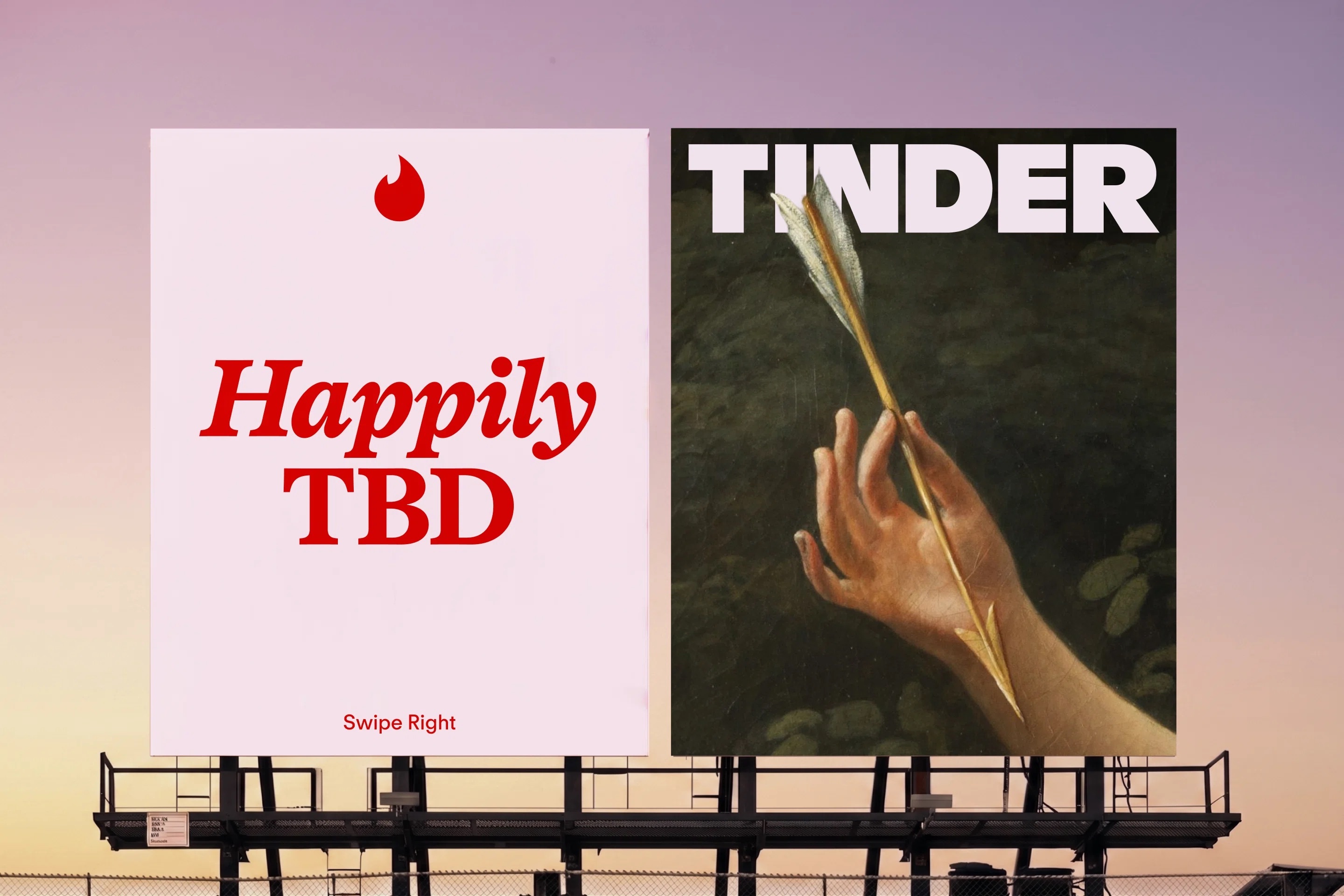
Tinder presents its first comprehensive rebrand in nearly a decade, developed with the New York design studio Porto Rocha.1 The lowercase wordmark the app has carried since 2017 gives way to an all caps setting, the flame mark is simplified and sharpened, a serif headline face enters the system for the first time, the colour palette widens beyond the red to pink range Tinder has used since launch, and the swipe is formalised as a motion design system.1, 2, 3
Tinder launched in 2012 out of the Hatch Labs incubator and now operates in more than 190 countries and 45 languages.3, 4 It is owned by Match Group, whose portfolio also includes Hinge, OkCupid and Plenty of Fish.3 According to Daniel Kim, SVP Tinder Asia at Match Group, the work responds to a change in behaviour rather than to a dated logo.3, 5
"Tinder's first rebrand in almost a decade reflects how dating, and the way people approach connection, has evolved."3, 5
From the dot on the i to a standalone mark
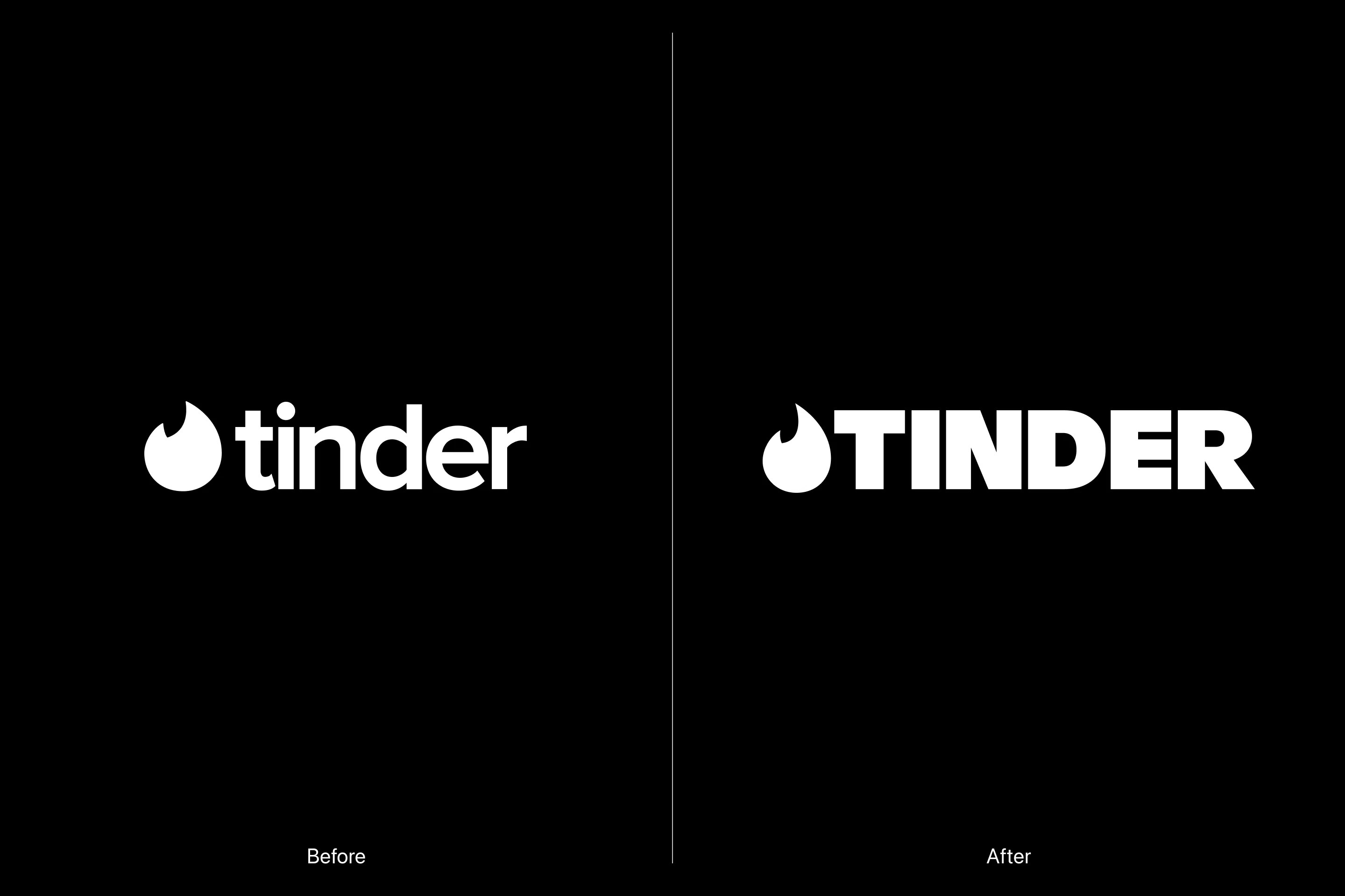
The wordmark history explains why the shift to capitals reads as more than a styling decision. The 2012 identity set the name in a rounded lowercase face with the flame doing double duty as the dot above the i.6 The 2017 redesign separated the two, releasing the flame as an independent mark that could work at app icon scale, and settled the wordmark into a rounded sans serif.6 The 2026 version keeps that separation and hardens both halves. The letterforms lose their softness, and the flame gives up the gradient that made it read as literal fire.2, 6
Yedo Han, designer at Porto Rocha, describes the capitals as a counterweight rather than an escalation, noting that the treatment balances out the softer side of the brand.7 The new serif is asked to supply the opposite quality, which Han characterises as confidence with a little edge.7 In application it leans on its italic to mark the operative word in a line, which keeps long copy scannable at poster scale.8
A columnist called T
The most consequential decision in the system is a verbal one. Porto Rocha built a fictional persona, a dating columnist called T, and wrote the tone of voice as that character: experienced, unshockable, open to whatever arrangement the reader is actually in.1, 2 The reference points are the advice column and its television descendants, from Dear Karen in the 1990s edition of Sky Magazine to Carrie Bradshaw.1
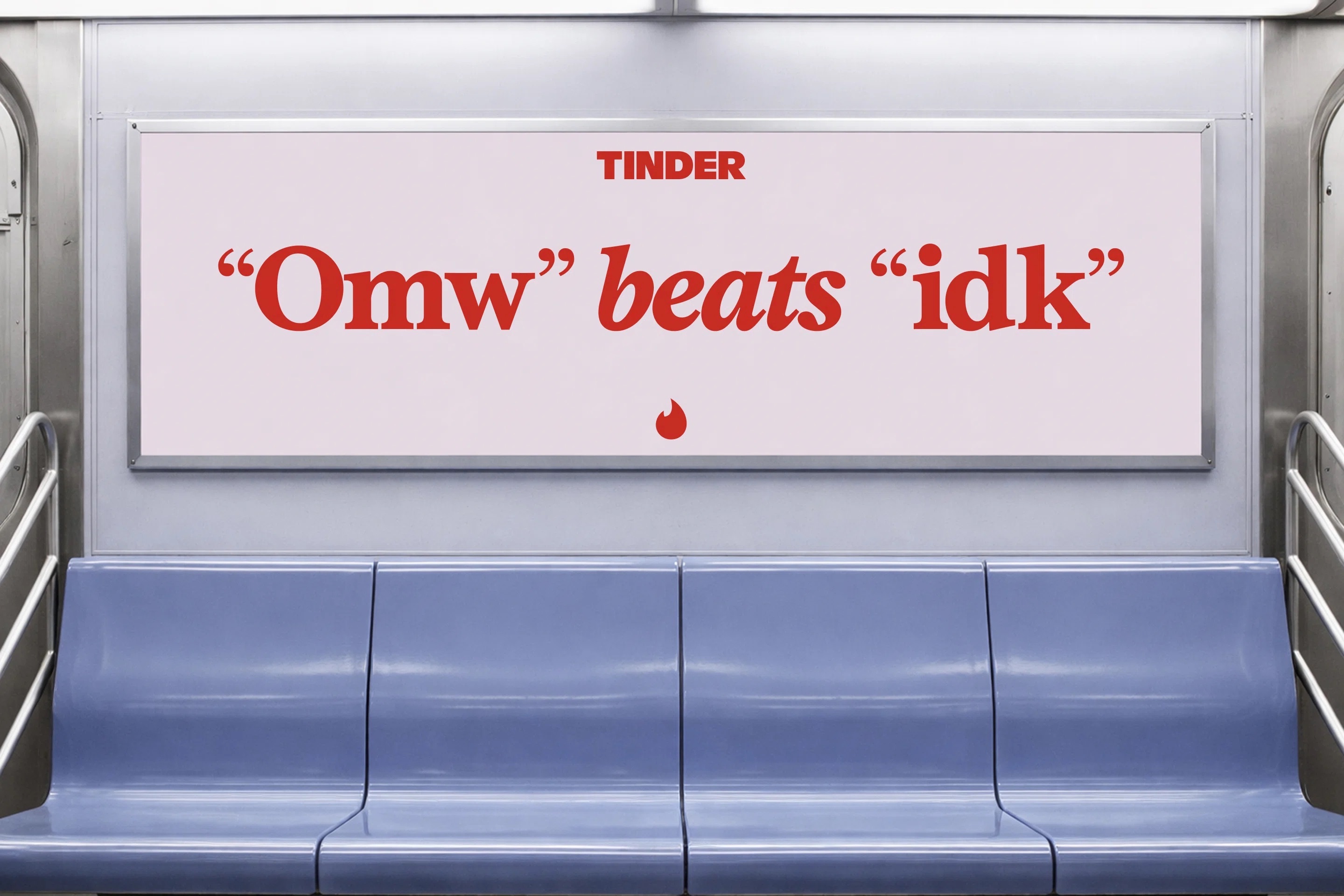
The device changes what the brand is allowed to say. Copy released with the identity runs to specifics rather than promises, among them "Find your crush. Find your slow burn. Find your doubles partner."1 Poster work borrows the letter format outright, opening with the salutation "Hey T," and out of home executions carry lines that would read as flippant from a corporate voice and as observation from a columnist, among them a subway card reading "Omw" beats "idk".8 A platform of Tinder's size has an institutional pull toward addressing everyone and therefore committing to nothing. The persona is what lets the brand hold a view without appearing to speak for the company.

Colour and photography widen the register
The palette adds blue and green alongside the reds, with the studio framing the wider range as a map of the emotions the app actually produces rather than the single note of romance.1, 7 Clashes between the new and existing hues are deliberate.7 In application the range runs from a deep forest green and a periwinkle blue through magenta and a dark maroon, held together by an off white that carries most of the typography, and the primary red is pitched deeper than the pink leaning tone of recent years.2, 8 Art direction draws on point and shoot photography, oil paintings, found imagery and mixed media, assembled with a scrapbook logic.2, 7 Real daters appear, but so do metaphors, and none of the imagery depicts a relationship literally.1
The swipe as a brand asset
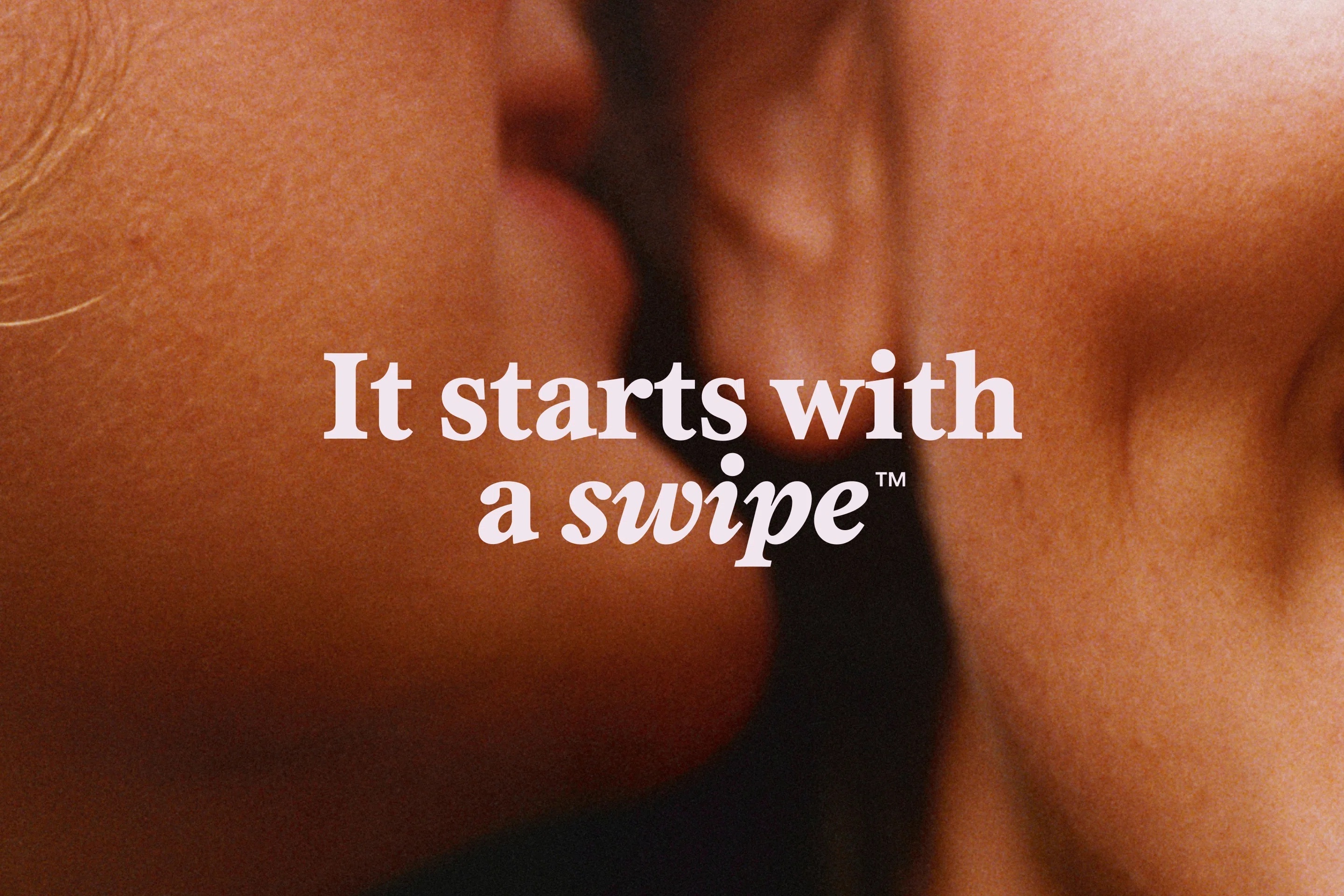
Motion is where the strategy and the product meet. Rather than leave the swipe as a mechanic, the system treats it as the signature gesture and extends it across digital surfaces and marketing, where a swipe reveals type, a mark or an image beneath it.2, 3, 5 It is the one element no competitor can adopt without quoting Tinder directly, and the company makes that claim explicit in the line "It starts with a swipe", which it carries with a trademark symbol.9
The commercial context
The refresh arrives while the business is stabilising rather than growing. Match Group reported 8.6 million Tinder payers in the first quarter of 2026, down 5 percent year on year, on direct revenue of $455 million, up 2 percent.10 Monthly active users were down 7 percent in March, which the company described as the slowest rate of decline in 31 months, and 30 day retention turned positive for the first time in years.11, 12
Chief executive Spencer Rascoff has credited that improvement to product work rather than brand work, telling investors that marketing now performs better when it promotes specific features that resonate rather than what he called amorphous brand reconsideration.10 Commissioning a full identity overhaul in the same year places the two arguments side by side. The new system does not promise growth. It gives Tinder a single consistent voice for the features the company says are already doing the work.
Written with AI assistance, edited by a human. Find out more about our Use of AI.
1. Creative Review, Daniel Milroy Maher, "Porto Rocha reveals first Tinder rebrand in a decade", 21 July 2026, for Porto Rocha being the New York studio behind Tinder's first rebrand in a decade, for the new all caps wordmark and the sleeker, sharper flame, for blue and green joining Tinder's red to pink range, for the persona T described there as "wise, experienced and open to everything", for the reference points Dear Karen, which the piece places in UK Sky Magazine in the 90s, and Carrie Bradshaw, for the copy line "Find your crush. Find your slow burn. Find your doubles partner." reproduced word for word, and for imagery that blends candid realism and expressive symbolism, mixing real couples with metaphors and cultural symbols rather than depicting a relationship literally. https://www.creativereview.co.uk/porto-rocha-reveals-first-tinder-rebrand-in-a-decade/
2. Designtagebuch, Achim Schaffrinna, "Wider die Dating-Monotonie, Tinder vollzieht Redesign", 24 August 2026, for the serif Society entering the system as the headline face and supplying what the piece calls an editorial quality, for the previous red, pink and orange gradient being replaced by a single strong red supplemented by blue, brown and green tones, for T as a fictional brand personality written as an advice columnist, for an art direction that sets oil paintings, anime stills and internet imagery alongside polished lifestyle photography for a less curated effect, and for the swipe gesture being translated into animated transitions used across the app and in marketing. https://www.designtagebuch.de/wider-die-dating-monotonie-tinder-vollzieht-redesign/
3. afaqs!, news bureau, "Tinder drops its lowercase logo as it unveils a new brand identity", 17 July 2026, carrying the Match Group announcement for the Asia region, for the new expressive serif typeface, for the signature swipe being built out into a motion design system, for Tinder operating in more than 190 countries and over 45 languages, for Match Group also owning Hinge, OkCupid and Plenty of Fish, and for the quoted words of Daniel Kim, named there as SVP, Tinder Asia, Match Group. The announcement sets the middle clause off with em dashes where the body uses commas; the wording is otherwise identical. Off whitelist and used for corroboration only. https://www.afaqs.com/news/mktg/tinder-drops-its-lowercase-logo-as-it-unveils-a-new-brand-identity-12173102
4. Wikipedia (English), "Tinder (app)", read on 17 September 2026, for Tinder having launched in 2012 and for Hatch Labs, the IAC owned startup incubator, being where the app originated. The same article gives 60 languages where the company's own announcement gives more than 45; the body follows the company figure. https://en.wikipedia.org/wiki/Tinder_(app)
5. Social Samosa, "Tinder announces brand refresh with redesigned identity and updated visual", 17 July 2026, a second outlet carrying the same Match Group announcement, for the Daniel Kim quotation and his title SVP, Tinder Asia at Match Group, and for the swipe gesture being expanded into a motion design system for use across digital platforms and marketing campaigns. The full statement runs on past the sentence the body quotes: "Tinder's first rebrand in almost a decade reflects how dating, and the way people approach connection, has evolved. Modern dating is full of contradictions. It's exciting and vulnerable. Intentional and spontaneous. Hopeful and unpredictable." Off whitelist and used for corroboration only. https://www.socialsamosa.com/industry-updates/tinder-announces-brand-refresh-with-redesigned-identity-and-updated-visual-12173629
6. Logos World, "Tinder Logo and symbol, meaning, history, PNG, brand", read on 17 September 2026, for the 2012 wordmark setting the name in lowercase with a flame in place of the dot above the i, for the 2017 redesign lifting the flame out of the wordmark into an independent symbol placed to the left of a rounded sans serif, and for the flame carrying a pink to orange gradient that gave it the reflection and depth of real fire. https://logos-world.net/tinder-logo/
7. Creative Bloq, Georgia Coggan, "Tinder gets a dramatically different new look to connect with Gen Z", 17 July 2026, for the quoted judgements of Yedo Han, named there as Senior Designer, that the all caps setting "balances out the softer side of the brand now, especially with the updated colour and the serif we're bringing in" and that the headline serif "brings in boldness and confidence, and a little bit of edge", for Han on balancing "red hues with hues of blue and green, so it speaks to a wider spectrum of the emotions you feel throughout using the app", for the colour clashes being deliberate and adding to what Han calls a "scrapbook-y, real-life sort feeling", and for the tactile mixed media range running from point and shoot style photography to oil paintings. Off whitelist and used for corroboration only. https://www.creativebloq.com/design/branding/tinder-gets-a-dramatically-different-new-look-to-connect-with-gen-z
8. Identity assets released with the rebrand and held with this verse (tinder-01.jpeg, tinder-03.jpeg, tinder-06.jpeg, tinder-logo.gif), read directly, for the italic marking the operative word in a headline at poster scale, for the poster salutation "Hey T,", for the out of home line "Omw" beats "idk", and for the colours as they appear in application, sampled as off white #F0E3EC, forest green #002E2A, maroon #5E0010, red #CC1309, magenta #FF0FA2 and periwinkle #9DB5E4. No published source carries the two copy lines; the studio's own project page was not reachable on 17 September 2026. https://www.portorocha.com/tinder
9. Tinder press room, "Tinder Redefines Expectations With New Brand Campaign That Celebrates Gen Z's Authentic, Fluid and Beautiful Connections", 27 February 2023, for the swipe line being a trademarked property of the company, written there as "It Starts with A Swipe(TM)" and introduced with Tinder's first global brand campaign. https://www.tinderpressroom.com/2023-02-27-TINDER-REDEFINES-EXPECTATIONS-WITH-NEW-BRAND-CAMPAIGN-THAT-CELEBRATES-GEN-ZS-AUTHENTIC,-FLUID-AND-BEAUTIFUL-CONNECTIONS
10. The Motley Fool, "Match Group (MTCH) Q1 2026 Earnings Call Transcript", call held 5 May 2026, for the figures as management gave them on the call, "Payers declined 5% year over year to 8.6 million" and "Tinder direct revenue in Q1 was $455 million, up 2% and down 3% FXN", and for the words of Spencer Rascoff, Chief Executive Officer, "Prior campaigns were focused on more amorphous brand reconsideration, 'Hey, Tinder's great, check out Tinder.' Now we are able to market very specific features that have great resonance with our key user segments." Off whitelist and used for corroboration only; the quarterly press release does not break the Tinder segment out. https://www.fool.com/earnings/call-transcripts/2026/05/05/match-group-mtch-q1-2026-earnings-transcript/
11. Match Group, "Match Group Announces First Quarter Results", 5 May 2026, the company's own release, for the sentence "In March, MAU trends also improved, down 7% Y/Y, the slowest rate of decline in 31 months, and new user registrations returned to Y/Y growth." https://www.prnewswire.com/news-releases/match-group-announces-first-quarter-results-302763209.html
12. BigGo Finance, "Match Group Q1 2026 Earnings Call, Tinder's Turnaround Accelerates: MAU Decline Slows to -7%, Retention Turns Positive as Match Group Beats Q1 Estimates", 6 May 2026, for the retention figure being reported as 30 day retention, positive for the first time in years and up 1 percent year on year in March. The call transcript gives the same movement as "user retention increased, up 1% year over year in March after multiple years of decline" without naming the window. Off whitelist and used for corroboration only. https://finance.biggo.com/news/US_MTCH_2026-05-05