
A single ribbon signals a change in creative direction
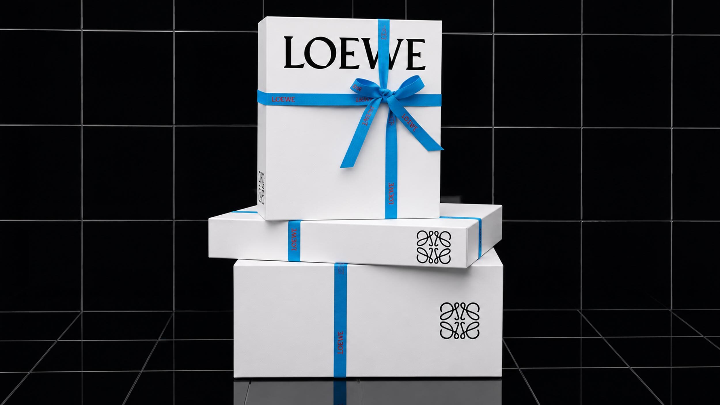
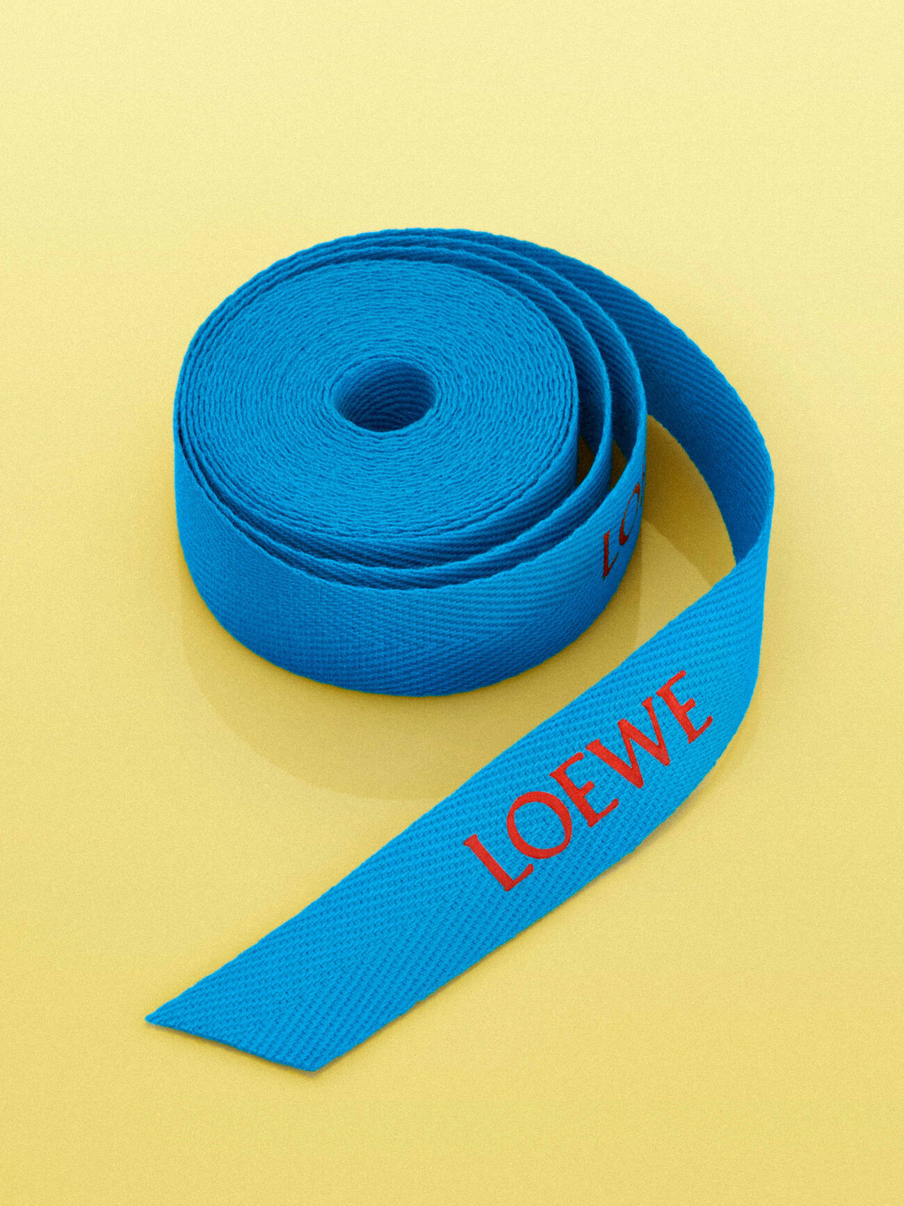
Since Jack McCollough and Lazaro Hernandez became Loewe's creative directors in 2025, the house has updated its packaging with a new detail: purchases made through loewe.com now arrive wrapped in a blue branded ribbon, replacing the ribbon colour used under the previous creative regime.1, 2 Loewe describes the choice explicitly as a nod to the colourful vision of its new design leadership, making the packaging update a deliberate signature of the creative-director transition rather than an incidental refresh.1
The rest of the packaging system stays close to what came before: online purchases are gift-wrapped in Loewe's signature smoky white packaging, with branded tissue paper and a Loewe box for smaller items, or cotton covers and hangers for larger ready-to-wear pieces.1 Perfumes and home scents keep their own dedicated boxes and bags, which can be customised with a personalised message for gift sets, continuing the book-like, paper-forward packaging language Jonathan Anderson had established for Loewe fragrance a decade earlier with the 001 line.1, 3
Packaging adapted for specific markets and moments
Beyond the global packaging system, Loewe has also commissioned market-specific packaging for particular retail moments. In China, the design studio UDL created a limited-edition gift box tied to the Loewe 520 Cubi handbag collection and an Anagram pendant with heart-shaped detailing, timed to the Chinese "520" gifting occasion, a date, 20 May, that reads in Mandarin numerals as a phrase close to "I love you."4, 5 The box was built with a deliberately playful structure and vibrant colours, including a blank panel customers could personalise with coloured markers, extending the message-of-love concept from the product itself onto the packaging.4
That kind of market-specific packaging commission sits alongside, rather than inside, the global smoky-white-and-ribbon system, giving Loewe room to run culturally specific gifting campaigns without altering the core packaging identity customers encounter everywhere else. The approach mirrors how several luxury houses now treat greater China as a market requiring its own calendar of gifting occasions, distinct from the Christmas and Valentine's Day moments that anchor packaging campaigns in Europe and North America.5
A visible marker of continuity and change
Packaging is one of the few brand touchpoints a house can change quickly and cheaply relative to a full visual identity overhaul, which makes a ribbon colour a useful, low-risk way for a new creative team to put a visible signature on the house without redesigning the logo, the stores or the product range all at once. The blue ribbon lets McCollough and Hernandez mark their arrival on every single purchase leaving loewe.com, long before their first full ready-to-wear collections had reached stores in volume.
Read alongside Anderson's 2016 approach with the 001 fragrance line, where the packaging change accompanied an explicit naming reset and a new outside design partnership, the 2026 ribbon update looks comparatively modest: a single colour change layered onto an otherwise unchanged packaging system, rather than a full rebuild of the format.3 That contrast may say as much about the current creative directors' broader strategy, evolving Loewe's existing codes rather than resetting them, as it does about packaging specifically.
Whether the blue ribbon becomes a lasting Loewe signature, in the way the smoky white box has remained constant across several creative-director eras, will depend on how long McCollough and Hernandez stay in the role and whether they choose to extend the colour into other parts of the identity, store interiors, campaign design, digital presentation, rather than confining it to the ribbon alone. For now, it functions as the most visible, most frequently encountered marker that a new team is in charge, reaching every customer who receives a Loewe box regardless of whether they follow the house's runway shows or creative-director news at all.
Colour changes to packaging carry different weight depending on how fixed a house's existing colour identity already is. Some heritage brands protect specific, decades-old proprietary colours precisely because changing them would undo years of unaided brand recognition; Loewe's smoky white and its previous ribbon colour never reached that level of singular association, leaving McCollough and Hernandez comparatively free to adjust the ribbon without the same risk of eroding an established, legally defended asset.
The distinction also suggests a limit on how much symbolic weight a ribbon colour alone can carry. Blue ribbon or not, Loewe's packaging identity still rests primarily on the smoky white box format established under earlier creative leadership, meaning McCollough and Hernandez have so far modified an existing system rather than replaced it, a more incremental approach than Anderson's full institutional reset of the fragrance business with 001 a decade earlier.
Written with AI assistance, edited by a human. Find out more about our Use of AI.
1. Loewe, "Our packaging", brand site page carrying no publication date, consulted 18 September 2026, for the blue branded ribbon now used on loewe.com purchases and described there as "a nod to the colourful vision" of creative directors Jack McCollough and Lazaro Hernandez marking a new era, and for the rest of the system: the signature smoky white packaging with branded tissue and a Loewe box, the cotton covers and hangers for larger ready-to-wear pieces, the signature boxes and bags for artisanal fragrances and home scents, and the gift sets that can be customised and finished with a personalised message. https://www.loewe.com/eur/en/pd/packaging/our-packaging.html
2. Wallpaper, Jack Moss, "Proenza Schouler's Jack McCollough and Lazaro Hernandez are the new creative directors of Loewe", 24 March 2025, for the appointment of the pair as Loewe's creative directors in 2025, confirmed on 24 March and in effect from 7 April 2025, and for their succeeding Jonathan Anderson, who had left the house earlier that month. https://www.wallpaper.com/fashion-beauty/loewe-proenza-schouler-jack-mccollough-lazaro-hernandez
3. Wallpaper, Christopher Stocks, "Scents and sensibility: Jonathan Anderson's first Loewe perfumes return the brand to square one", 23 September 2016, for the 001 line being Jonathan Anderson's first fragrance range for Loewe and dating to 2016, for the name signalling "a new start for the brand" and the first combination of perfume and fashion at a house that had made perfumes separately since 1947, and for the packaging itself: boxes by the outside design partners M/M (Paris), made with James Cropper paper, that open like books and carry Karl Blossfeldt botanical photographs. https://www.wallpaper.com/lifestyle/jonathan-andersons-first-perfume-range-for-loewe-is-a-lesson-in-perceptive-design
4. UDL Studios, "LOEWE 520 Limited-Edition Packaging", project page carrying no publication date, consulted 18 September 2026, for the studio having designed the limited-edition gift box for Loewe's 520 Cubi Handbag Collection and the Anagram pendant with its heart-shaped details, for the box being built on "clever structure, vibrant colors", and for the blank area on the box that customers can use "to express your thoughts with customized colorful markers", carrying the message that love is forthright and should be bravely expressed. Creative direction Li Xiang and Xing Chen, design Bian Shuyao and Wang Yinan. https://u-d-l.com/en/work/loewe-520-packaging/
5. WWD, "Brands Return for China's 520 Valentine's Day Amid Spending Rebound", page carrying no visible publication date, its contents placing it in the May 2023 campaign season, consulted 18 September 2026, for 520 having "originated online as an acronym for 'I love you' in Chinese" and for 20 May having become a gifting festival in China distinct from the traditional Qixi, and for the occasion having become "a fixture on brands' China marketing calendar", with dedicated campaigns and limited editions from Louis Vuitton, Gucci, Prada, Bottega Veneta, Balenciaga, Valentino, Ferragamo and others. Off whitelist and used for corroboration only. https://wwd.com/fashion-news/fashion-features/china-520-valentines-day-luxury-brand-campaign-1235650108/