
A new identity for a new era
In 2014 Loewe presented a comprehensive new visual identity, developed by the Paris graphic design studio M/M (Paris). The rebrand followed the September 2013 appointment of Jonathan Anderson as creative director, and it signalled the scale of his intentions. Loewe was a respected Spanish leather house with a long history, but its identity had grown quiet. The redesign gave Anderson a fresh graphic foundation on which to rebuild the brand, and it was introduced under the guiding idea of past, present and future.
The choice of M/M (Paris) set the tone. The studio, known for its work at the intersection of fashion and art, treated the assignment as an act of interpretation rather than decoration. The brief was not to invent a look from nothing but to return to the brand's own history and draw out what was already there, a method well suited to a house of Loewe's age.
The scale of the exercise was notable for a house of Loewe's size. Rather than a light refresh, the brand committed to a full redrawing of its core assets at the start of a new creative regime, treating identity as a strategic priority rather than an afterthought. That commitment set expectations for the ambition that would follow.
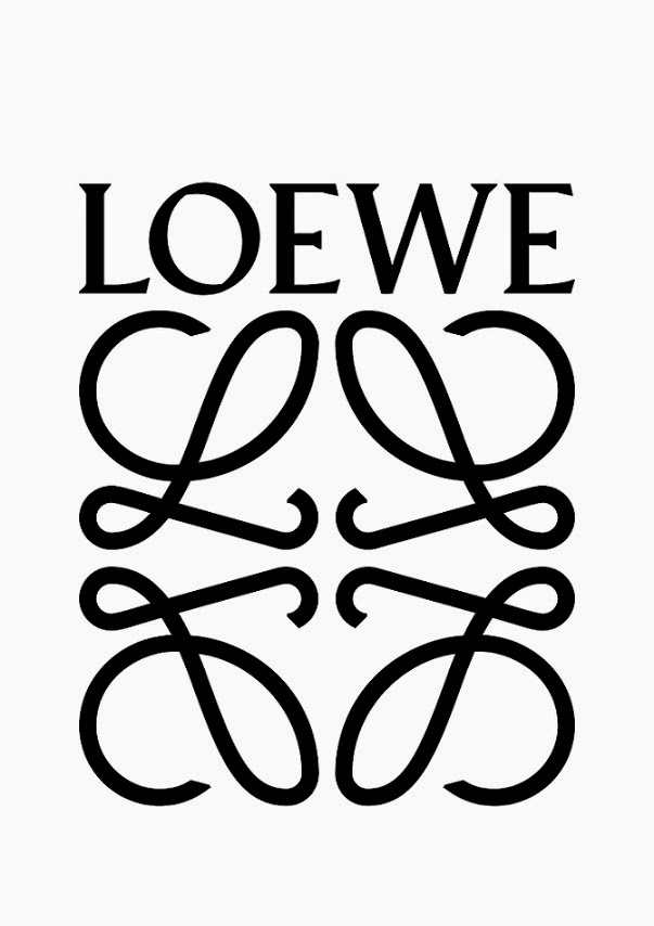
Redrawing the Anagram
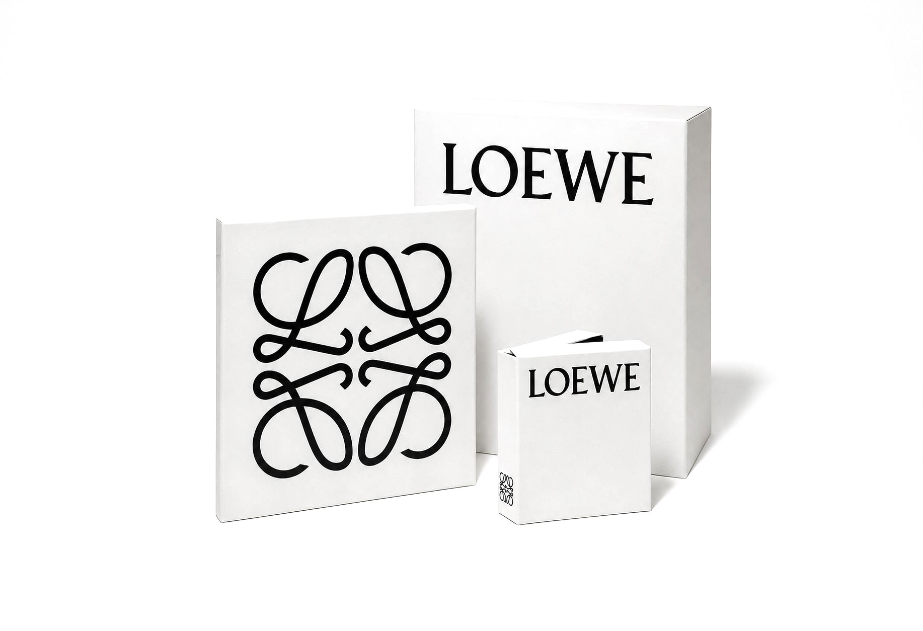
The centrepiece was the Anagram, the mark of four interlocking L shapes designed in 1970 by the Spanish artist Vicente Vela and known informally as el cangrejo, the crab. M/M (Paris) reworked it, tightening the geometry and, in the studio's account, returning it toward its origins as a device suited to being stamped, like a branding iron used to mark leather. The redrawn Anagram was cleaner and more assertive, better able to function as a modern logo across products and packaging while remaining recognisably the same emblem.
Reconnecting the mark to leather-marking was more than a visual flourish. It tied the logo directly to the craft at the centre of Loewe's identity, so that the emblem carried the brand's story rather than floating free of it. For a house whose value rested on leather work, grounding the Anagram in that tradition gave the rebrand a logic beyond style.
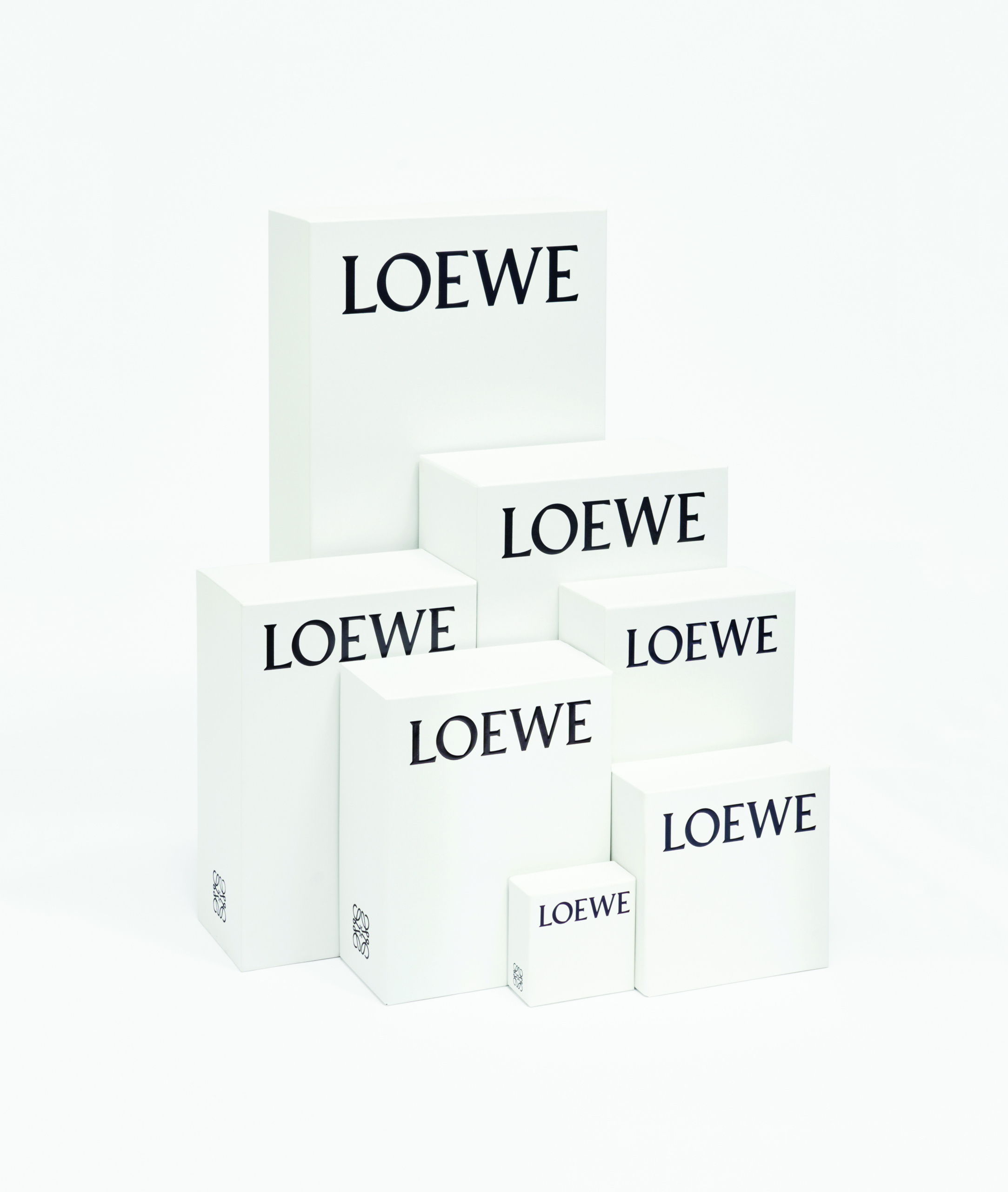
Typography and packaging
Alongside the Anagram, M/M (Paris) redrew the Loewe wordmark. The new logotype drew on the work of the German-born typographer and calligrapher Berthold Wolpe, with the studio taking inspiration from his 1937 Pegasus typeface, which they encountered in the archives of the Victoria and Albert Museum in London. The reference gave the wordmark a considered, literary character and connected the brand to a specific typographic heritage rather than a generic luxury style.
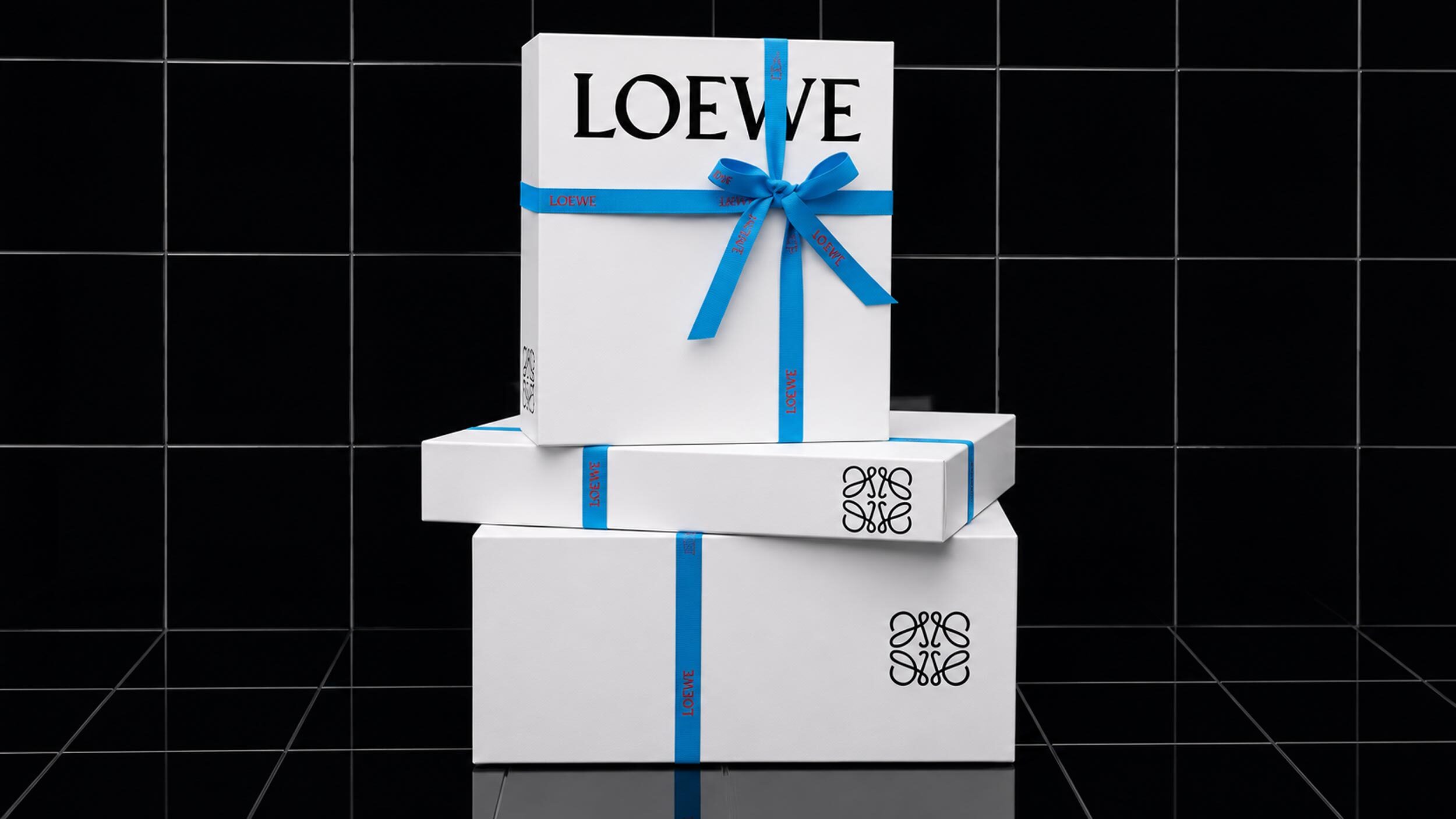
The system extended to packaging. Boxes, bags and envelopes carried the logos in black against a discreet grey created specially for the rebrand and named Humo, the Spanish word for smoke. The restrained palette positioned Loewe away from overt display and toward a quieter, more design-literate luxury, an approach that would characterise the house throughout the decade that followed.
Setting the direction for a decade
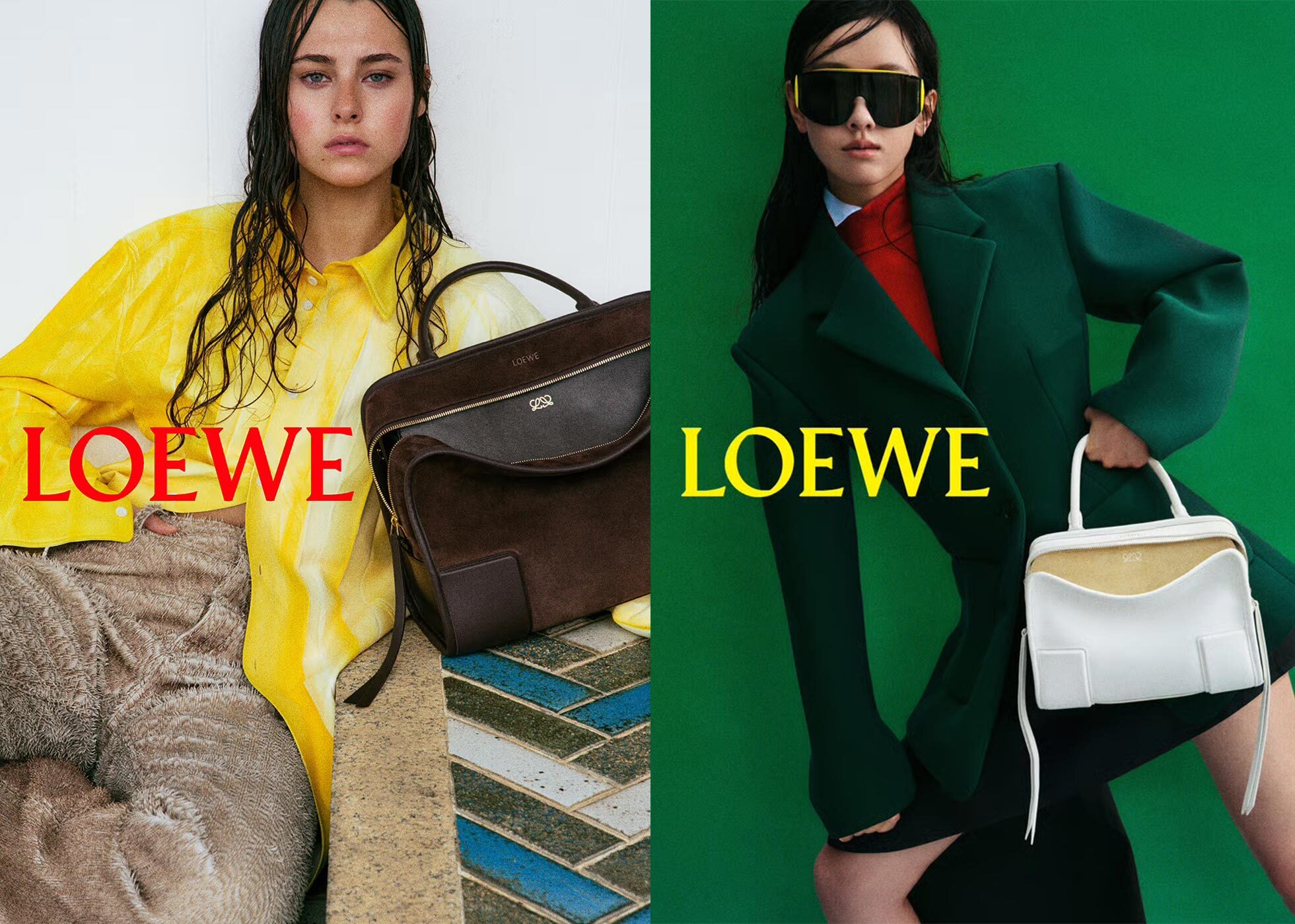
The 2014 identity proved foundational. It established the visual grammar within which Anderson would build Loewe into one of the most discussed brands in luxury, and it demonstrated a method that the house would apply repeatedly: mine the archive, then reinterpret it for the present. The redrawn Anagram in particular became a durable asset, appearing on the products and campaigns that carried the brand's rising profile.
The rebrand also illustrated a broader truth about heritage brands. Loewe's strongest material was already in its own history; the task was to recover and sharpen it rather than to import a borrowed aesthetic. By returning to a 1970 mark and a 1937 typeface, the redesign renewed the brand without severing it from its past, and the result felt both contemporary and rooted.
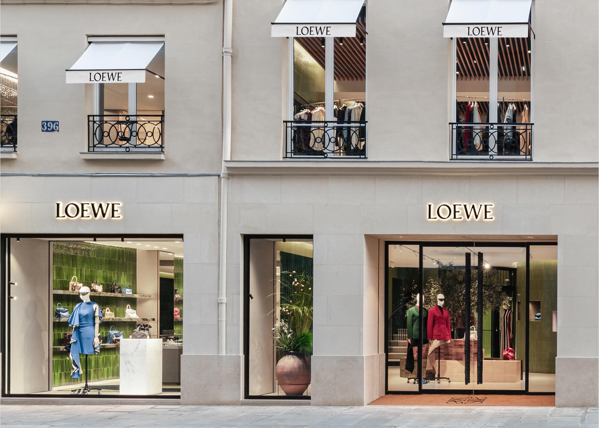
The rebrand's influence extended beyond the logo and typeface. It established a design sensibility that carried through the brand's stores, publications and campaigns, giving Loewe a consistency of tone across every point of contact. That coherence is a large part of what allowed a mid-sized heritage house to register as a distinctive presence in a crowded luxury market, and it showed how much strategic weight a well-considered visual identity can carry when it is applied with discipline.
Seen from later years, the 2014 identity marks the true beginning of the modern Loewe. It gave a long-established but understated house a coherent, distinctive face at the exact moment it acquired the creative ambition to use one. The Anagram that M/M (Paris) redrew remains central to the brand today, a piece of design that carried Loewe from quiet heritage house to contemporary luxury name.
Written with AI assistance, edited by a human. Find out more about our Use of AI.