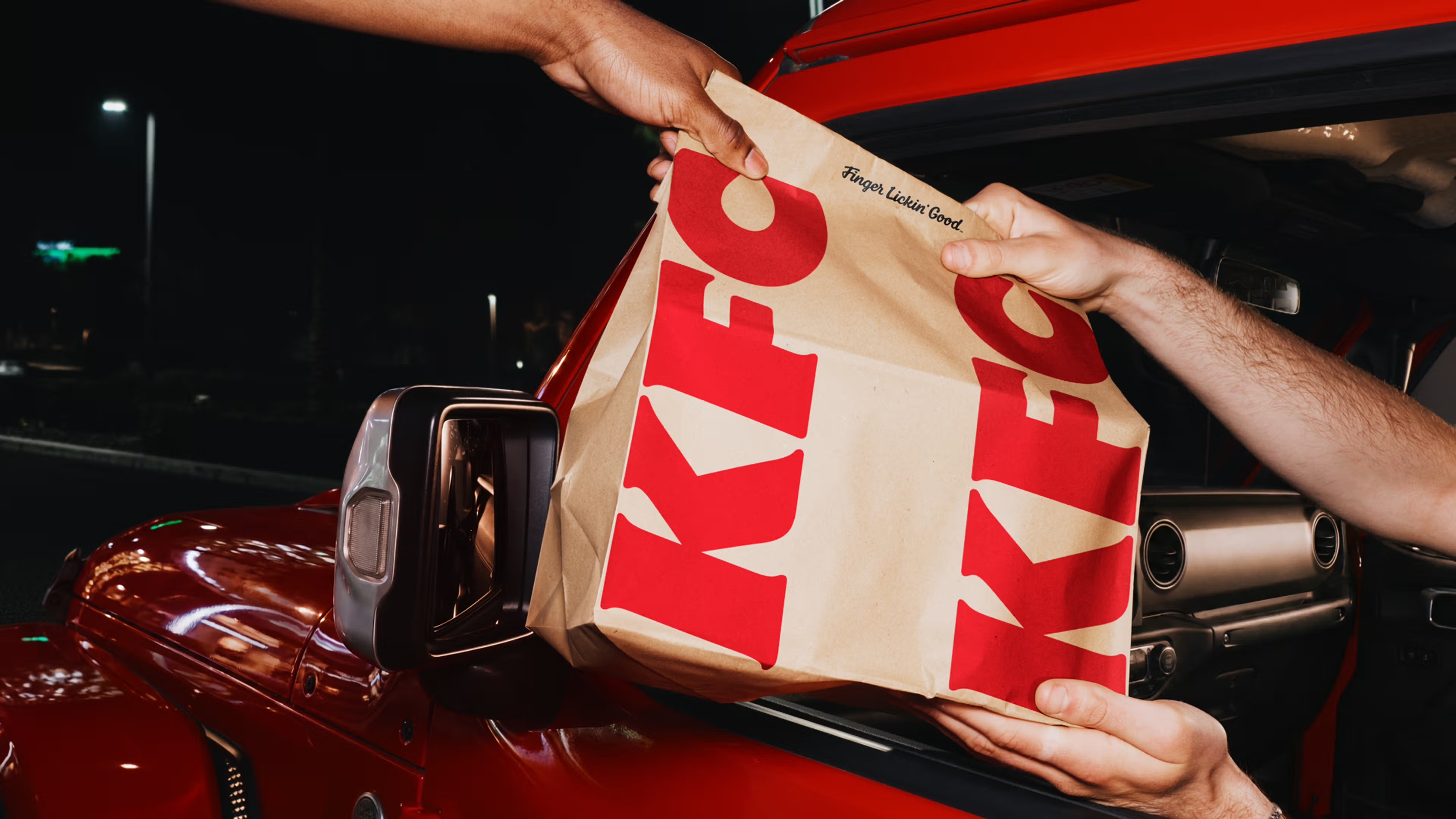
KFC turns its bucket into the centre of a global identity
KFC presents a sweeping global rebrand, developed with the branding agency JKR, that the company frames as its "next chapter". The work reaches well beyond a new logo. It spans visual identity, packaging, restaurant design, digital experiences and menu innovation, and it is held together by a single familiar object: the bucket. Rather than a radical reinvention, the system reads as a deliberate doubling down on the asset that has carried the brand for most of its history.
JKR gives the idea a name. The agency calls the expanded world the "Bucketverse", a framework that treats the bucket not as one piece of packaging among many but as the organising device of the entire identity. Sean Thomas, global executive creative director at JKR, describes a "360 evolution" that runs from the design system and brand assets to restaurant environments, packaging, digital platforms and tone of voice. The stated ambition is a brand that is "more expressive, more connected, more KFC".
What actually changes
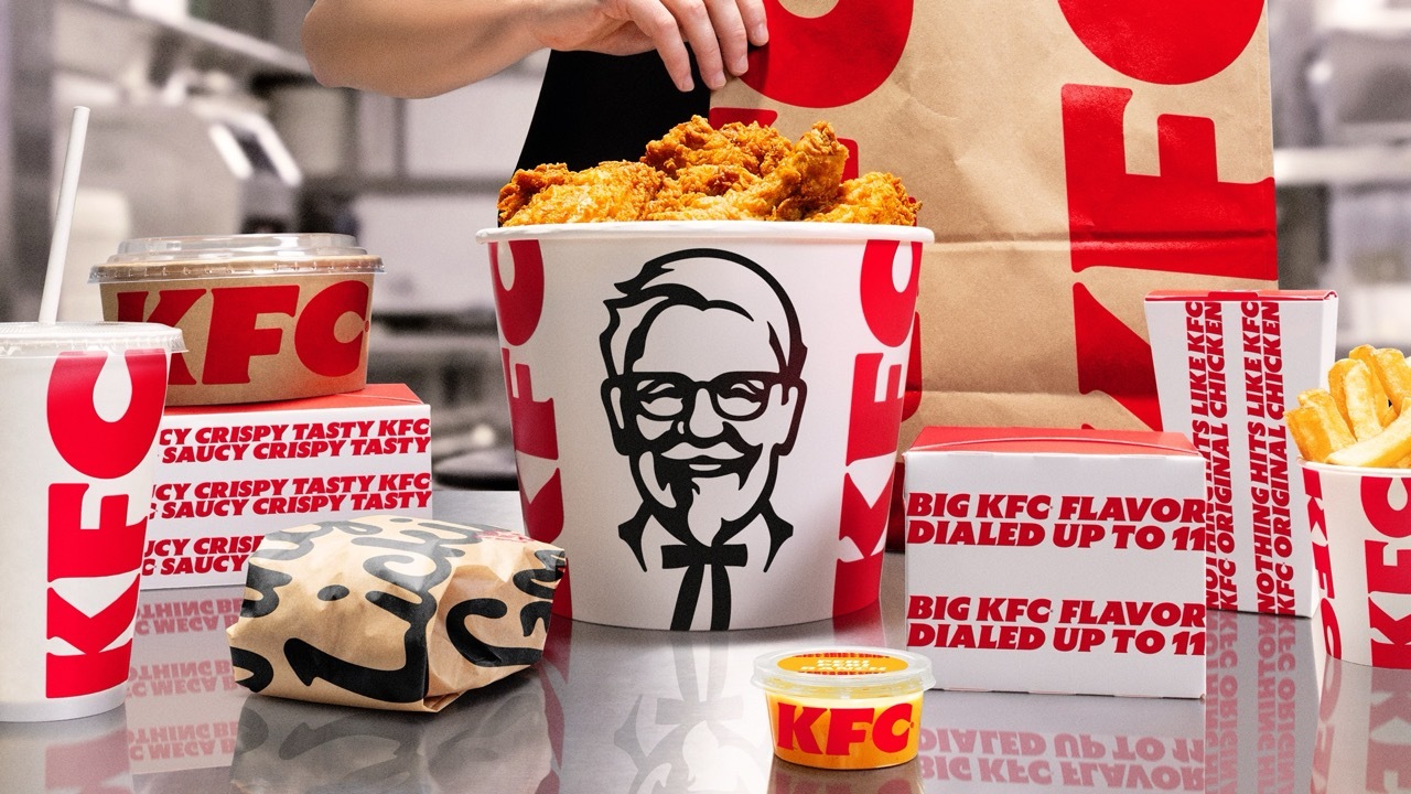
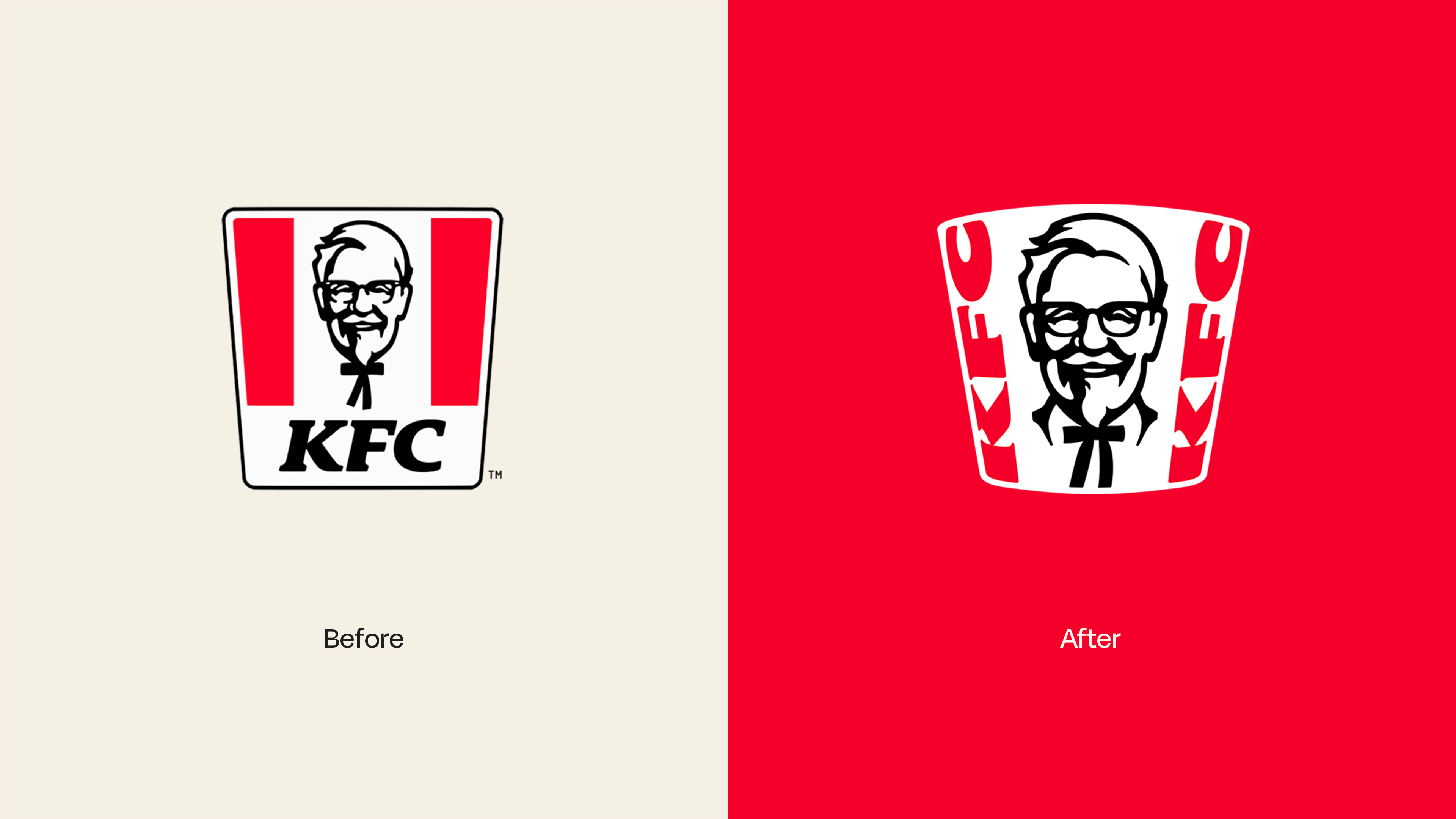
The graphic system is refreshed rather than rebuilt. The logo becomes noticeably less flat and less squared-off than the previous version, and the Colonel Sanders illustration is redrawn. There are bespoke typefaces, new photography and illustration approaches, and an expanded colour palette. The familiar red, white and black remain intact, joined now by a secondary "Herbs and Spices" palette intended to add flexibility and vibrancy across a wider range of applications.
The brand's long-running slogan, Finger Lickin' Good, is also repositioned. Instead of working primarily as a tagline, it is now treated as a behavioural principle meant to guide the customer experience across every channel. The shift is small in wording but significant in intent, because it moves a line of copy into the territory of operating philosophy.
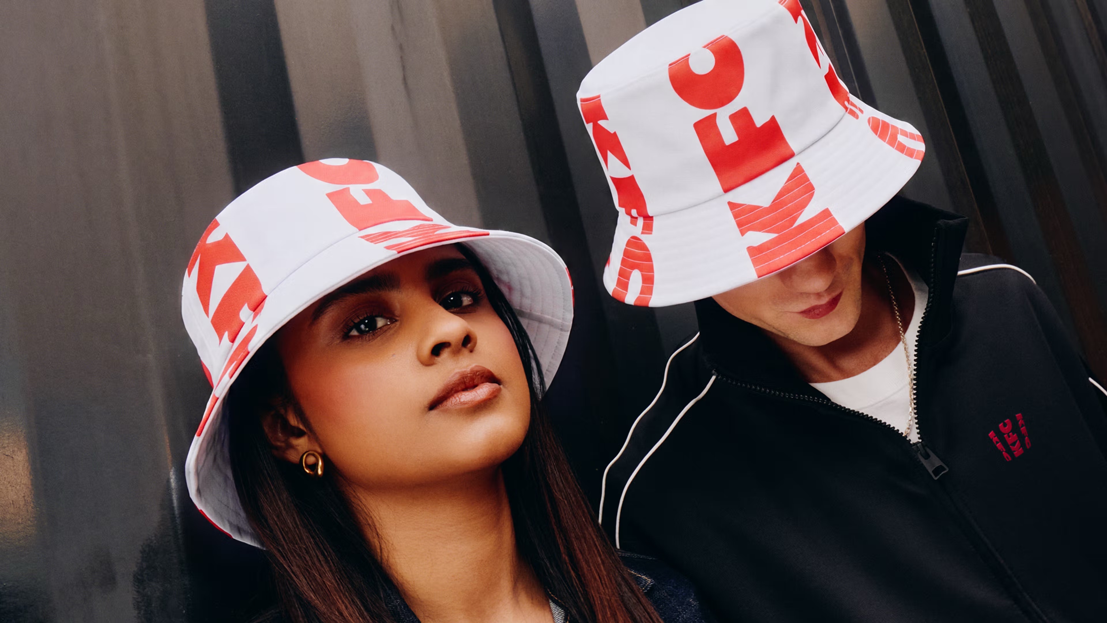
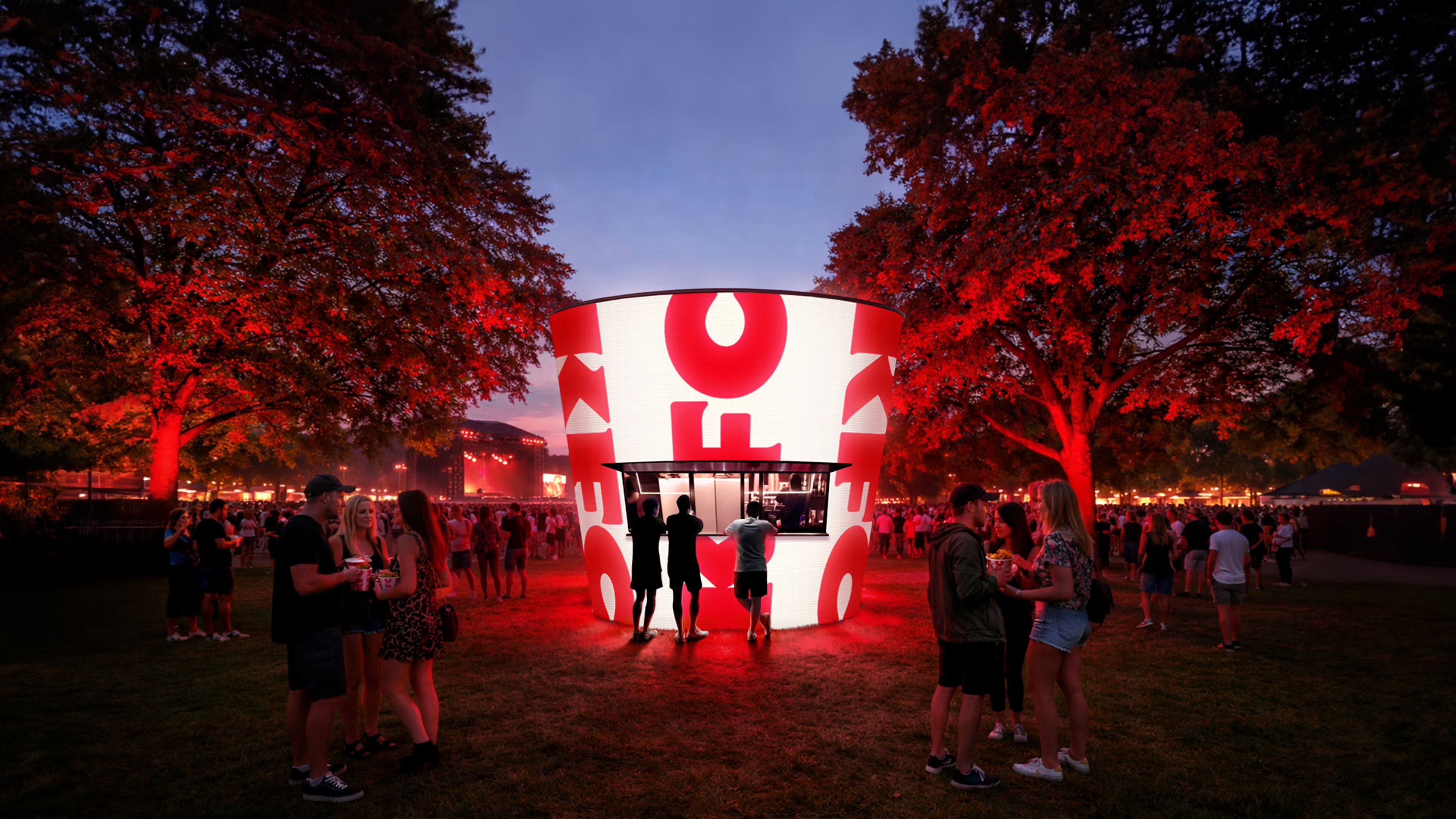
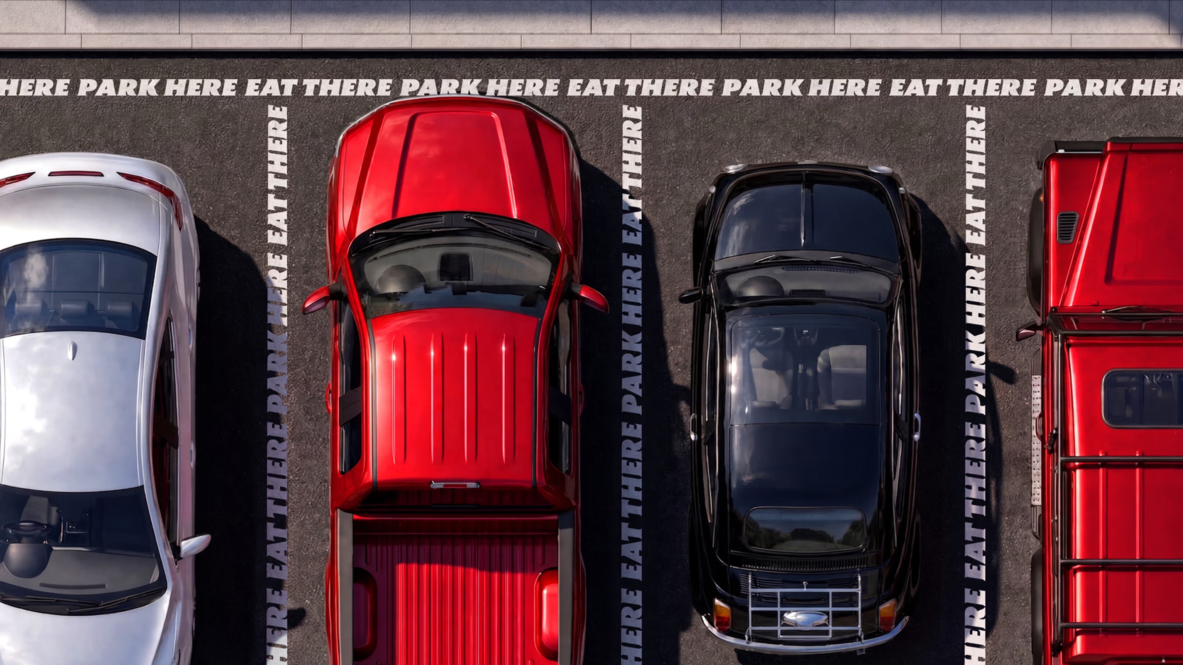
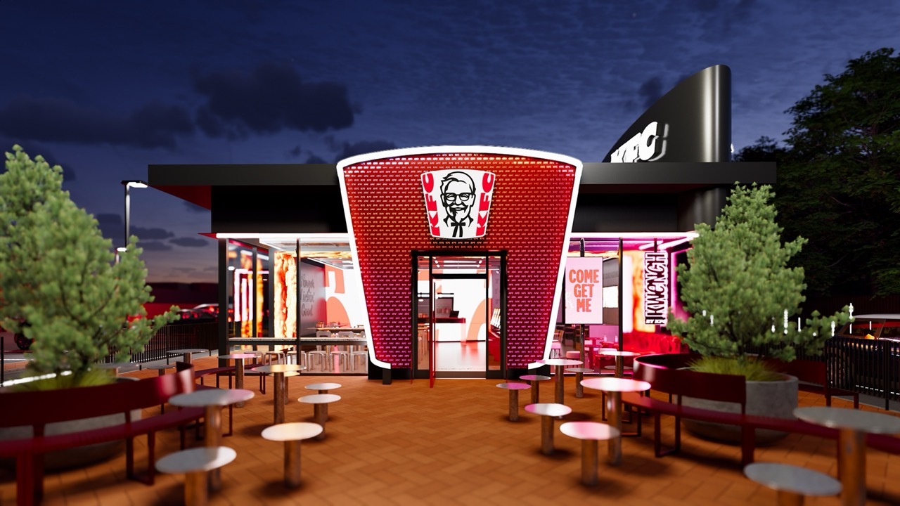
The identity extends into physical and digital space. KFC introduces next-generation restaurant concepts in markets including Texas and Dubai, aiming for more cohesive and immersive dining environments. Digital menu boards and screens are reframed as brand canvases rather than purely transactional tools. Fans are also offered customised apparel, including, predictably, a bucket hat. Alongside the design work, the company introduces new boneless chicken products, a global range of sauces and an expanded drinks platform called Kwench by KFC.


The bucket as a system
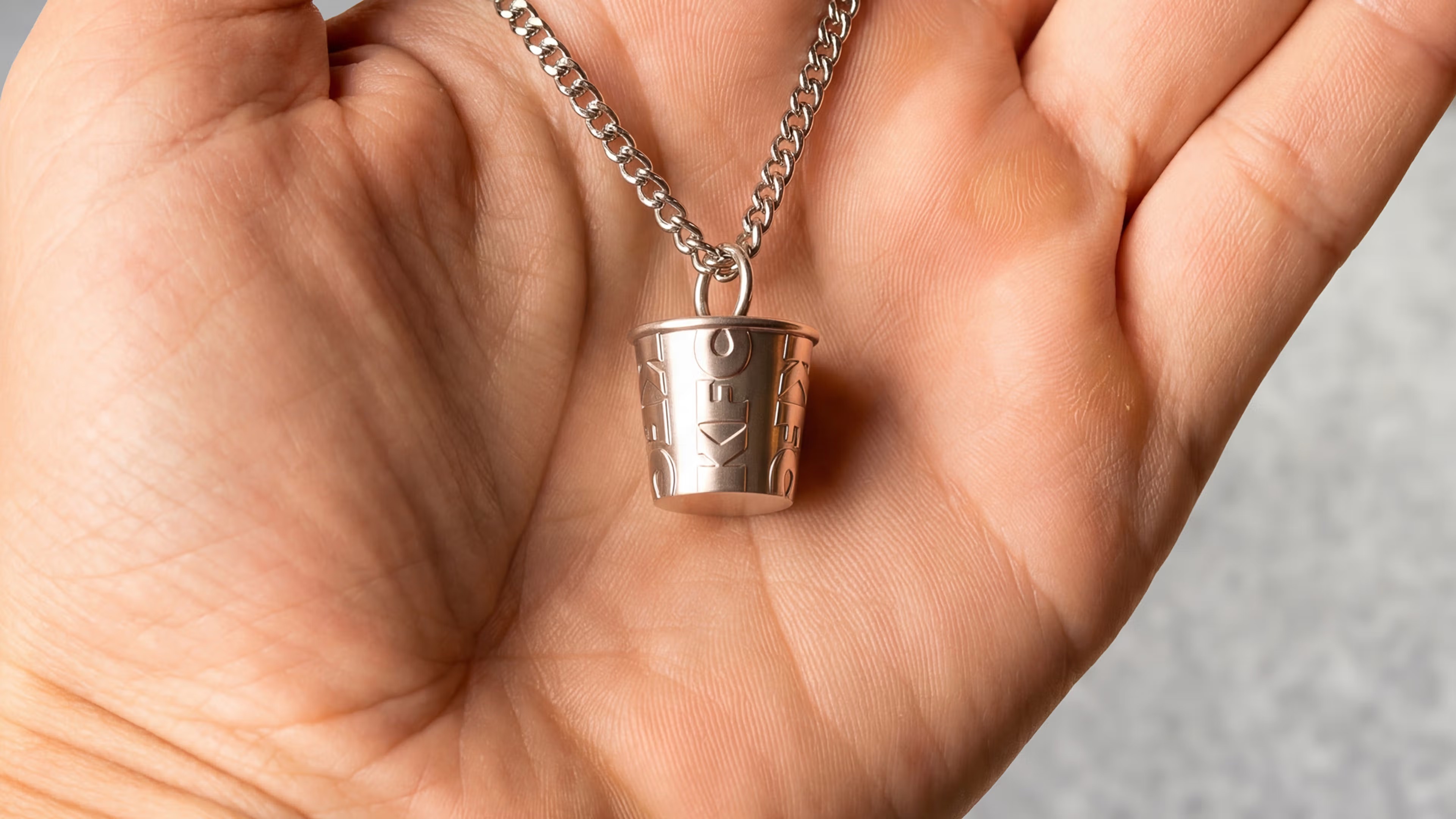
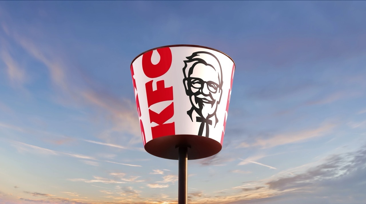
The strategic core of the project is the decision to promote the bucket from packaging to platform. Across nearly a century, the bucket evolves from a way to carry fried chicken into a central visual device used in communications, physical environments and digital touchpoints. KFC and JKR now position it as both a framing system and a storytelling tool, a container that can hold an image, a message or an entire restaurant facade and still signal the brand instantly.
This is recognisable distinctive-brand-asset thinking. The most defensible identities tend to be built on a small number of assets that an audience can recognise without the name attached, and the bucket qualifies cleanly. It is proprietary, it is decades old, and it already carries strong associations. By making it the spine of the system rather than one element within it, KFC reduces its dependence on the logo alone and gives every market a shared device to build on.
Reading the move
The rebrand reflects a wider pattern among heritage fast-food brands, which increasingly favour experience-led design systems that extend beyond logos and packaging into environments, products and tone of voice. The logic is consistency at global scale, and the method is to amplify the assets that made the brand famous rather than to replace them. For a chain operating in an increasingly crowded chicken market, where competitors press hard on both value and craft, leaning on an icon that rivals cannot use is a rational bet.
It is worth noting what the work does not do. There is no attempt to discard the Colonel, abandon the red, or chase a generic minimalism of the kind that has made many recent rebrands interchangeable. The palette grows rather than shrinks, the illustration becomes warmer rather than flatter, and the heritage signals are retained. The challenge JKR sets itself is modernisation without erasure, evolving one of the world's most recognisable fast-food brands while protecting the distinctiveness that made it recognisable in the first place.
The refreshed identity begins rolling out in the UK and Ireland this month, before expanding to Australia, the United States and other markets through 2026. Whether the Bucketverse succeeds in setting KFC apart remains to be seen, but the direction is clear. The company is betting that its future lies in making the bucket impossible to ignore.