A logo chosen by competition
In 1901, Burberry adopted a new logo selected through a public design competition. The winning entry presented a knight on horseback, riding forward at the gallop, dressed in chain mail and carrying a flag inscribed with the Latin word Prorsum, meaning forwards. The motif became known internally as the Equestrian Knight Design, abbreviated EKD. Burberry registered the design as a trademark in 1909, eight years after its initial adoption. The choice of a competition format to source a new identity was unusual at the time and produced a result that the firm did not have to invent in-house. The selected design carried a clear narrative structure of motion, intent and protection, which would become central to the brand's later positioning.
Reading the symbolism
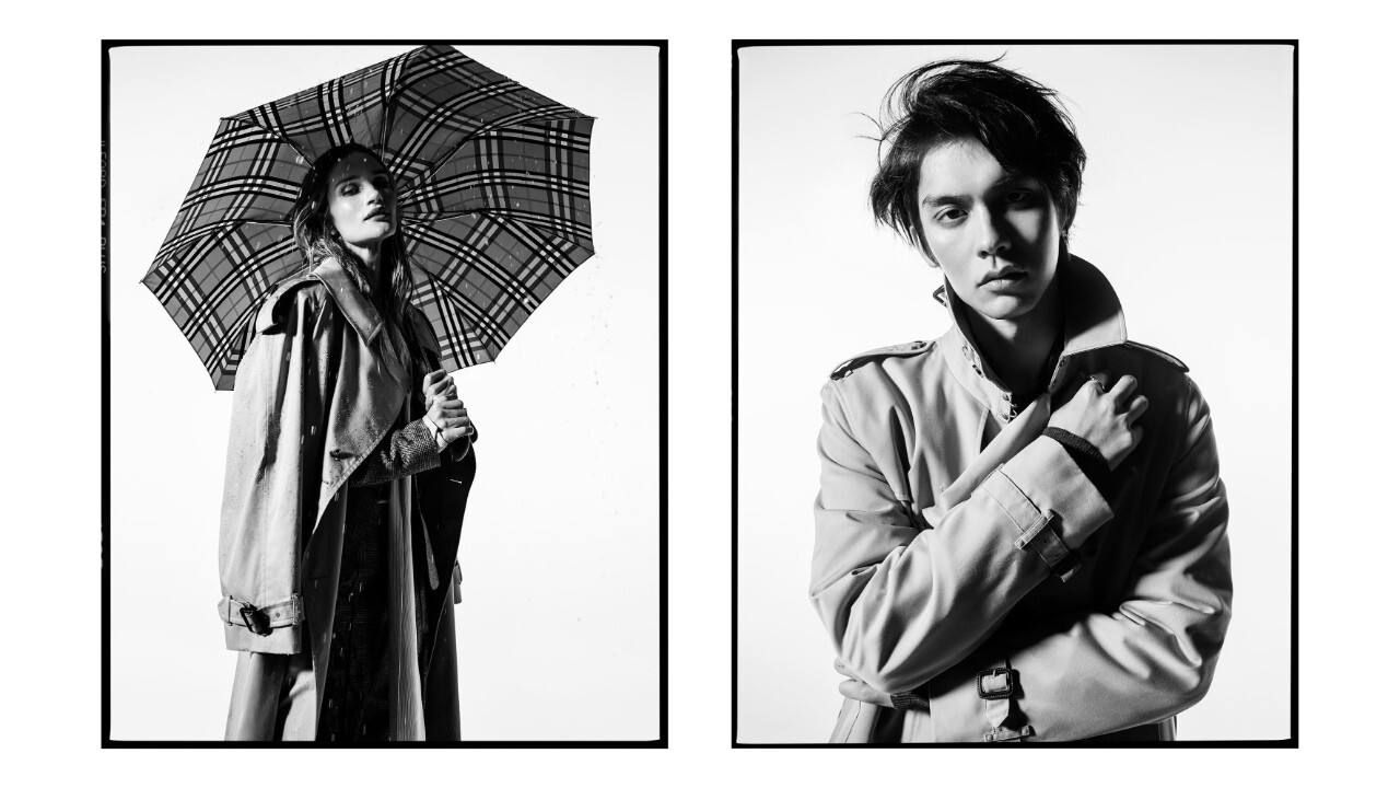
The Equestrian Knight Design is constructed from three discrete symbolic elements, each of which the company has consistently described in the same terms. The knight stands for honour. The lance stands for reform, in the sense of forward-moving change. The shield stands for protection, the same functional benefit that the gabardine fabric had been built to deliver since 1879. The Prorsum banner unifies the three elements under a single Latin word that establishes both heritage and aspiration. Each element is therefore tied either to a value, honour and reform, or to a product attribute, protection. The design was not abstract decoration. It was a structured visual statement of what the house intended to communicate about itself.
Heraldry and the British context
The 1901 mark sat naturally inside an older British tradition of heraldic identity. Royal warrants, family crests, regimental colours and merchant guild seals were familiar reference points for a Hampshire firm of the period and for its London customer base. By choosing a knight rather than a more abstract emblem, Burberry placed itself within a recognisable graphic register. The decision worked alongside the gabardine story to position the company as a serious supplier to country, military and exploration markets rather than as a fashionable city outfitter. That framing helped Burberry win contracts with the British War Office during the First World War and reinforced the house's appearance on early polar expeditions.
The Prorsum word and its later use
The single word Prorsum on the banner became one of the most resilient assets in the system. It was reused in 1988 when the company introduced the Prorsum runway label as its high-end ready-to-wear line, designed to elevate the perception of the brand at the highest end of fashion. Christopher Bailey, who joined Burberry as creative director in 2001, used the Prorsum line as the principal vehicle for his runway statements until the line was retired in 2015 and consolidated under a single Burberry label. Daniel Lee referenced the same word again in 2023 when reinstating the Equestrian Knight as the primary lockup. A single Latin word, fixed to a flag in 1901, has therefore moved across more than a century of brand decisions without loss of meaning.
The first long pause and the second one
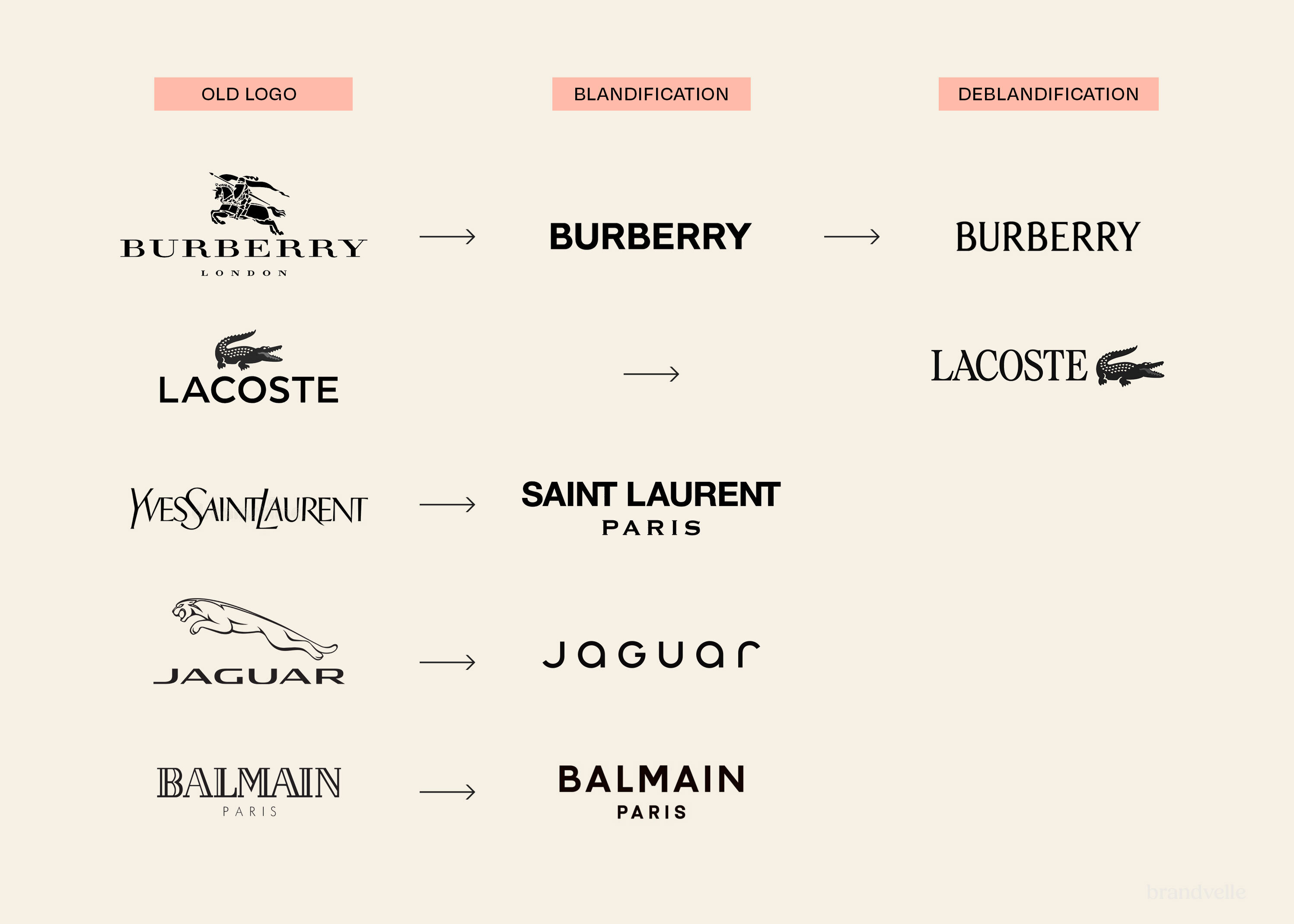
The Equestrian Knight Design was the principal Burberry mark from 1901 through most of the twentieth century. It was used on labels, advertising, packaging, gold buttons, signage and printed materials. In 1999, under chief executive Rose Marie Bravo, the house began a major repositioning programme that simplified the wordmark and reduced the visibility of the Equestrian Knight in some applications, though the knight remained part of the system. The most decisive interruption came in 2018, when Riccardo Tisci and Peter Saville introduced an all-caps sans-serif wordmark and a monogram pattern as the primary identity. The Equestrian Knight largely disappeared from packaging and ready-to-wear in this period. The 2023 restoration under Daniel Lee returned the knight to the centre of the brand for the first time since the 1990s.
An asset built to outlast trends
The endurance of the Equestrian Knight Design across more than 120 years reflects a particular property of the asset. It is figurative enough to remain unambiguously Burberry across reproduction conditions, including embroidery, gold tooling, lithography, screen printing and digital display. It carries a story that can be re-explained without contradiction. It belongs to a category, heraldry, that does not date in the way that contemporary graphic styles do. These qualities are the reason the Burberry creative leadership has been able to retire and restore the knight at successive moments without the asset losing recognisability. The 1901 competition produced not just a logo but an identity instrument that the house has continued to use as both anchor and signal across very different periods.