An archive returns to the masthead
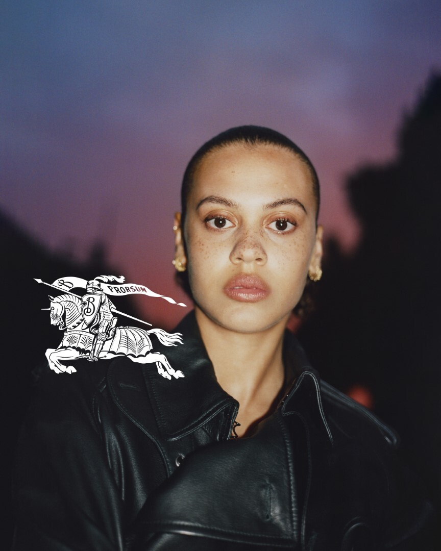
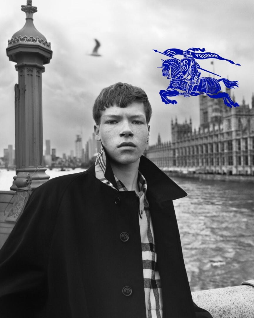
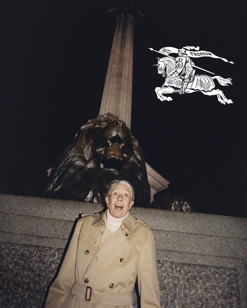
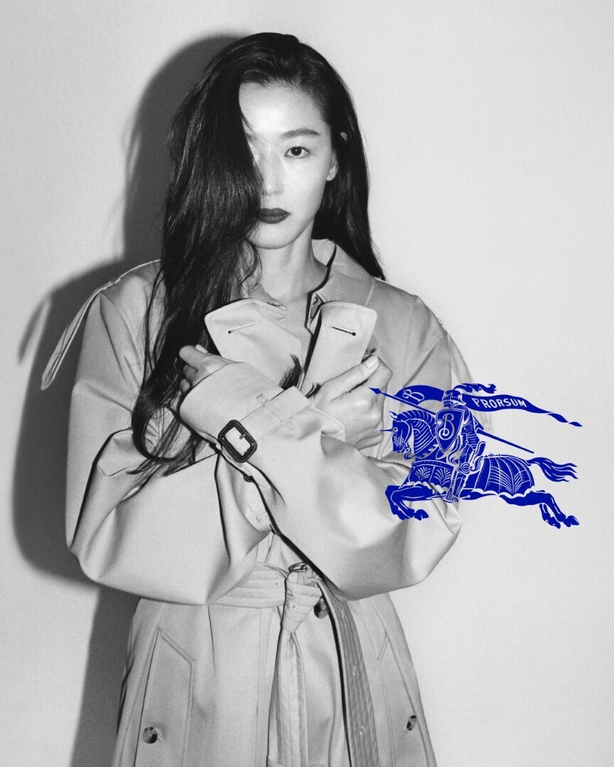
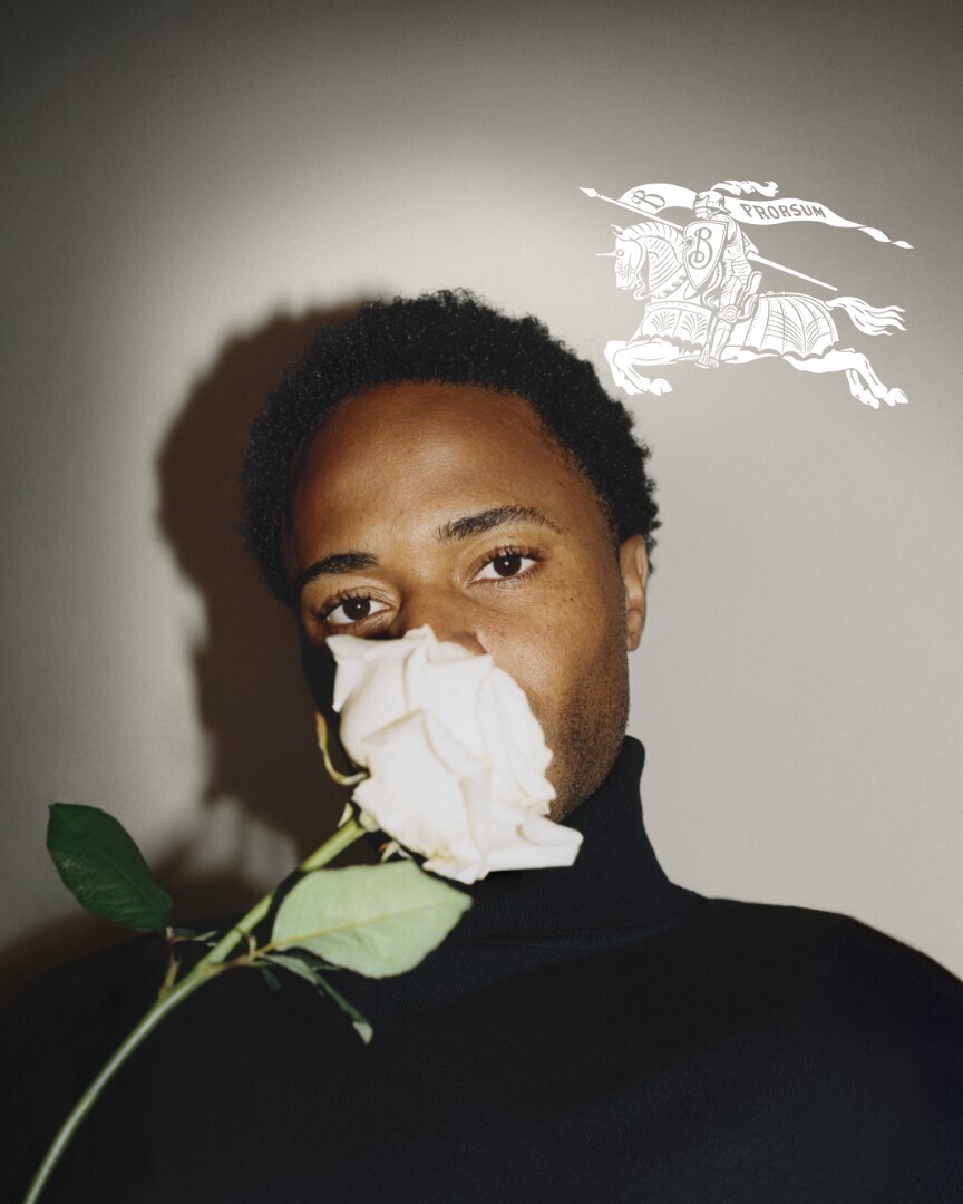
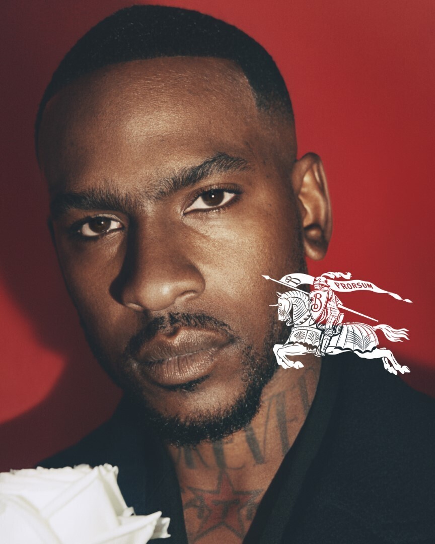
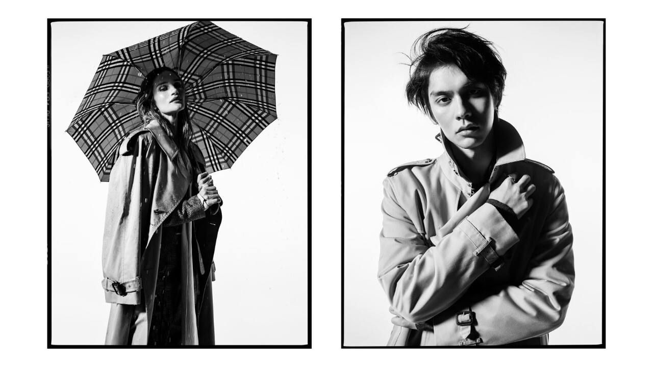
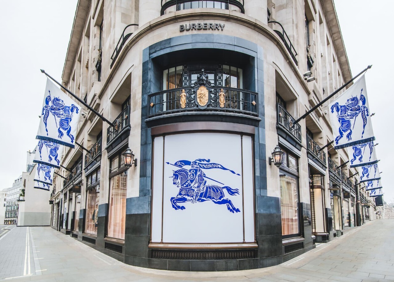
On 7 February 2023, Burberry presents the first creative expression of its new Chief Creative Officer Daniel Lee, and the visual proposition is as much an act of restoration as a rebrand. The London Maison reinstates the Equestrian Knight Design, the charging knight motif that won a public design competition in 1901, and replaces the all-caps sans-serif wordmark introduced under Riccardo Tisci and Peter Saville in 2018 with a custom serif. The new house colour is an electric, near Yves Klein cobalt that carries the identity across imagery, packaging and digital surfaces. The campaign is photographed by Tyrone Lebon, fronted by Vanessa Redgrave, John Glacier, Liberty Ross and Lennon Gallagher, and released two weeks ahead of Lee's runway debut on 20 February during London Fashion Week.
From the safe-modern wave to a heritage signal
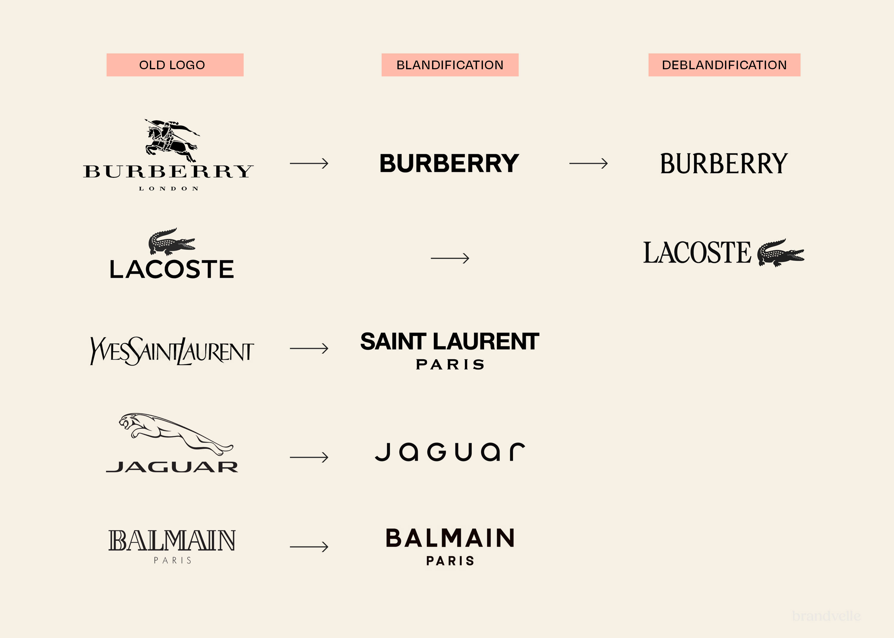
The 2018 identity was emblematic of a wider luxury convention sometimes called blanding, in which historic Maisons gravitated toward geometric sans-serifs designed to read clearly on small screens and mobile commerce surfaces. Burberry sat alongside Balenciaga, Berluti, Balmain, Saint Laurent and others in that consolidation. The 2023 revision moves in the opposite direction. By restoring the Equestrian Knight and pairing it with a serif drawn to evoke earlier Burberry wordmarks, Lee positions the house against the homogenised look of the late 2010s and aligns it more openly with the British heritage canon and the gabardine outerwear story that has anchored the brand since 1879.
The Equestrian Knight Design as a strategic asset
The Equestrian Knight Design, abbreviated EKD inside Burberry, is a knight on horseback bearing a flag inscribed with the Latin word Prorsum, meaning forwards. The motif was selected through an open competition organised in 1901 and registered as a trademark in 1909. According to the Burberry corporate description, the knight stands for honour, the lance for reform and the shield for protection. Within the new identity, the Equestrian Knight functions as the principal lockup, while the Burberry wordmark is treated as a complementary mark. The decision returns a unique, ownable asset to the centre of the system after a period in which the wordmark stood largely alone.
Typography and colour as countercurrent
The new typeface references typefaces used by Burberry in earlier periods, with measured contrast and a small set of considered details. Industry observers describe the move as a contribution to what trade press has called the serif wars, the broader reaction by luxury and culture brands against the dominant sans-serif minimalism of the previous decade. The accompanying cobalt blue is unusual for a house associated with the camel, ivory and red of the Burberry Check tartan. The colour functions as a signature device for campaigns and store environments rather than as a product palette, allowing the heritage materials to remain unchanged while the brand layer becomes more declarative.
A British casting against a British backdrop
Lebon photographs the campaign in tones associated with British social documentary, with subjects framed against weather, brick, garden and gallery interiors. The choice of Vanessa Redgrave foregrounds a long lineage of British acting and activism. Lennon Gallagher and Liberty Ross extend that conversation into music and cultural memory. The casting is consistent with Lee's stated intent to root the brand more deliberately in British identity rather than in the global luxury aesthetic of any single capital.
Implications for the wider category
The 2023 Burberry identity is read by industry commentary as an early signal of a broader correction inside luxury. After almost a decade in which heritage houses converged toward similar geometric wordmarks, the move opens space for serif typography, archive iconography and house-specific colour to return as differentiators. The restoration of the Equestrian Knight does not recreate any single past version of the mark verbatim. It selects the strongest archive elements and redraws them for current production conditions, including digital reproduction at small sizes, embroidery, signage and motion. The result is presented not as nostalgia but as a working modernisation of Burberry's most recognisable graphic equity.
A first chapter, ahead of the collection
The campaign is released in advance of Lee's debut Burberry collection rather than alongside it. The sequence frames the brand layer as a decision made before the product layer, with the new identity setting the conditions for the autumn winter 2023 show and for subsequent activations. By restoring the Equestrian Knight Design and the serif wordmark in February and reserving the runway for the product story two weeks later, Burberry separates a long-running identity question from a seasonal one and treats the brand reset as a discrete editorial moment for the house.