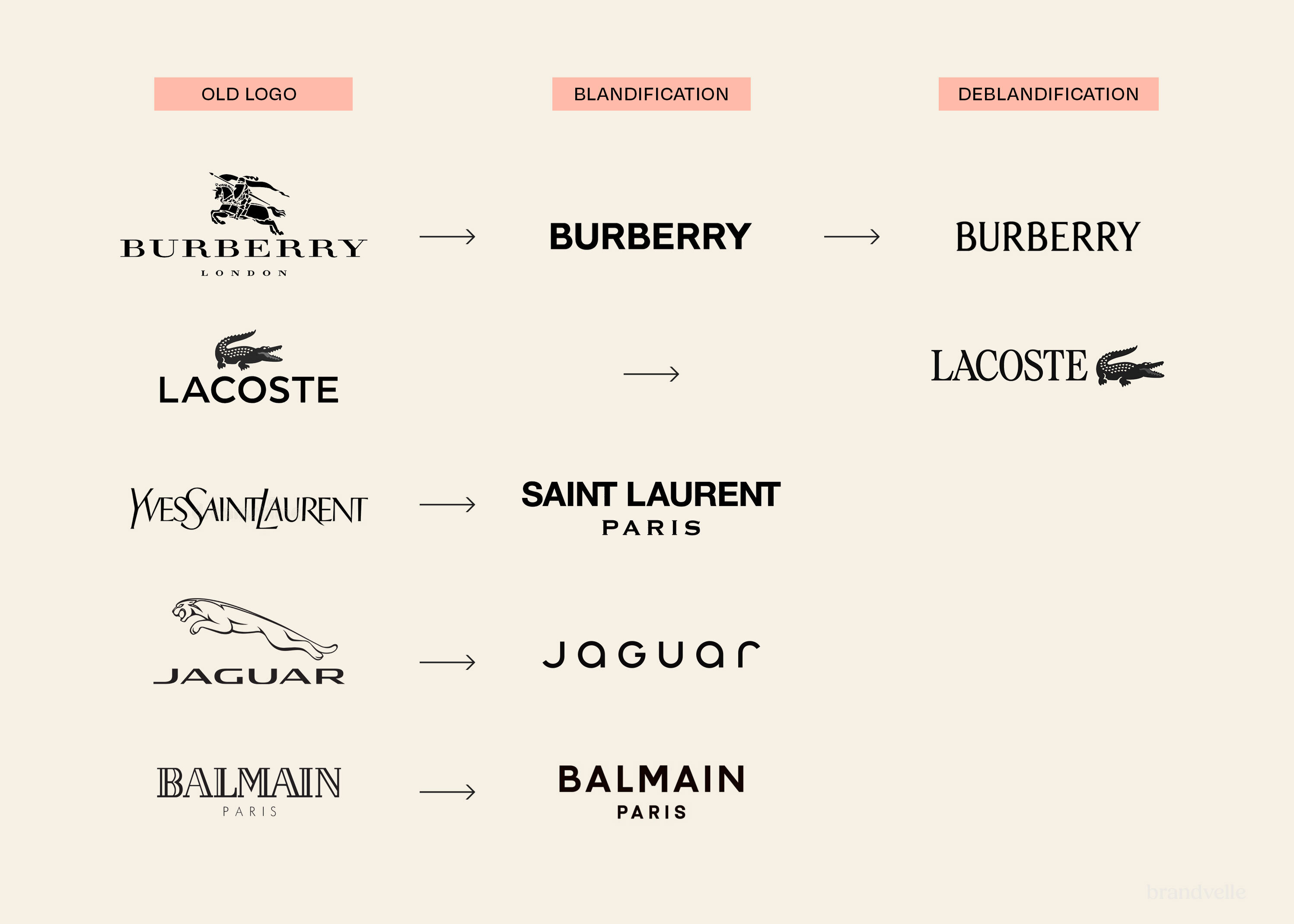
A 117-year wordmark retired
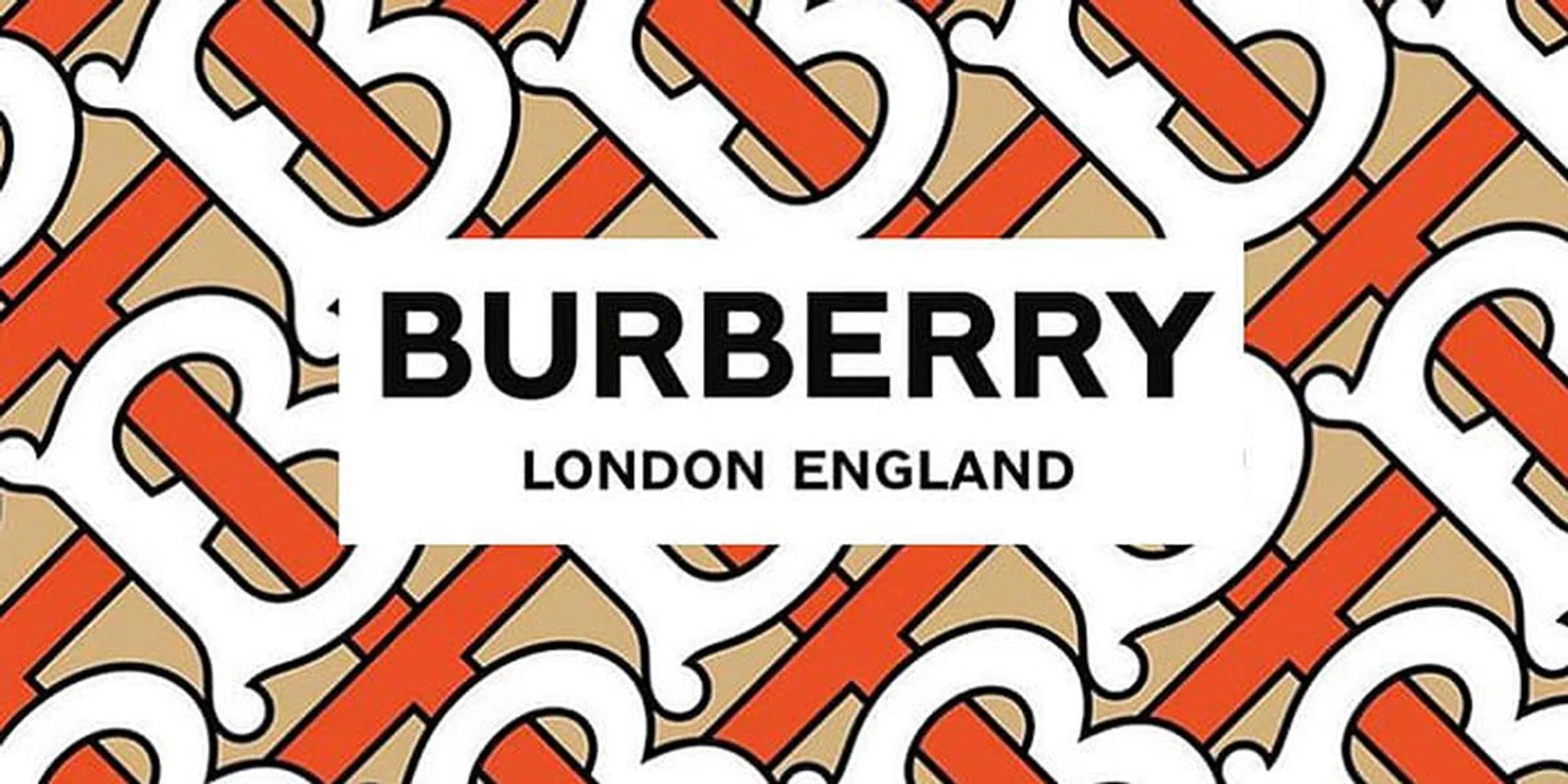
On 2 August 2018 Burberry revealed a new visual identity that closed a chapter the British Maison had kept open for one hundred and seventeen years. The Equestrian Knight wordmark, registered in 1901 and elaborated over more than a century, was retired in favour of a clean, condensed sans-serif logotype. The cursive sweep of the script "Burberrys" and the heraldic figure of the knight, with his "Prorsum" banner, were both removed from primary brand expressions. In their place came a single, confidently spaced word, set in a custom variant of a tightly tracked grotesque, and a new monogram pattern composed of interlocking T and B letters in honour of founder Thomas Burberry.
The new identity was introduced through Riccardo Tisci's Instagram account on the morning of the announcement, with a series of short visual posts that placed the logotype against plain backgrounds and revealed the monogram in cropped views. Burberry's own channels followed within hours, and the trade press carried the story through the day. The launch sequence avoided a dedicated press conference, framing the change as an editorial moment in line with Tisci's wider preference for releasing work directly through social platforms.
Saville and Tisci, working in conversation
The identity was developed by graphic designer Peter Saville together with Burberry's then Chief Creative Officer Riccardo Tisci, who had joined the Maison in March 2018 from Givenchy. Saville, best known for his work with Factory Records, Joy Division, New Order and a long sequence of cultural and luxury collaborations, has frequently described his role at brand level as that of an editor rather than a designer in the conventional sense. The collaboration with Tisci was set up around a small number of editorial decisions rather than a comprehensive system delivered in a single document.
The wordmark used a custom variant of a tightly tracked grotesque, with even letterforms, confident weight and a wide x-height. It was set without serifs and without the knight, and the spacing between letters opened the word out, giving the logotype the bearing of an editorial masthead. The TB monogram was rendered as a continuous, geometric pattern in hues of beige, white and ochre, with a structure that could be cropped, scaled or recoloured for application across leather goods, ready-to-wear, packaging and digital surfaces. The pattern referenced the visual register of historical fashion houses while avoiding direct quotation of any single archival monogram.
A repositioning toward streetwear-aware luxury
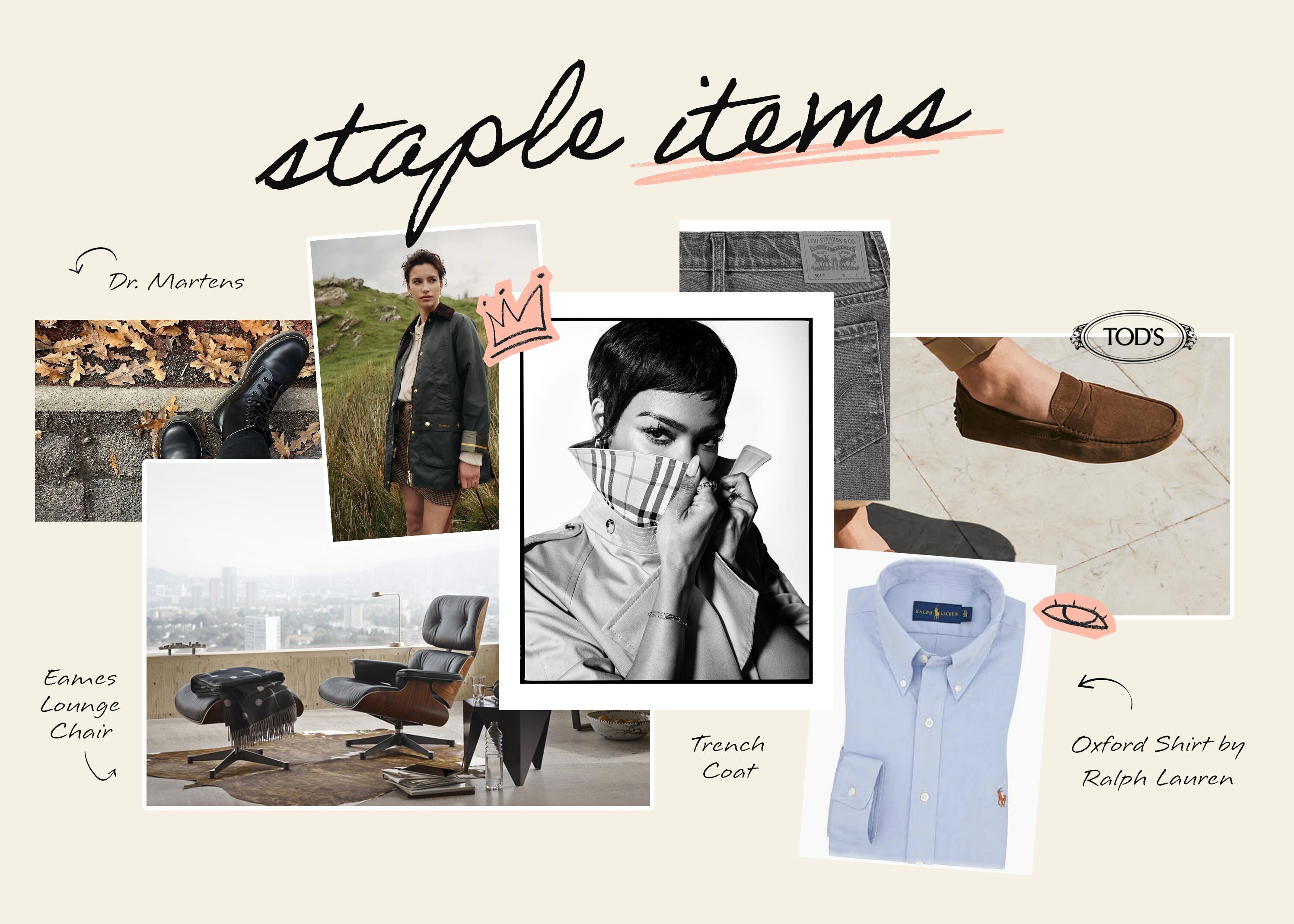
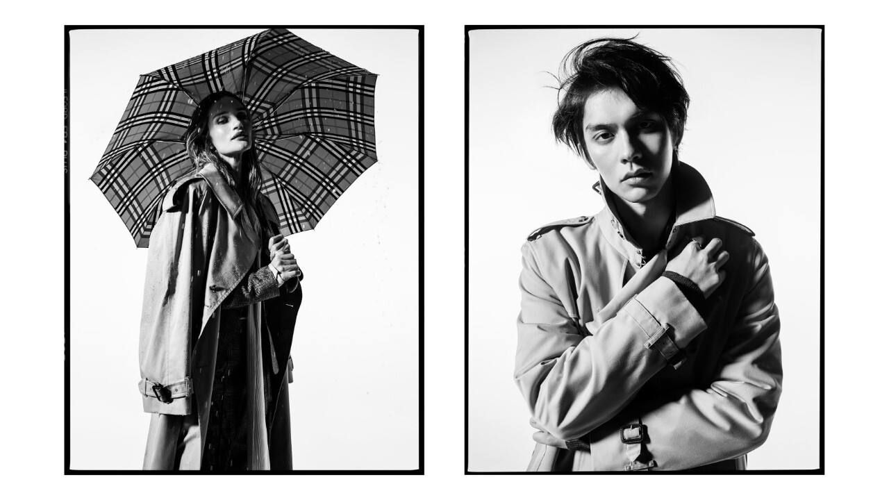
The intent of the rebrand was to support a strategic repositioning toward a younger, more globally networked luxury consumer. Tisci had built his reputation at Givenchy in part by translating streetwear codes into haute couture. At Burberry he was hired to do a related job, anchoring the Maison's heritage in a contemporary, almost editorial visual register that signalled a wider product-line refresh and a more frequent drop calendar. The first ready-to-wear collection under the new identity was presented at London Fashion Week in September 2018, accompanied by a B Series of monthly product drops sold through social platforms.
The reception in the design industry was mixed and unusually animated. Critics of the new wordmark argued that its sans-serif neutrality risked indistinguishability from a wave of similar simplifications across luxury fashion in the late 2010s, including Balmain, Berluti, Saint Laurent and others. Supporters argued that the change was less about the wordmark in isolation and more about restoring narrative space around the founder's name, with the heritage visual elements held in reserve for selective use. Both readings persisted in the design press through the following years.
What stayed and what was held in reserve
Although the Equestrian Knight was withdrawn from the primary visual identity, it was not deleted from the Maison's vocabulary. The figure remained a registered trademark, and selected products and architectural treatments continued to use it as a heritage element. The Burberry Check tartan, originally introduced as a coat lining in the 1920s, was kept in active use throughout the rebrand, while sitting alongside the new TB monogram pattern as a parallel system rather than a replaced one.
The 2018 identity remained the Maison's primary visual framework through Tisci's tenure, which continued until 2022. The pace and direction of subsequent visual changes belong to a different chapter of Burberry's history, but the editorial questions raised by the 2018 work, about how a heritage brand can use a sans-serif wordmark without losing its specificity, continued to circulate in the wider conversation about luxury branding.
Looking back, the Tisci and Saville moment can be read as the cleanest expression of a particular late-2010s industry move, in which heritage Maisons stepped away from elaborate scriptural marks and toward letterforms tuned for screens, social platforms and global readability. Burberry's distinctness in the cohort came from the way the change was framed: not as a denial of the past, but as a quiet recasting of the founder's name as the primary brand sign, with the heraldic apparatus held nearby for editorial use.