A First Major Visual Overhaul
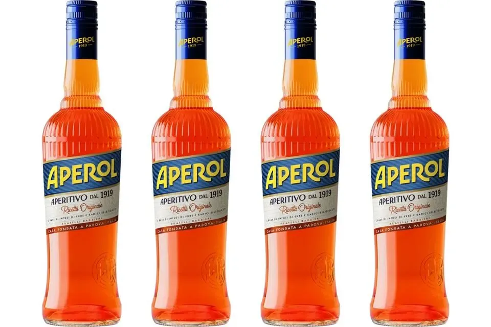
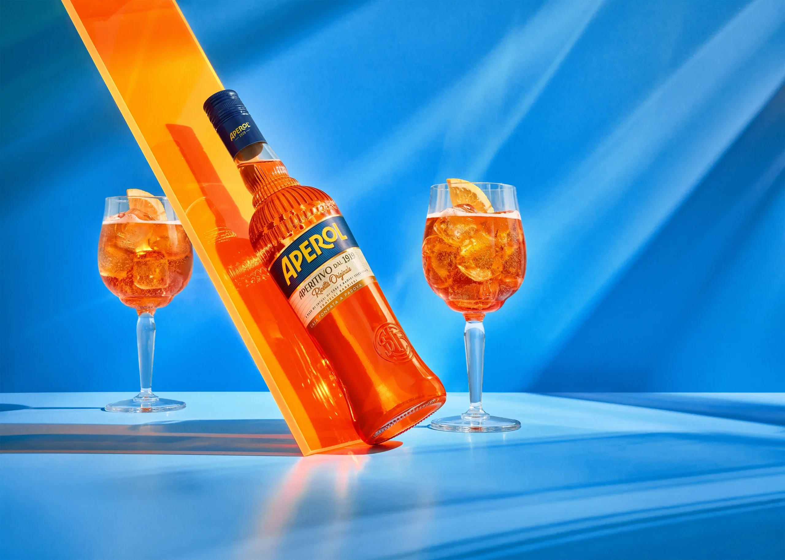
For the first time in decades, Aperol has redesigned both its bottle and its brand logo. Campari Group, which has owned the Italian aperitivo since 2003, unveiled the updated design in early 2026, with the new bottle available in gastronomy and retail from March 2026.
The bottle form itself has been reworked — a significant step for a brand whose silhouette has long anchored its presence behind the bar and on the shelf. The new shape was developed to further strengthen Aperol's visibility across countertops, terraces, and retail displays.
Logo and Visual System
Alongside the new bottle, the Aperol wordmark has been refined. The updated typeface appears more closed and calmer than its predecessor, with reduced visual interruption across the letterforms. The label takes on a more detailed retro aesthetic, adding depth and character to the packaging's surface.
The relaunch extends beyond packaging: a proprietary typeface, updated colour palette, and expanded visual system have been introduced for consistent deployment across digital and physical applications. Core brand colours — the yellow wordmark on blue — are retained, ensuring visual continuity while the overall identity is modernised.