
A pharmacy aesthetic built into the packaging
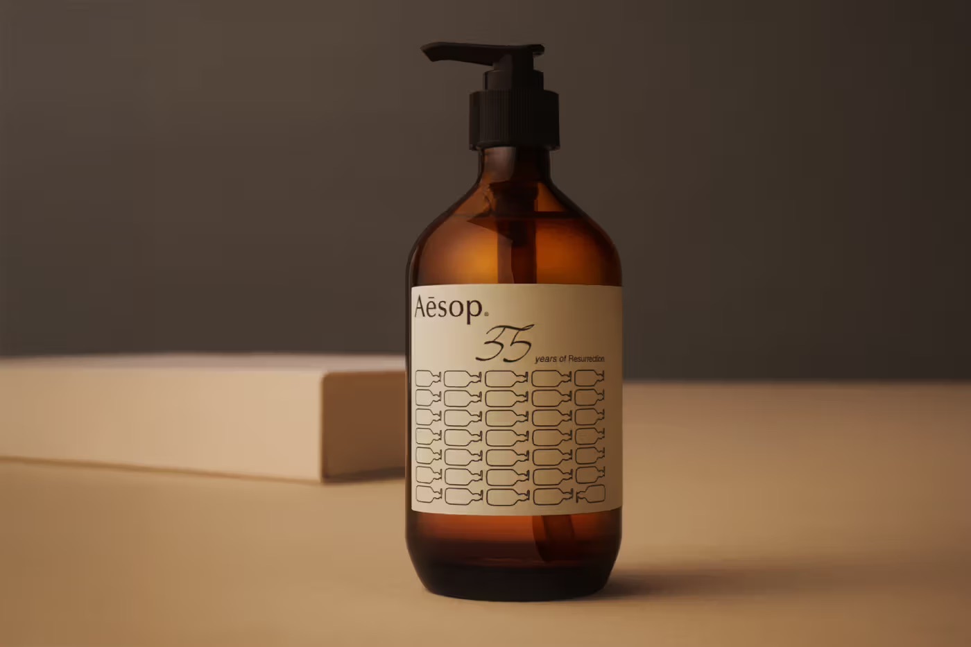
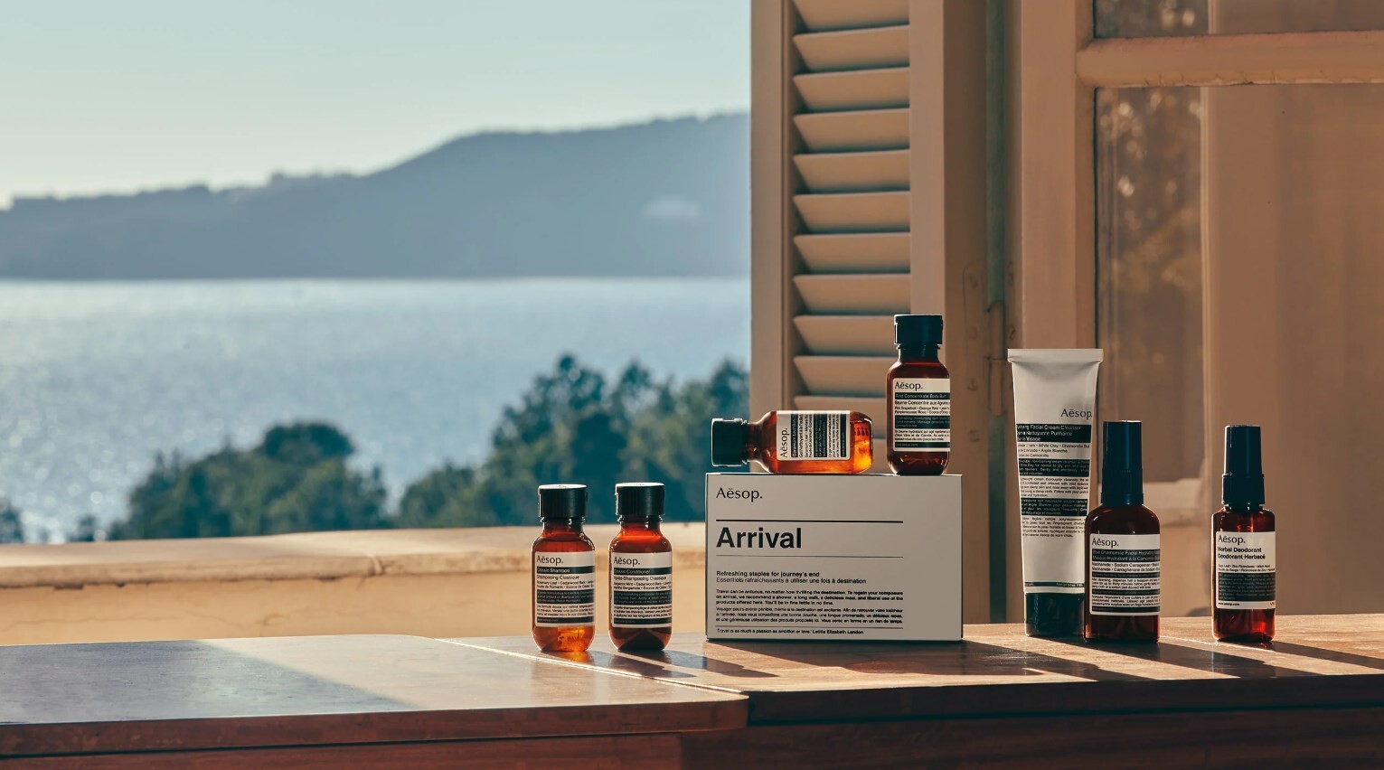
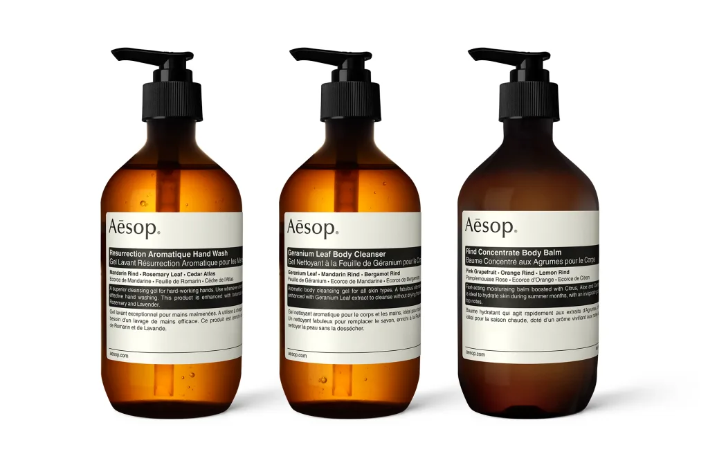
Aesop packages its products in amber glass and amber PET plastic bottles, a design choice the company frames as functional first and aesthetic second.1 According to Aesop's own customer service documentation, the brand favors "pharmaceutical-grade amber glass for its inert properties and UV protection, which maintains the stability of active botanical extracts and minimizes the need for preservatives."1 The amber tone, now closely associated with the brand across every product category from skincare to home fragrance, exists primarily to block the light that degrades plant-derived active ingredients over time.1
Function first, recognition second
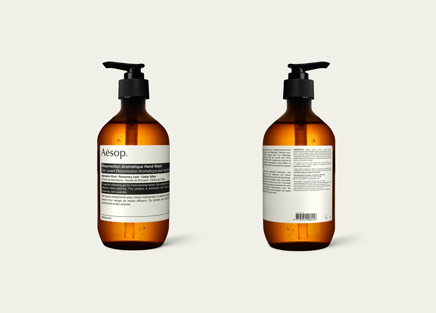
The rationale matters for how Aesop's packaging functions as a brand asset. Where many beauty brands develop a signature color or bottle shape primarily for shelf recognition and then justify it after the fact, Aesop's amber packaging began from a formulation requirement, protecting botanical extracts from light exposure, that happened to produce a highly distinctive, consistent visual identity as a byproduct.1 The label design reinforces the same logic: text-forward, typographically plain, and organized around ingredient lists and usage instructions rather than product photography or lifestyle imagery, closer in appearance to a compounding pharmacy's dispensary than to a cosmetics counter.
A material system built for reduction, not addition
Aesop describes its packaging philosophy in terms of restraint: vessels are intended to be, in the company's words, "humble, utilitarian, and have minimal environmental impact."1 The design brief effectively works backward from the constraint of function and low environmental cost, rather than forward from a desired visual statement, a discipline consistent with the company's broader resistance to embellishment across naming, copywriting, and retail architecture.
Updating the materials without changing the look
In 2023, Aesop moved its most widely used 75 millilitre and 100 millilitre tube packaging to one hundred percent post-consumer recycled aluminum, and now uses a minimum of ninety-seven percent post-consumer recycled PET plastic across bottles where plastic packaging is used.1 The change is a material substitution rather than a redesign: the amber color, the pharmacy-style label layout, and the overall silhouette of the packaging remain unchanged, while the underlying material composition shifts toward recycled inputs. The approach lets Aesop reduce its packaging's environmental footprint without altering nearly four decades of consistent visual identity, a trade-off many brands attempting a sustainability transition struggle to manage without altering shelf recognition.2
No named designer, and perhaps no need for one
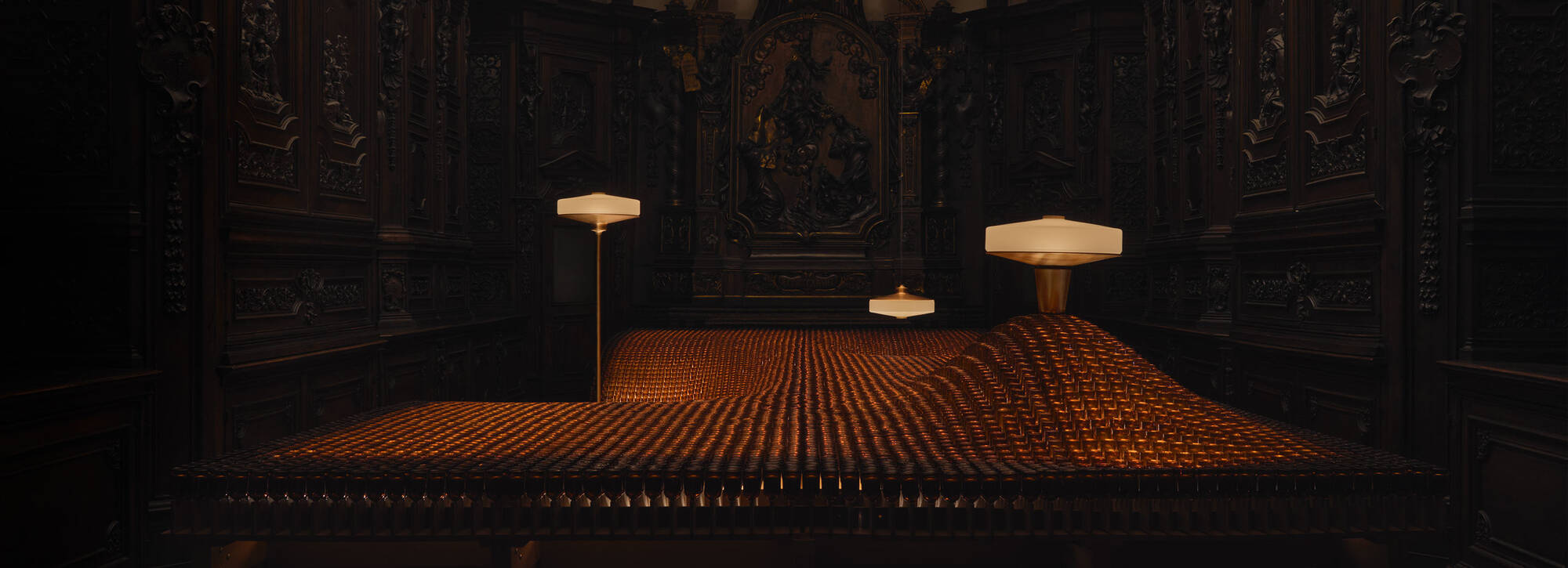
Unlike several of Aesop's individually commissioned store interiors, which typically carry a credited architect or design studio, the amber-bottle packaging system carries no publicly documented individual designer or agency credit.3 The system appears to have developed internally from the company's earliest years, reflecting founder Dennis Paphitis's preference for utilitarian, ingredient-led presentation over externally commissioned brand design.2 Where Aesop repeatedly seeks outside collaborators for retail architecture, one store's design almost never resembling another's, the packaging has stayed remarkably stable and internally authored, functioning as the one constant visual thread running through a network of otherwise entirely distinct store environments.3, 4
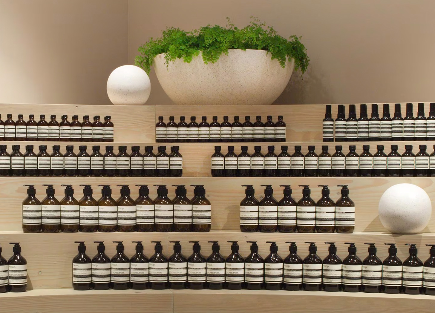
The result is a packaging system that behaves almost like a uniform. Whatever a given store looks like, whether a restored Victorian mansion in London or a wall of reclaimed cardboard tubing in Los Angeles, the amber bottles on the shelf look the same, carrying the brand's identity consistently across a retail program that otherwise deliberately avoids consistency.3, 4
A quiet contrast to the rest of the beauty aisle
Placed next to conventional prestige skincare, which typically leans on white or pastel packaging, gold accents, and photography of the product in use, Aesop's amber bottles and plain, ingredient-dense labels read closer to a chemist's shelf than a department store counter. That contrast, deliberate since the brand's earliest years, has become one of the clearest visual shortcuts customers use to identify an Aesop product before reading a single word of its label.
A visual identity that predates modern branding practice
Aesop's packaging system took shape years before the branding industry began routinely advising beauty companies to build a signature color or bottle silhouette as a deliberate recognition device. Because the amber bottle originated from a functional requirement rather than a branding brief, it avoids the slightly manufactured quality that can attach to color choices selected primarily for shelf standout, giving the packaging a credibility that a more overtly designed system might struggle to replicate.
Written with AI assistance, edited by a human. Find out more about our Use of AI.
1. Aesop Assistance (United States), "What materials do Aesop utilise in its packaging?", undated, for Aesop's use of amber glass and amber PET bottles and for the company's own rationale, "We traditionally favour pharmaceutical-grade amber glass for its inert properties and UV protection, which maintains the stability of active botanical extracts and minimizes the need for preservatives", for the statement that vessels must be "humble, utilitarian, and have minimal environmental impact", for the 2023 transition of the most popular 75 mL and 100 mL tubes to 100 percent post-consumer recycled aluminium, and for bottles being manufactured using a minimum of 97 percent post-consumer recycled content. The same page is listed twice in the verse's research notes, once as an article and once as the brand newsroom entry. https://us.assistance.aesop.com/hc/en-us/articles/7406664205327-What-materials-do-Aesop-utilise-in-its-packaging
2. Wikipedia (English), "Aesop (brand)", for Aesop having been founded in 1987 by Dennis Paphitis in Armadale, Victoria, which is the basis for the packaging system being close to four decades old, and for Aesop's minimalist approach to branding and its practice of developing a unique interior for each store in collaboration with architects, interior designers and artists. https://en.wikipedia.org/wiki/Aesop_(brand)
3. Dezeen, Anna Winston, "Dezeen's top 10 Aesop store designs", 17 December 2014, for Aesop's store interiors being individually commissioned and each credited to a named studio, among them Cheungvogl in Hong Kong, March Studio in Singapore, Tacklebox in New York, Ciguë in Paris, Tolila+Gilliland and Studioilse in London, Schemata Architecture Office in Tokyo, Torafu Architects in Kyoto and NADAAA in San Francisco, and for the London store in Mayfair by Studioilse occupying a protected Victorian shop building. Off whitelist and used for corroboration only. https://www.dezeen.com/2014/12/17/dezeens-top-10-aesop-store-designs-interiors/
4. Dezeen, Lizzie Fison, "Brooks + Scarpa recycles cardboard tubes and paper for Los Angeles Aesop store interior", 21 March 2017, for the Los Angeles store whose walls are lined with reclaimed cardboard tubing from fabric rolls used by the nearby fashion district, and for each Aesop store being unique, which the piece traces to founder Dennis Paphitis, who told Dezeen he was "horrified at the thought of a soulless chain". Off whitelist and used for corroboration only; it is the same Dezeen report the sibling verse on the Los Angeles store is built on. https://www.dezeen.com/2017/03/21/aesop-store-interior-brooks-scarpa-los-angeles-recycled-cardboard-tubes/