
Canada Goose
Canadian outerwear maker that turned Arctic-grade expedition equipment into a global luxury brand, and is now extending that authority beyond the cold season.
- Founded
- 1957
- Industry
- Apparel · Outdoor
- Headquarters
- Canada
- Ownership
- Public company
Key Facts
We believe that true warmth goes beyond protection from the weather: we are there for one another, always and everywhere.
Canada GooseSince 1957, our Canadian heritage has stood for uncompromising craftsmanship and durable products.
Canada GooseOur mission is to encourage explorers while protecting our planet.
Canada GoosePositioning
Brand Chronology
Canada Goose revives Snow Goose, its own old name
2024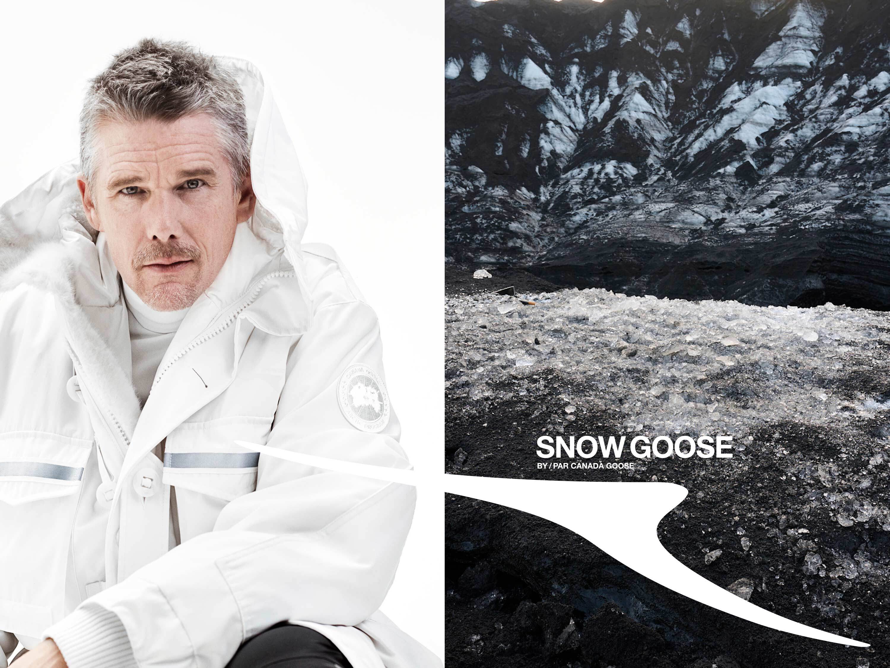

Haider Ackermann
becomes Creative Director
Canada Goose gets its own Pantone colour, PBI Blue
2018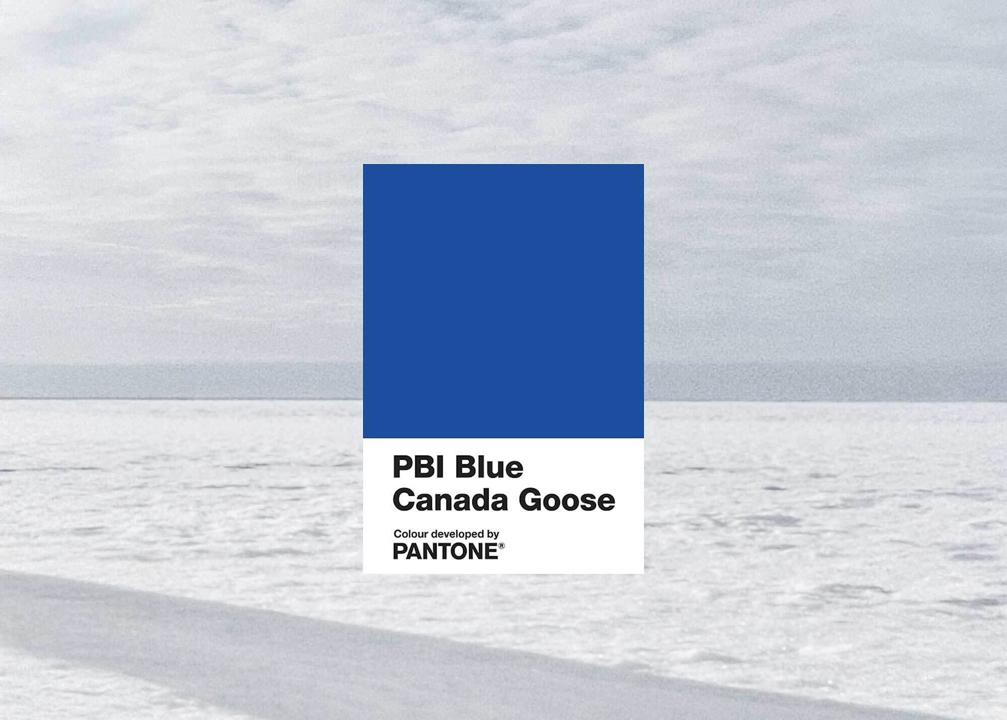
Canada Goose dresses the Sundance Film Festival
2013
Logo Redesign
2010
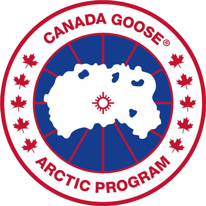
The iconic Canada Goose emblem is more geographically specific than it might first appear. Rather than depicting Canada, the central image represents an inverted view of the North Pole. The large white area symbolizes the Arctic Ocean, while the blue shapes represent surrounding islands. At the center, a red circle marks the point where the meridians converge, which are illustrated as red lines across the map.
The emblem was created by David Reiss in the 1980s and became closely associated with Canada Goose’s Arctic heritage and expedition-oriented identity.

Dani Reiss
becomes CEO
Canada Goose keeps making its parkas in Canada
2001
Logo Redesign
2000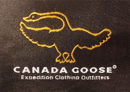
When, in the 1990s, clothing manufacturer Snow Goose entered the European market, it turned out that its name was already taken there. Therefore, he began working for Canada Goose in some countries. In 2000, Dani Reiss, son of David Reiss, decided to permanently rename the company to Canada Goose. This is how the logo appeared with the corresponding inscription. She was in the first line, and the second was occupied by the phrase “Expedition Clothing Outfitters.” All letters were white and bold and had no serifs. At the top was an image of a goose with a golden outline.
Logo Redesign
1985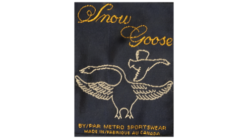
In 1972, David Reiss joined Metro Sportswear and introduced a new line of insulated coats and parkas under the name Snow Goose. Its logo featured two geese—a larger standing bird and a smaller one shown in flight—reflecting the brand’s connection to cold-weather environments.
The brand name appeared above the birds in an elaborate script with prominent decorative flourishes. Beneath the illustration, the emblem included details identifying the company and its Canadian manufacturing origin, including “BY / PAR METRO SPORTSWEAR” and “MADE IN / FABRIQUE AU CANADA.”
On garment labels, the lettering was embroidered in gold, while the geese were outlined in a light beige tone. In 1985, David Reiss acquired a majority interest in Metro Sportswear Limited and subsequently renamed the company Snow Goose.
Canada Goose and the Goose People
1982
Logo Design
1967
In 1957, Metro Sportswear Limited established its original visual identity. The emblem centered on a red maple leaf with a stylized brown bear positioned in front of it, creating a distinctly Canadian motif.
On either side of the central illustration were vertically arranged bilingual descriptions: “SPECIALIZED INDUSTRIAL CLOTHING” on the left and “VÊTEMENT INDUSTRIEL SPÉCIAL” on the right. Beneath the emblem, the company name “METRO SPORTSWEAR LIMITED” appeared above a long red underline, followed by “TORONTO, CANADA.”
The combination of the maple leaf, bear, and bilingual typography reflected the company’s Canadian origins and its focus on industrial outerwear.
Founded
1957