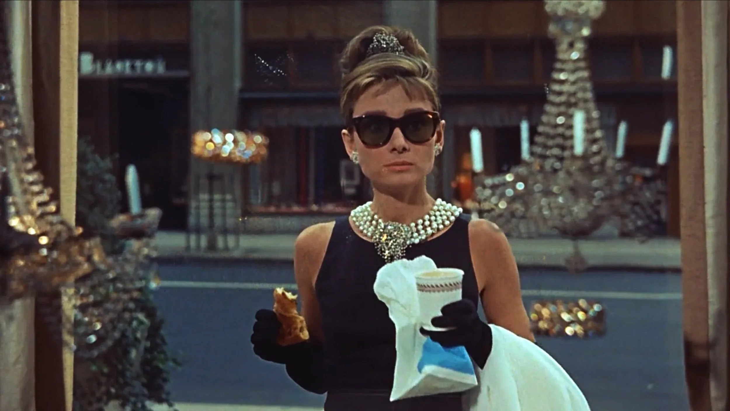

A colour on the cover of the first Blue Book
Tiffany & Co. used a distinctive robin's-egg blue as early as 1845, when the colour appeared on the cover of the house's first Blue Book, an annual catalogue of Tiffany jewelry and silver the company has published continuously since. The choice predates any formal branding strategy in the modern sense; it was simply the colour Charles Lewis Tiffany chose for the catalogue's cover, decades before packaging design became a discipline in its own right.
The colour became attached to Tiffany's packaging over the following century, most visibly on the small boxes the house uses for jewelry, tied with a white ribbon rather than the coloured ribbon associated with other luxury retailers. By the twentieth century, the pairing of the blue box and the white ribbon had become recognizable enough on its own, without any Tiffany wordmark visible, that customers and journalists routinely referred to receiving "a little blue box" as shorthand for a Tiffany gift.
From informal signature to registered trademark
Tiffany registered the specific shade as a colour trademark in the United States in 1998, formalizing a legal claim to a colour the house had used informally for more than 150 years. Colour trademarks are difficult to defend in most jurisdictions, since courts generally require proof that a colour has become so strongly associated with a single company that consumers identify the source from the colour alone, without any accompanying logo or text, a bar Tiffany's decades of consistent use helped it clear.
In 2001, Tiffany went a step further and worked with Pantone, the standards company whose colour system is used across the design and manufacturing industries, to create a proprietary formula named 1837 Blue, after the house's founding year. Unlike a standard Pantone reference, which any printer or manufacturer can license and reproduce, Pantone 1837 is restricted to Tiffany's own use and does not appear in the publicly available Pantone Matching System swatch books, meaning no other company can obtain the exact formula through ordinary commercial channels.
Source: The Ads Curators
A colour that now does the talking
The result is a packaging signature that requires no text to identify its source. Tiffany's own marketing materials describe the colour as carrying meaning beyond decoration, stating that whatever comes out of a Tiffany Blue Box is expected to justify the anticipation the box itself creates, a claim that depends entirely on the colour having built that expectation over more than a century rather than through any single campaign.
The strategy has also shaped how Tiffany uses the colour outside packaging. Store interiors, staff uniforms, digital interfaces and the Tiffany & Co. flagship building's accents draw on the same proprietary blue, extending a nineteenth-century catalogue cover into a coordinated identity system that spans everything the house touches, still built around a formula only Tiffany is permitted to print.
Tiffany has been active in policing use of similar shades by other companies, and legal commentators frequently cite the Tiffany Blue trademark alongside a small group of colour marks, such as the magenta used by T-Mobile or the orange associated with Hermès packaging, as one of the few colours to have survived sustained legal challenge on the basis of decades of exclusive commercial use. Even brands with no intention of imitating Tiffany's packaging design tend to steer away from robin's-egg blue in luxury contexts specifically to avoid any suggestion of association with the house.
Few brand assets illustrate the value of patience as clearly as Tiffany's blue. The colour did not begin as a branding decision at all, and it took more than 150 years of uninterrupted use before Tiffany converted that consistency into a formal, defensible trademark and, three years later, a colour formula no competitor can legally reproduce.
Reproducing an exact, legally significant colour is harder in some media than others, a problem Tiffany has had to manage as its marketing has moved from print catalogues to screens. A printed Pantone 1837 swatch can be matched precisely by a printer using the proprietary ink formula, but digital displays render colour through combinations of red, green and blue light that vary from one screen to another, meaning the exact shade a customer sees on a phone or a monitor is never guaranteed to match the physical box. Tiffany's brand guidelines specify an approved digital equivalent for use on its website and social channels, an approximation the house treats as close enough for on-screen purposes while reserving the true, legally protected formula for print and packaging.
That distinction between the protected physical colour and its necessarily imperfect digital equivalent is a modern complication for a nineteenth-century brand asset, and it illustrates how even a fixed, guarded trademark still requires active management as the channels through which customers encounter a brand continue to change.
Written with AI assistance, edited by a human. Find out more about our Use of AI.