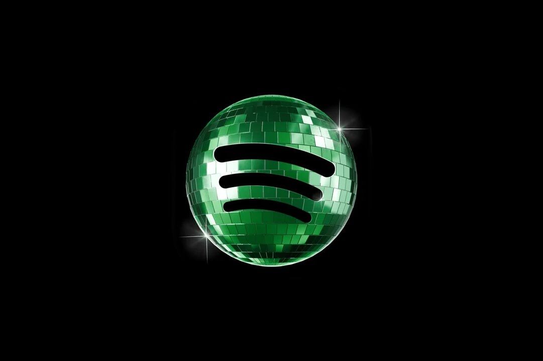
A birthday icon meets its end on schedule
On 17 May 2026, Spotify confirms that the disco-ball app icon introduced in early May for its 20th anniversary is retired the following week, returning users to the familiar flat green mark with three sound waves. The statement comes through replies on the official Spotify account on X and follows several days of public criticism over the icon's readability, colour balance and fit with the rest of the home screen.
The disco ball is part of "Spotify 20: Your Party of the Year(s)," a mobile in-app experience that revisits each listener's twenty years of music history. Spotify rolled it out without explicit warning on iOS, replacing the regular icon with a photorealistic glowing green mirrorball. Many users read the swap as permanent rather than as a time-limited celebration, which set the tone of the response.
Spotify's reply, signed off with the line "we know glitter is not for everyone", is unusually direct for a brand of its scale. The company tells one user that the "birthday icon was a limited-time guest star" and another that the platform will be "back to normal when the lights go down". The wording leaves the regular mark intact as the master asset and frames the disco ball as a guest, not a successor.
Why a temporary icon felt permanent
The visual critique centres on three concrete issues. The icon uses a darker green than the standard Spotify Green at #1ED760, which loses contrast against the black home-screen wallpaper many users default to. The disco-ball texture is rendered at photographic fidelity, which results in visible pixelation at the small format of an iPhone home-screen tile. And the photorealism breaks the typeface and abstraction conventions of the icons around it, producing a single object that does not sit cleanly in any standard grid layout.
Jack Appleby, a creator and social media consultant, summarises the response in a post on X over the weekend, describing the icon as carrying "huge readability and brand issues" and calling the switch "a kinda dumb mistake". The critique is shared widely by users who default to dark home screens, with several documenting their screens before and after the icon swap. A parallel current of support runs alongside the criticism. Michael J. Miraflor of EssenceMediacom argues on X that the icon is "fun and different (and temporary to begin with)" and that the backlash represents an unwillingness to allow a brand a moment of play.
Spotify replies in real time
The company's response is conducted in the medium where the criticism is loudest. Spotify uses the official X account to reply to individual users by name across 17 May 2026, repeating a small set of lines with stylistic variation. "We know glitter is not for everyone. Our temp glow up ends soon." "Our birthday icon was a limited-time guest star. Your regularly scheduled Spotify icon resumes soon." "It's our birthday so we're in our party gear, but we'll be back to normal when the lights go down."
The choice to respond at the individual reply level, in voice, is a continuation of the social tone Spotify has cultivated since its first wave of Wrapped content in 2016. The company does not retract the icon, defends the celebration as a temporary moment and signals a fixed return date for the regular mark. The result reads as a calibrated correction rather than a reversal, and the regular logo, originally scheduled to return after the campaign window, returns on the same schedule it was always set to.
Distinctive assets in the icon era
The episode brings into focus a question that distinctive-brand-asset theory was not built to handle directly. A mobile app icon is closer to a packaging mock than a logo on a building. It lives on a 60-by-60-pixel tile, sits in a fixed grid alongside dozens of other brands' marks, and is encountered by users dozens of times each day, often before any other contact with the brand that day. The cost of any deviation from the master icon is paid in repeated micro-interactions across millions of devices, and the user's home screen sits in tension with the brand's editorial calendar.
Spotify's position throughout the cycle is that the disco ball is a celebration, not a replacement, and that distinction is the substantive editorial point. The brand uses the temporary icon to mark a milestone the way a brand might use a wrapper redesign for a packaging house, and then returns to the master asset on schedule. Whether the reaction calibrates how the brand approaches its 25th anniversary remains an open question; the immediate signal is that Spotify is willing to take the friction of a public correction in exchange for a moment of play, but that the master mark stays master.
Written with AI assistance, edited by a human. Find out more about our Use of AI.