The Fifth Evolution
On 7 July 2025, Bentley Motors presented the fifth iteration of its Winged B emblem at its headquarters in Crewe, England. The redesign represents what the company describes as "the biggest change to the instantly-recognisable mark in more than a century."
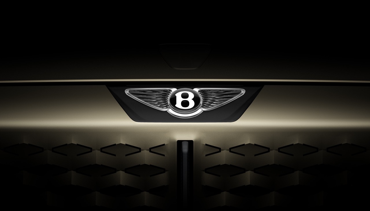
Founded in 1919 by W.O. Bentley, the marque's emblem has evolved through the decades, each iteration reflecting its era while maintaining core symbolic elements. This fifth redesign revisits the asymmetric structure of the 1919 original: the left wing now features ten feathers while the right carries eleven—an homage to the founding design.
Subtraction as Modern Strategy
The most significant change is what was removed. The lower feathers that previously extended beneath the B have been eliminated entirely, creating a "visually-cleaner shape" that reduces visual complexity without abandoning heritage. This reductive approach aligns with contemporary design thinking while honoring the brand's historical vocabulary.
Critically, the redesign allows the B centre to function as a standalone graphic device independent of the wings. This modular flexibility enables the emblem to scale and adapt across digital touchpoints, vehicle displays, and brand applications—a necessity in modern luxury automotive marketing.

In-House Design and Electrified Future
Bentley's design team, led by Director of Design Robin Page, developed the mark in-house, signaling organizational confidence in internal creative capabilities. The unveiling coincided with the launch of a new Design Studio and the EXP 15 concept car, together articulating Bentley's "Beyond100" electrification strategy.
The Winged B redesign thus serves dual purposes: it honors a 106-year design legacy while signaling Bentley's commitment to electric transformation. The logo's evolution reflects not abandonment of heritage, but its adaptation to a future the 1919 founder could never have imagined.