A brand mark that argued by appropriation
Supreme opened at 274 Lafayette Street in Manhattan in April 1994. James Jebbia founded the store at the age of 30 after moving from England to New York in the early 1980s and working through formative posts at Parachute, Union NYC, and the Union Stüssy partnership with Shawn Stussy. The first Supreme store was a skate shop. Jebbia and his team designed the interior with a skateable central plan: clothes and decks lined the perimeter walls, the central floor was kept open, and skaters could ride through the store rather than around it. The configuration was unusual at the time and signalled the brand's central editorial position, that the shop was for skaters first and the merchandise was a record of the culture that came through the door.
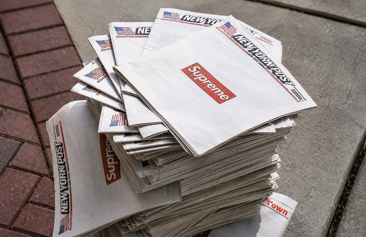
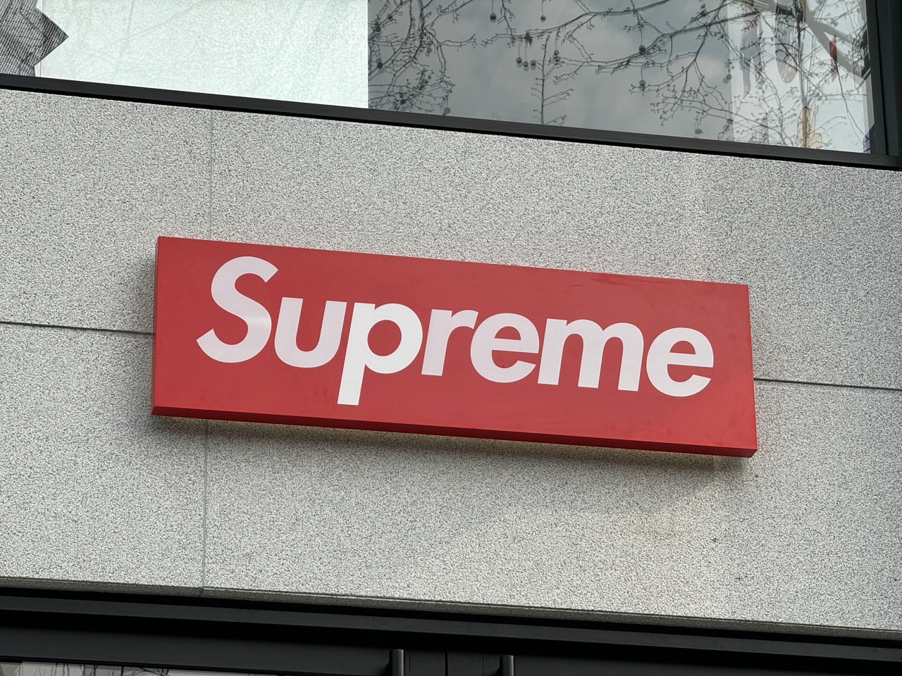
The Box Logo arrived almost immediately. Jebbia handed his graphic designer a book of Barbara Kruger's work and asked for a mark that captured the same compositional logic. The result placed the single word Supreme in white Futura Heavy Oblique inside a red rectangle. The italicised type filled the frame to the edges, with the slope of the letterforms creating a small diagonal counter at top-right and bottom-left. The mark was applied first to Supreme T-shirts and to the storefront signage, and it has stayed structurally unchanged for more than thirty years across every product, every collaboration, and every season.
The Kruger reference
Barbara Kruger had developed a distinctive visual language across the 1980s. Her 1981 Public Address exhibition placed white Futura type inside red and black bars over found photographs, with declarative second-person statements such as Your gaze hits the side of my face and I shop therefore I am. The work argued that the techniques of magazine advertising and political poster design could be turned back on the viewer to interrogate consumption, gender, and authority. Kruger's visual vocabulary became part of the visual literacy of the late twentieth century, recognisable to anyone who had spent time inside the gallery system or the magazine racks of the 1980s.
Jebbia's appropriation of that vocabulary was deliberate rather than coincidental. He had grown up inside the same visual landscape that Kruger's work commented on. The Box Logo borrowed Kruger's font, her red field, and her italic compositional bar, and used them to mark a downtown skate shop rather than to make an art-world argument. Jebbia later acknowledged in court filings during a 2013 trademark dispute that the Box Logo was based directly on Kruger's work. Kruger herself, asked in 2013 about the dispute between Supreme and Married to the Mob over the use of the word Supreme inside a red rectangle, called both parties uncool jokers and added that she would not be surprised if either of them eventually sued her for copyright infringement.
The Box Logo as a brand mechanism
The Box Logo functioned from the start as both an identity mark and a product. The red rectangle was applied to T-shirts, hoodies, beanies, caps, stickers, and a wide range of seasonal accessories. The product range was narrow at first, and the Box Logo carried most of the editorial weight. Customers who wore a Box Logo T-shirt or hoodie were marking themselves as part of an audience that had access to the shop and to the queue outside the door. The brand mark therefore performed a recruitment function as much as a labelling function. The garment was effectively a small portable version of the storefront signage.
The decision to apply the mark sparingly mattered as much as the design itself. Supreme released Box Logo T-shirts and hoodies in small quantities and at irregular intervals, with the consequence that any given Box Logo carried both a season identifier and a scarcity premium. Collectors learned to read Box Logos by colour, by font weight, and by collaboration tag, and a secondary market for Box Logo merchandise developed quickly. The mark therefore became one of the few late twentieth century brand identities to function simultaneously as a logo, as a product, and as a tradable cultural object.
The store as the centre of the system
The 274 Lafayette Street store stayed structural to the brand for almost two decades. Supreme opened a second store in Los Angeles in 2004, and the international roll-out followed: London 2011, Paris 2016, Brooklyn 2017, San Francisco 2019, Milan 2021, Chicago 2022, Berlin 2023, Seoul 2023, and Shanghai 2024. The Tokyo network had developed earlier, with Daikanyama opening in 1998. Each store followed the original blueprint: skateable central floor, perimeter merchandising, and a Box Logo storefront. The format was therefore exportable, with the consequence that the brand expression remained consistent across every market the company entered.
The retail model also held a weekly drop discipline. Supreme released new product every Thursday in the United States and Europe and every Saturday in Japan, and the size of each drop was kept below predicted demand. The queue outside each store became a feature of the brand rather than an inconvenience. Customers in 1994 stood for hours outside Lafayette Street for a small skate deck or a new T-shirt, and customers in 2024 still stood for hours outside Berlin, Shibuya, or Brooklyn for the same reasons.
The legacy assessment
The Box Logo is now one of the most internationally recognised brand marks of the late twentieth century, alongside Coca-Cola's script, Nike's swoosh, and Adidas's three stripes. It has appeared on collaborations with Louis Vuitton, Comme des Garçons, Lacoste, Nike, Levi's, Burberry, Tiffany & Co., and a wide list of contemporary artists. It has been counterfeited at industrial scale, parodied by other brands, sampled by hip-hop visuals, and printed in editions of original limited runs that resell at multiples of original retail. The original mark designed for a small skate shop on Lafayette Street has carried thirty years of the brand without revision, an unusually long run for a logo of any kind.
Supreme's appropriation also continues to be cited inside design education. The Box Logo sits in graphic design syllabi as a case study in how a brand mark can be built from a visual reference that is already culturally recognised, and as a reminder that originality is not always the requirement that brand mark design is asked to meet. The brand has lived inside that reference for three decades and has never tried to escape it.
Written with AI assistance, edited by a human. Find out more about our Use of AI.