A spring campaign filmed as a black-and-white postcard from the Riviera
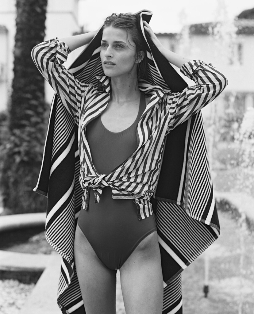
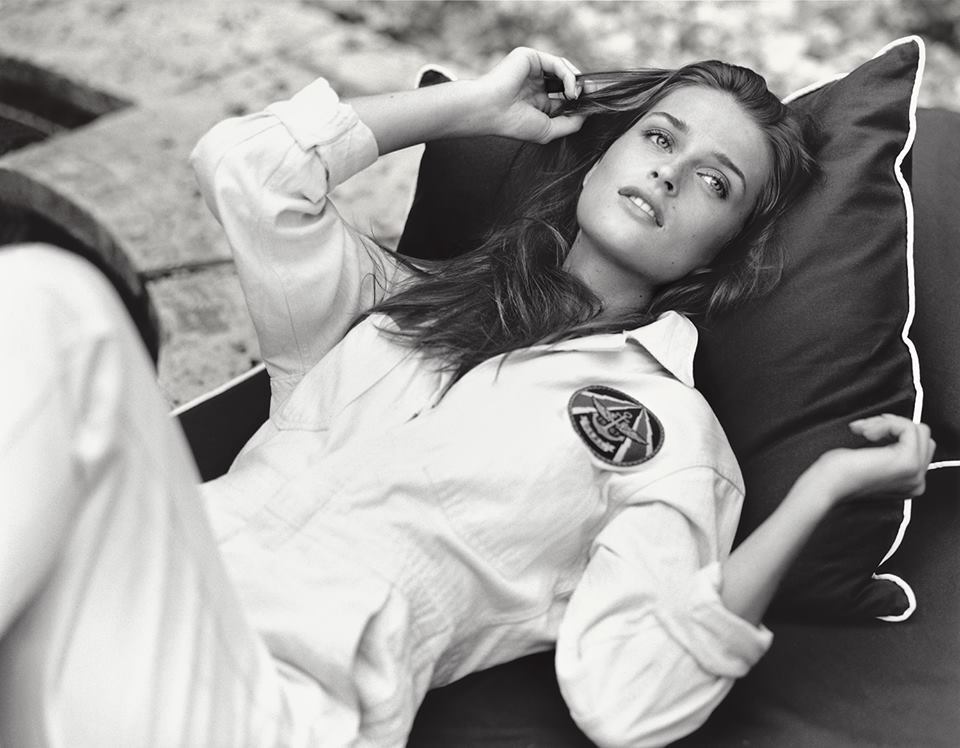
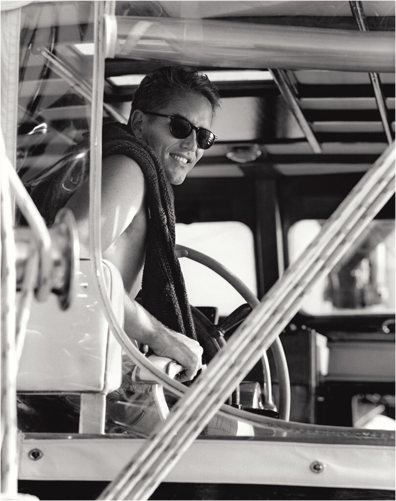
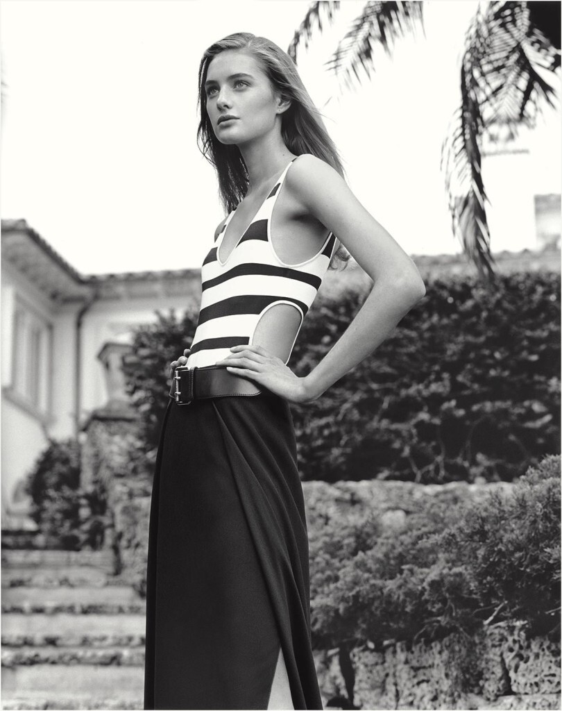
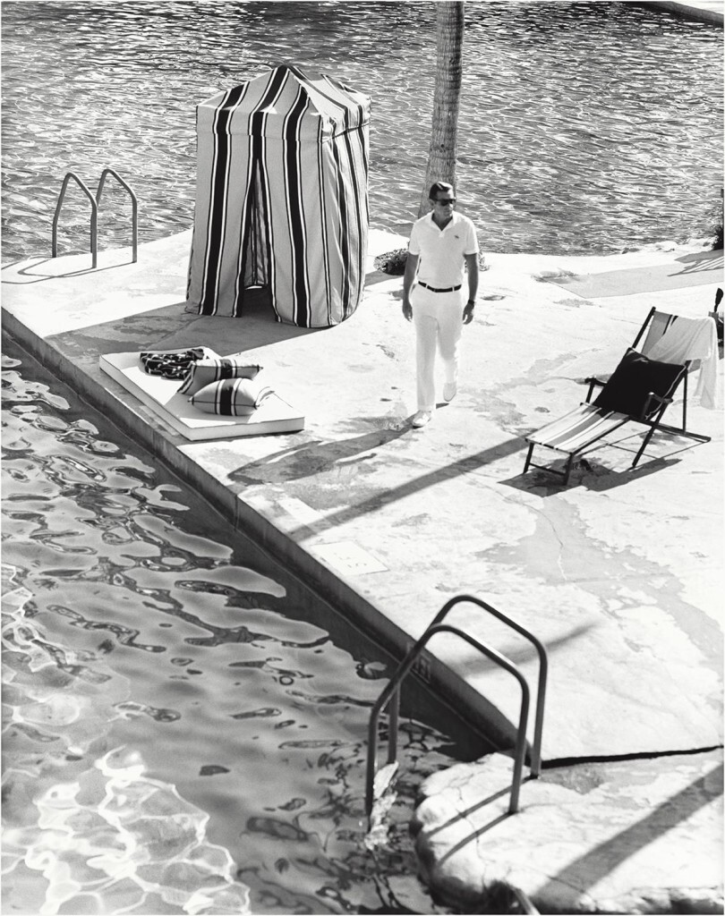
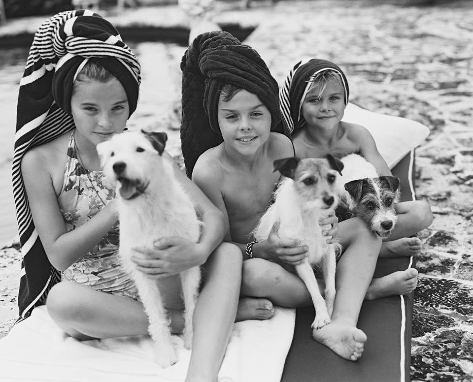
Ralph Lauren released Postcards from Paradise as the Spring 2016 campaign for the Ralph Lauren Collection in April 2016. The film was directed and photographed by Bruce Weber, with styling by Michel Botbol, hair by Orlando Pita, and makeup by Gucci Westman. It opens on a chateau on the French Riviera, where a family interacts by a pool and the children play in the water. The pace is slow and intimate, and the soundtrack moves with the romantic tempo of Mantovani's recording of Strangers in Paradise, the standard from the 1953 musical Kismet. The film cuts between fathers and sons in the pool, beauty frames of young women in swimsuits, scenes of champagne and dinners in evening wear, and travelling shots of the family yacht.
The release sat inside Ralph Lauren's long-running collaboration with Bruce Weber. The photographer had defined the visual language of the brand's American lifestyle advertising from 1984 onwards, and the 2016 film extended that vocabulary into a piece of mid-form online cinema. Postcards from Paradise was scaled for the digital channels that the brand had been building since the late 2000s and was shared as a complete short rather than as a sequence of stills. It also doubled as the brand's centrepiece reel for the Spring 2016 collection presentations.
The strategic problem the campaign answered
Ralph Lauren entered 2016 inside a structural shift in luxury fashion communication. The brands that had previously argued their case through twice-yearly print campaigns in Vogue and Vanity Fair were rebuilding around social platforms and brand-owned digital channels. The fast pace of Instagram and the short attention windows of the new platforms made the traditional luxury film, which had usually been built around a piece of high-production cinematography and a long aspirational arc, look slow. Several of Ralph Lauren's peers shortened their content to 15-second and 30-second cuts and adopted bright colour palettes designed for mobile screens.
Postcards from Paradise took the opposite position. The campaign was photographed in black and white, the pacing was deliberately slow, the cuts were long, and the soundtrack was a 1950s Italian-American easy-listening standard. The film rejected the formats that the rest of the industry was migrating towards and reaffirmed a slow-luxury register that Bruce Weber had pioneered for the brand three decades earlier. The strategic argument was that Ralph Lauren's editorial position depended on continuity rather than on adaptation, and that a 2016 spring film could afford to look as if it had been made for a 1980s campaign because the brand's value lay in being recognisable across generations.
The cast and the production register
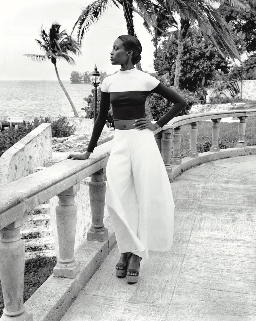
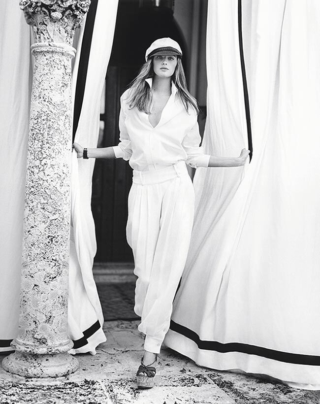
The campaign featured a cast that read as a single family rather than as a roster of named models, with the editorial intention that the viewer would attach to the relationships in the frame rather than to the celebrity of any single face. The Australian actor and model Ruby Rose appeared in adjacent imagery for the Spring 2016 collection. The result was a campaign that argued less by celebrity and more by what the production register itself communicated, with the chateau, the pool, the yacht, the evening wear, and the champagne reading as a coherent vision of a private summer.
The choice of the French Riviera was also strategic. Ralph Lauren had built much of its 1990s and 2000s editorial language around American summer references, with East Coast yacht clubs, Adirondack interiors, and Polo Match imagery. Postcards from Paradise relocated that vocabulary to a European setting and tied the brand to the long visual history of the Côte d'Azur that runs from the 1920s photography of the Murphy circle through to the 1960s magazine work of Slim Aarons. The brand placed itself inside that lineage by photographic association rather than by direct citation.
Source: DRESSBOX Youtube
The creative continuity argument
Bruce Weber's work for Ralph Lauren had defined a recognisable register: tonal black and white, generous depth of field, classical scoring, slow editing, and casts treated as families rather than as models. Postcards from Paradise applied that register to a single coherent storyline and used it as a season-leading campaign rather than as a magazine spread. The film also rhymed with the brand's 1984 lifestyle advertising and its 1990s Hamptons and Out West editorials. Customers and trade audiences who had followed Ralph Lauren since the 1980s recognised the visual signature immediately, while younger audiences encountered a register that distinguished the brand sharply from the colour-saturated, fast-cut campaigns of its peers.
The continuity argument was not nostalgic. Postcards from Paradise carried the same visual logic as the brand's earlier work, but the distribution was contemporary. The film was released on the brand's digital channels, was excerpted as short cuts for social platforms, and was integrated into the Spring 2016 collection rollout across editorial press, retail windows, and ecommerce assets. The format was older than the channels but the campaign architecture sat firmly inside 2016 luxury communications practice.
What the campaign continues to model
Postcards from Paradise is a useful reference for any brand managing the tension between communication continuity and platform change. It demonstrates that a brand can release contemporary work in a register that argues against the prevailing platform grammar, provided the brand's editorial position has the depth to carry that argument. It also extends the longest creative partnership in modern American fashion, between Ralph Lauren and Bruce Weber, into a piece of digital-era cinema. The film provides a small but precise reference point for the brand's editorial identity, and the title remains useful shorthand inside the industry for slow, photographic, family-oriented luxury communication.