Guinness
The world’s most iconic stout, built on a 267-year brewing heritage and the Brian Boru harp — a symbol inseparable from Irish national identity.
Key-Facts
Brand Chronology
Guinness celebrates the return of pubs by reviving the feeling fans had been missing
2021
Guinness Brings Craft Back to the Harp
2016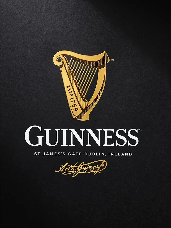
Guinness and the Sapeurs: When Elegance Becomes Identity
2014
Logo Redesign
2005This period is marked by a shift from Antiqua to a semi-grotesque typeface, while the lettering remained in uppercase and retained its previous proportions. At the same time, the harp symbol was carefully refined: the number and thickness of the strings were adjusted, the strings were detached from the frame, and the white gap at the top of the instrument was removed. The designers also reversed the arrangement of thin and thick lines on the left side, giving the emblem a more balanced appearance.
Guinness’ “Surfer” Ad Turned Patience Into a Powerful Brand Myth
1999
Logo Redesign
1997The designers enhanced the elegance of the Guinness logo by refining the wordmark, making the lettering thinner while preserving the classic serif typeface. The harp was also restyled, taking on the appearance of a compact golden emblem.
Logo Redesign
1986In 1968, the developers of the emblem added the beer brand’s name to the harp but simplified the instrument itself. They made it sketchy, keeping the basic structure rather than the detail. The inscription was bold, large, and made in stencil type with capital letters.
Logo Redesign
1955In 1955 Guinness adopted a minimalist logo, reducing the design to a single harp set against a white background. Despite the simplicity of the composition, the instrument itself was rendered with high precision, carefully preserving the number of strings, proportions, curves, and decorative details of the original.
John Gilroy
1930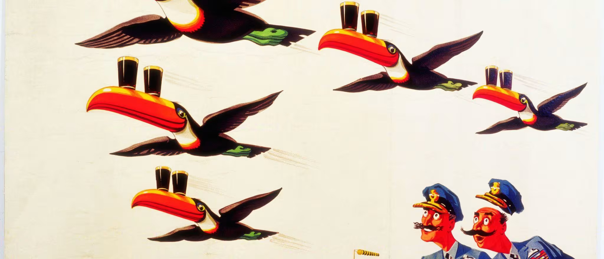
You might not know his name, but you'll certainly know his art, from the iconic Guinness Toucan to the mischievous, stout drinking Ostrich. John Gilroy was a polymath of the painting world, with a mind unlike those of his peers. For this reason, the Guinness campaigns he brought to life from the 1930s to the 1960s remain as distinctive now as they were back then.
The idea of using animals to advertise Guinness originally occurred to Gilroy after visiting the circus. While watching a performing sea-lion he entertained the curious thought that the animal would be smart enough to balance a glass of Guinness on its nose! Alas , it became the concept for one of the world's longest running advertising campaigns "My Goodness, MY GUINNESS”.
Logo Design
1862The Irish brewery long relied on a monochrome, stamp-like emblem. It took the form of a vertically elongated oval filled with detailed elements, giving it the appearance of a compact advertising mark.
Within the design were several graphic components, including a harp, a twisted rope with a repeating ornamental pattern, and a double border that framed the composition, reinforcing its structured and traditional character.