Counter-Trend: Detail Against the Flat Design Wave
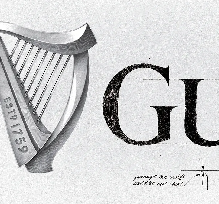
In 2016, Guinness released its first new logo in a decade — and deliberately swam against the prevailing tide of flat design in doing so.
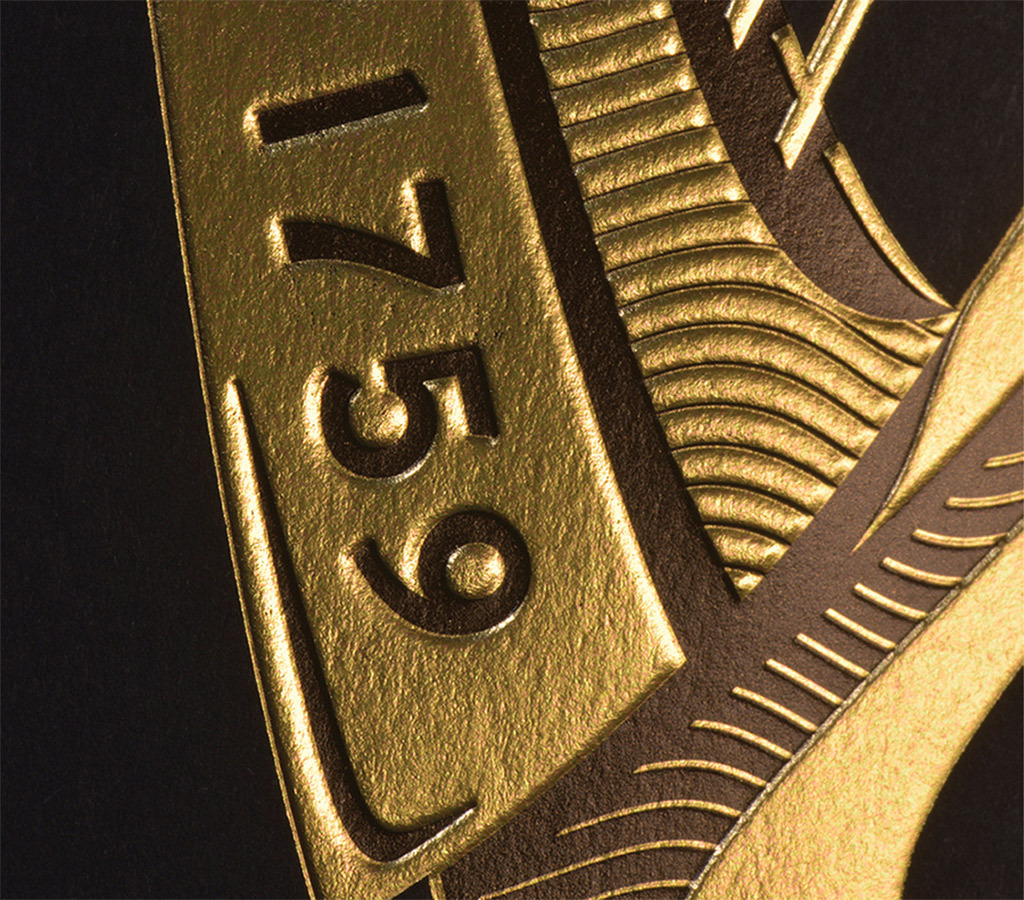
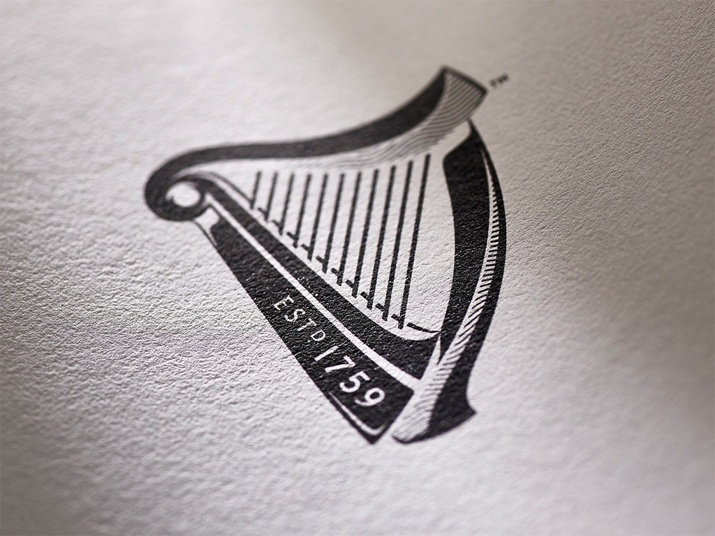
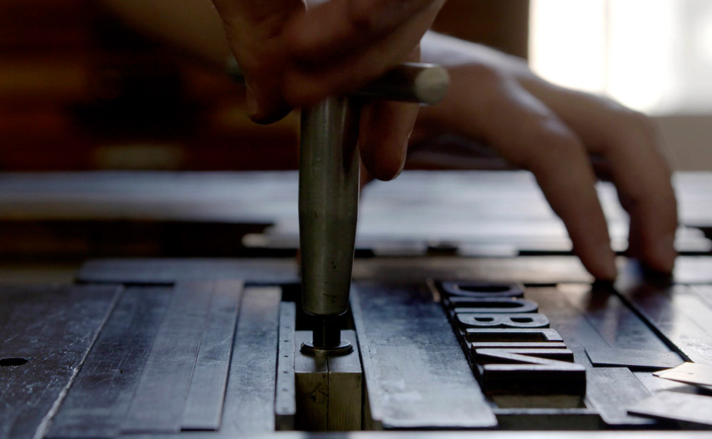
The redesign was carried out by London agency Design Bridge in collaboration with illustrator Gerry Barney, harp maker Niebisch & Tree, and letterpress workshop New North Press. Where the 2006 version leaned toward a clean, near-flat profile, the new harp restored dimensional shading, ornamental detailing, and fine engraved lines — referencing the visual language of engraving, gravure, and traditional craft.
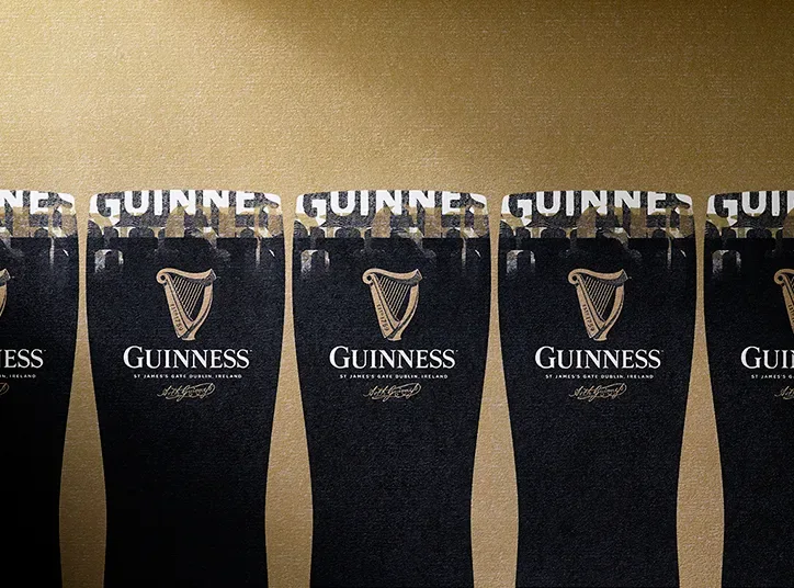
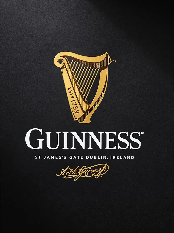
Guinness has used the harp as its trademark since 1862, modeled on the medieval Brian Boru harp, a symbol of Irish national identity. The 2016 revision marked the sixth reworking of the icon since its adoption. The wordmark received a matching treatment: stronger serifs and a more classical character replaced the smoother 2006 letterforms.
Design Bridge framed the intent as conveying “the true craftsmanship and history behind Guinness’s distinctive beers,” positioning the 267-year-old brand against the then-expanding wave of craft beer competitors. The redesign countered a decade-long industry trend toward simplification with a case for material richness and heritage depth.