Coinbase
A US cryptocurrency exchange that changed its mission from building an open financial system to increasing economic freedom in the weeks around its 2021 direct listing, and which runs its advertising from an in-house studio with no agency of record.
- Founded
- 2012
- Industry
- Cryptocurrency exchange · Financial Services
- Headquarters
- USA
- Ownership
- Public company
Key Facts

Clear communication. Efficient execution. Act like an owner. Continuous learning. Top Talent. Championship team. Customer focus. Repeatable innovation. Positive energy. Mission first.
Coinbase, Mission & CultureOur mission is to increase economic freedom in the world.
Coinbase, Mission & CultureBrand Chronology
Coinbase dates the financial system to 1913
2026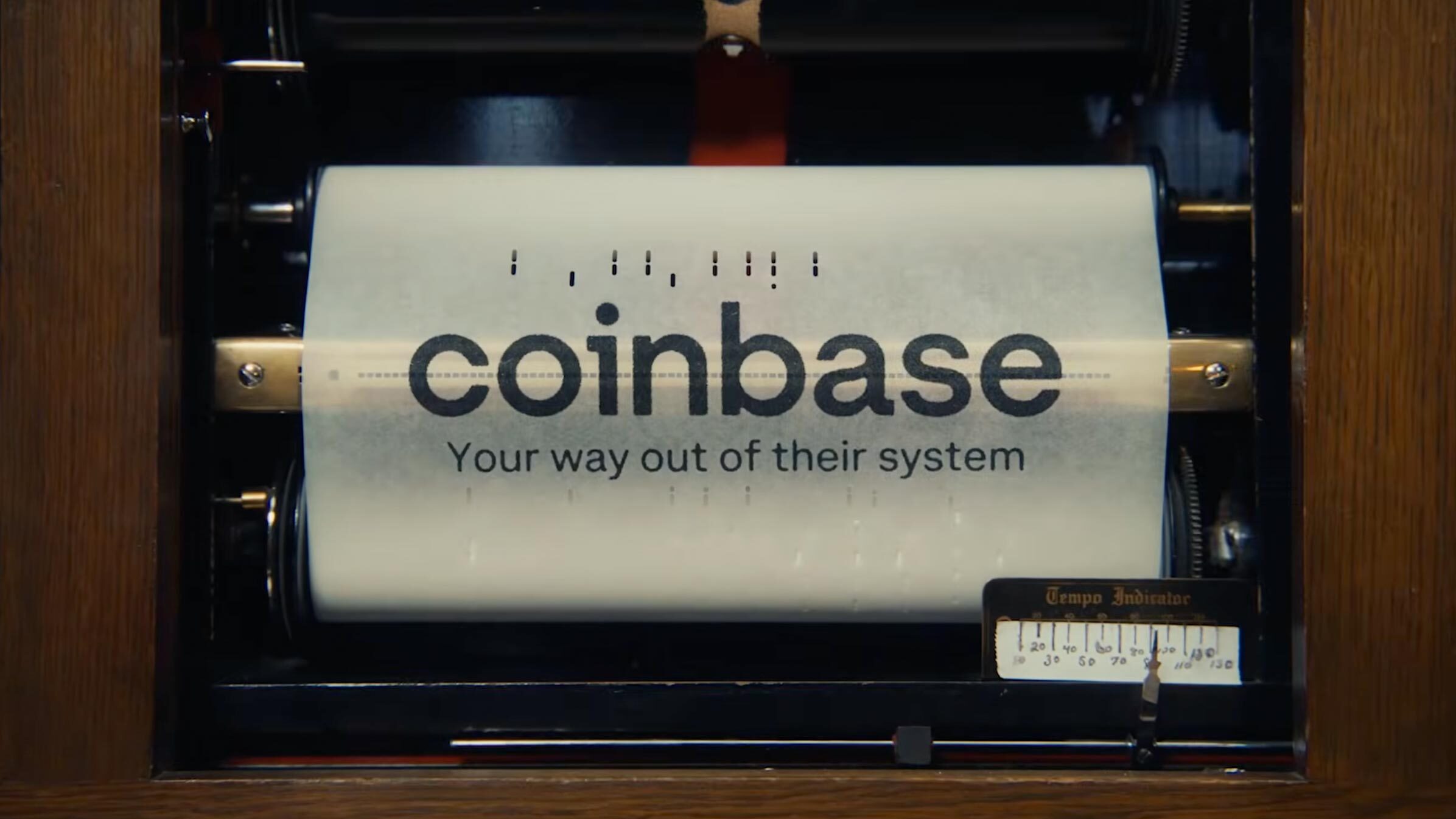
Coinbase runs Your Way Out in the Oscars break
2026
Coinbase makes its first UK campaign a musical
2025
Aardman casts Coinbase's animals by voice
2025
Coinbase runs a pizza ad about transaction fees
2024
Coinbase answers two labels with its own research
2023
Logo Redesign
2021
The modern Coinbase logo is defined by simplicity, balance, and precise geometry. Its carefully aligned lettering forms the central element of the identity, with evenly spaced characters creating a clean and harmonious wordmark. The rich blue color gives the design a distinctive and polished appearance while drawing attention to the company name.
The uniform letterforms and consistent proportions reinforce a sense of unity and visual stability. Rather than relying on decorative elements, the logo uses strong, static shapes to convey solidity and confidence. The restrained design reflects Coinbase’s emphasis on clarity, reliability, and a recognizable corporate identity.
Logo Redesign
2017
By 2017, Coinbase had grown significantly, and its visual identity was updated to reflect the platform’s expanding presence. The redesign introduced a richer blue in place of the earlier light blue, giving the logo a deeper and more established appearance.
The lettering was enlarged while maintaining its low-profile proportions, creating a solid and balanced wordmark. The company name remained centered as the main focal point of the composition, resulting in a clean and confident identity that reflected Coinbase’s continued development.
Logo Redesign
2013
In 2013, Coinbase updated its logo as the platform gained users and established greater operational stability. The redesign removed the “beta” label, leaving the company name as the central element in a light blue tone associated with technology and innovation.
The lowercase wordmark featured large, slightly raised letters that gave the design a subtle dimensional effect. Increased spacing improved readability and created a lighter visual rhythm, while the smooth letterforms added a polished and modern character to the identity.
Logo Design
2012
In 2012, Coinbase introduced its first logo, centered around the company name set in an elegant, structured typeface. The word “beta” was an important part of the design, signaling that the exchange was still in its early development stage.
The main wordmark appeared in black against a white background, creating strong contrast and clear legibility. Carefully balanced letter spacing, proportions, and geometric forms gave the logo a polished and professional appearance.
To the right, “beta” was placed inside a light green rectangular box, creating a fresh accent and drawing attention to the platform’s developing status. The large white lettering provided strong contrast within the box, while the overall composition combined clarity, structure, and a distinctly modern character.
Founded
2012